screenshot from An Extremely Detailed Map of the 2016 Presidential Election by Matthew Bloch, Larry Buchanan, Josh Katz and Kevin Quealy (you will need a NYTimes.com account available through the library).
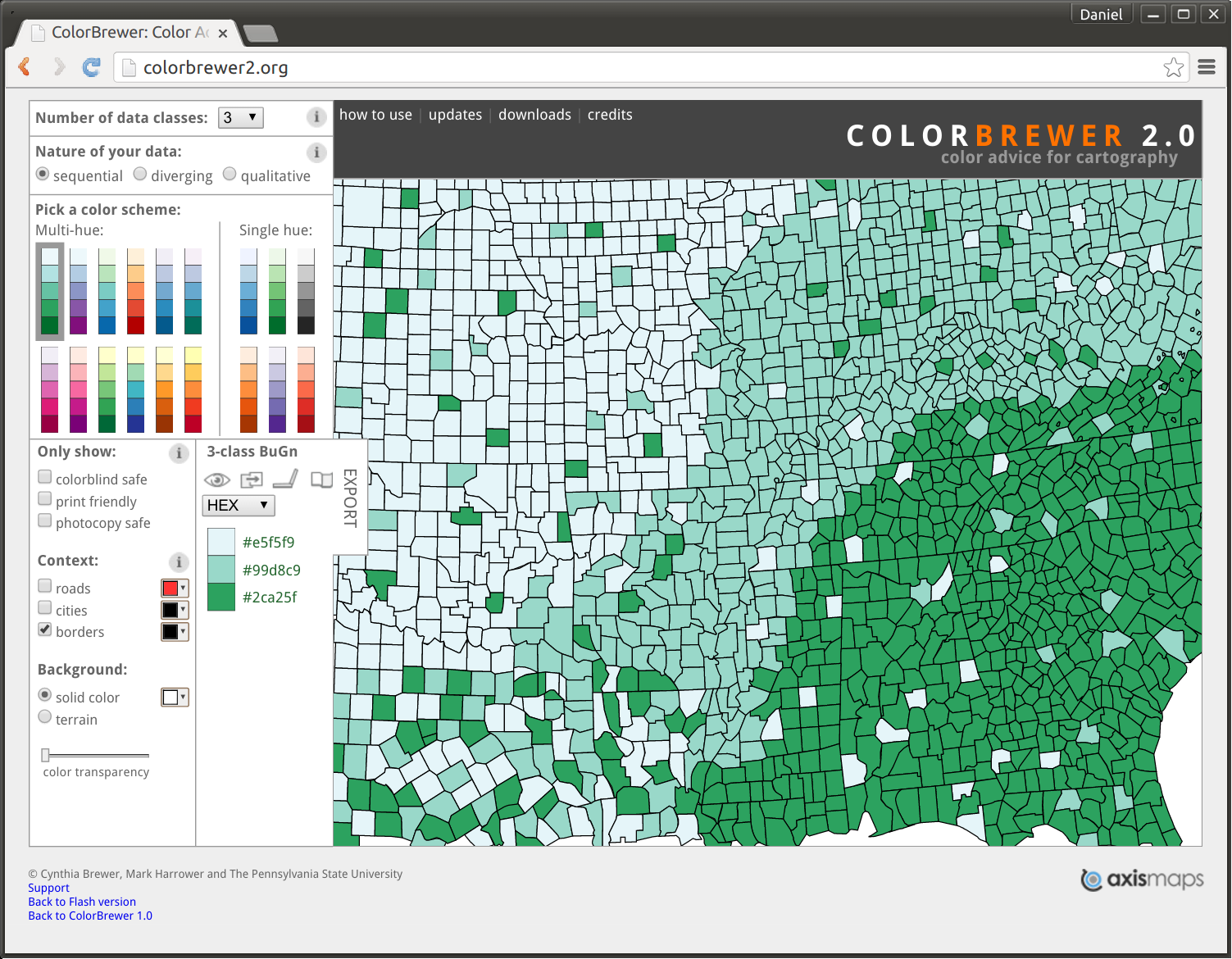
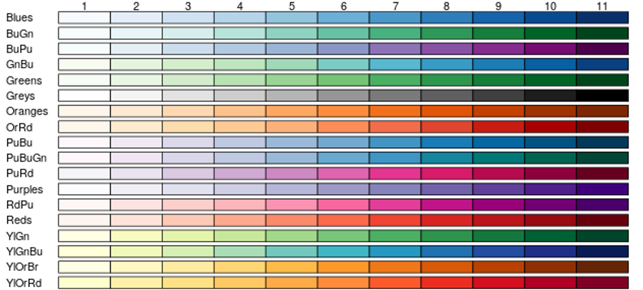
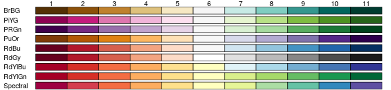
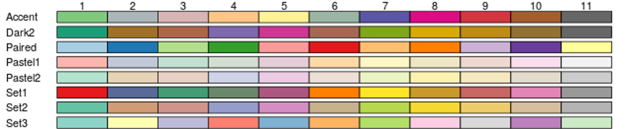
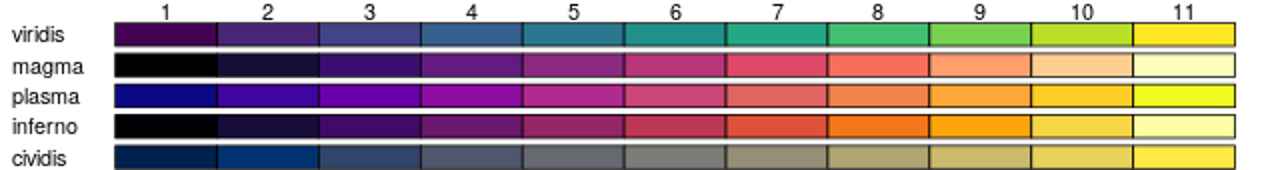
ggplot2 package (and related others), which... inspired tmapimage source boingboing.net
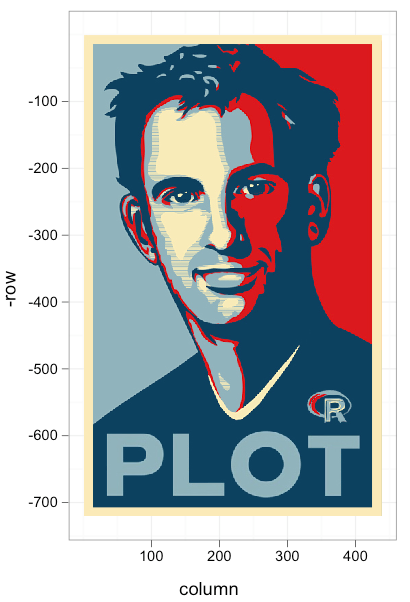
image source medium.com/tdebeus by Thomas de Beus

image source medium.com/tdebeus by Thomas de Beus

image source
commons.wikimedia.org
by Simon Eugster
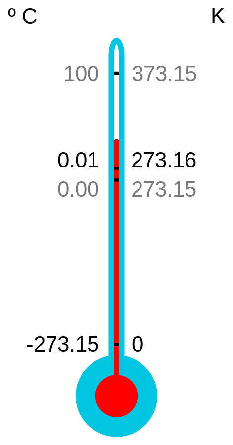
image source starbuckssecretmenu.net
image source commons.wikimedia.org
by Michael Johnson
image source commons.wikimedia.org by US federal government
image from O’Sullivan D & DJ Unwin. 2010.
Geographic Information Analysis
, Chapter 1.
image source
commons.wikimedia.org
by Fuzzypeg