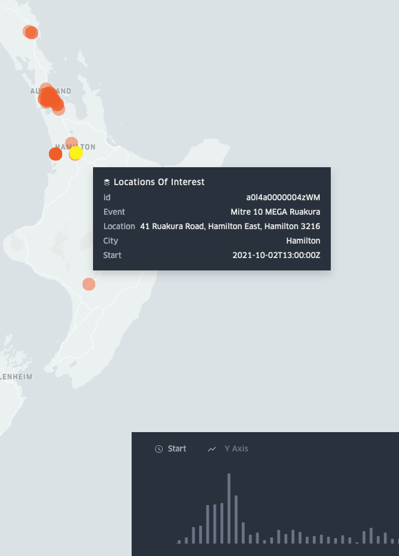
For a time, during the August 2021 COVID outbreak that started in Auckland but eventually led to the end of New Zealand’s attempt to stop COVID completely, I continuously updated the above kepler.gl animated map of ‘locations of interest’. Kepler.gl is a nice tool which I’d recommend for making quick visualizations like this.
There was something oddly compelling about the mundane details of the reported locations of interest.
Like most of the country I got pretty fed up doing it in the end, so I stopped… for whatever it’s worth, looking at the timeline on the visualization the delta outbreak did get reigned in eventually, but it it was pretty clear that the mood of the country had changed and lockdowns weren’t going to stick for much longer.

