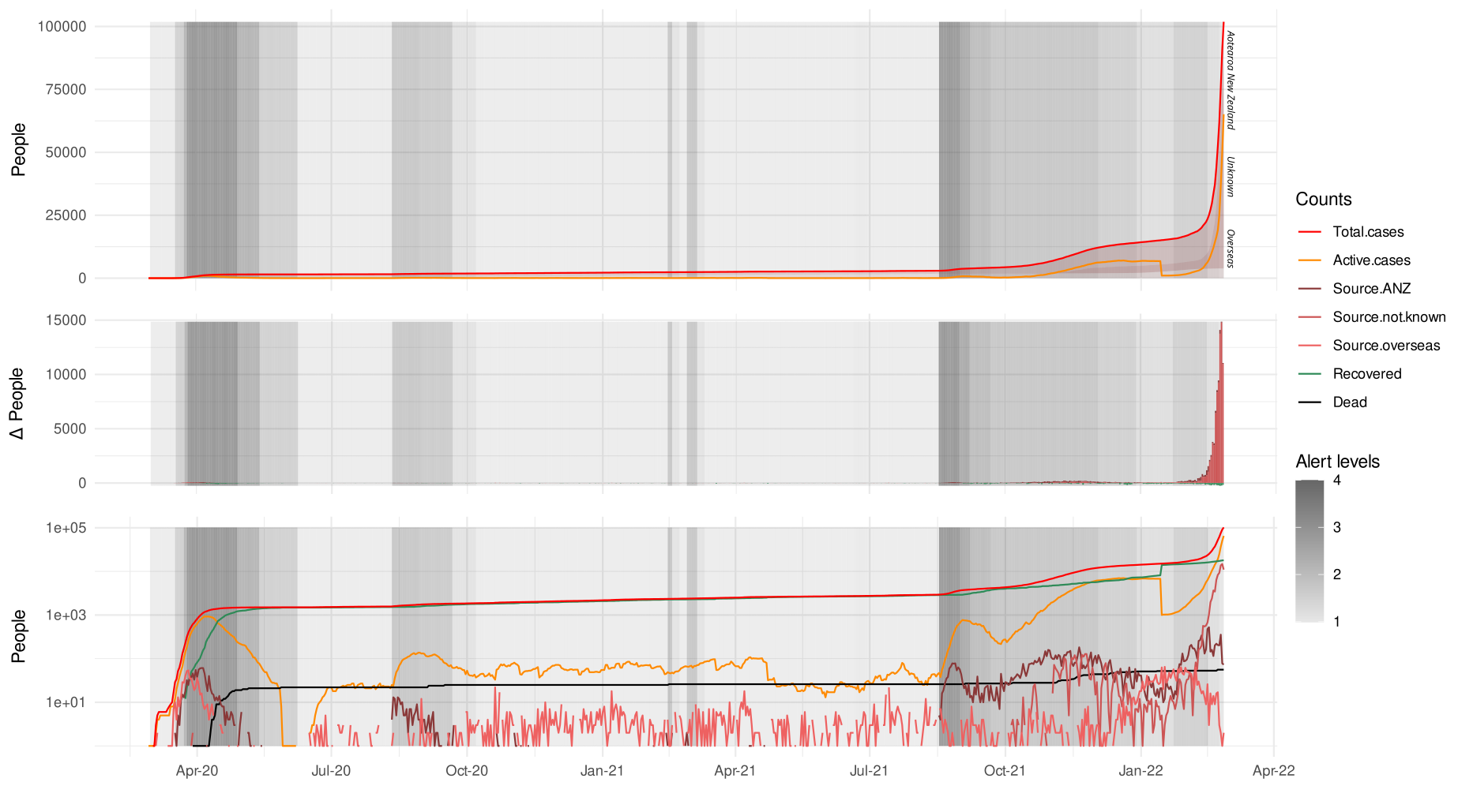
From some time in March 2020 for two years I downloaded the latest reported COVID data for New Zealand, added them to my spreadsheet of the various numbers, and updated a timeline I was keeping in R. The download process got a lot easier when I was introduced to the data downloader at University of Auckland eResearch.
As you can see, by the time I stopped things had gone pretty badly off the rails, and even a log scale wasn’t helping much.
I can honestly say this was when I started to become competent with the ggplot2 package, and for that, as well as the reassurance the daily ritual provided for about a year and a half (we were doing so well…), I am grateful.
Addendum
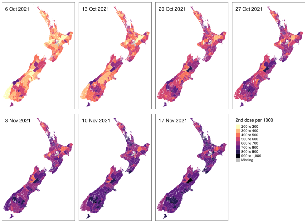
I also mapped the progress of the vaccination program for a (much shorter) time. At least these numbers were released weekly and in a much more accessible form. Here’s how the critical ‘second dose’ went:


