Code
import requests
from bs4 import BeautifulSoup
import time
import json
import pandas as pdI’ll never not want to see a map of the Dulux colours of New Zealand and am frankly a bit confused why they’ve never put one on their website.1 I especially enjoy a categorical choropleth map where the categories are the actual colours in the map, but that’s probably just me.
In the face of their gross dereliction of cartographic duty, I’m here to save the day. I already did this (using R, see here) but this time thought I’d give it a go in Python.
import requests
from bs4 import BeautifulSoup
import time
import json
import pandas as pdThe Python modules requests, BeautifulSoup, and json make grabbing the place names and RGB information about the colours relatively straightforward. The colour collections are on nine different pages, so we make up a list of the URLs we need to visit, and set up a couple of empty lists to put the colour names and hex codes in.
base_url = "https://www.dulux.co.nz/colour"
collections = [
  "whites-and-neutrals", "greys",
  "browns", "purples-and-pinks",
  "blues", "greens", "yellows",
  "oranges", "reds",]
urls = [f"{base_url}/{collection}/" for collection in collections]
names, hexes = [], []
Some sleuthing on one of the colour collection pages led to a HTML div with id __NEXT_DATA__ which is Javascript wrapped JSON containing all the information needed. Admittedly the information is deeply buried in what seems like an unnecessarily complicated nested data structure.2 The complexity I think relates to the JSON doing double—even triple—duty structuring the web pages, providing ordering and stocking information, and also information about the actual colours themselves.
In any case, that complexity accounts for having to reach four levels down into the JSON to get to the list of colours in each collection, and then another two levels further into each colour definition to get the title and hex elements to add to our names and hexes lists. These can then be used to make up a data table.
Of note in the code is using time.sleep(1) to avoid overloading the server by introducing a 1 second delay between requesting the pages.
for url in urls:
  page = BeautifulSoup(requests.get(url).text, "html.parser")
  data = json.loads(page.find(id = "__NEXT_DATA__").text)
  cols = data["props"]["pageProps"]["colourCollection"]["colourEntries"]
  names.extend([col["fields"]["title"] for col in cols])
  hexes.extend([col["fields"]["hex"] for col in cols])
  time.sleep(1)
Then we can make a data table of the colour names and their RGB hex definitions.
colours = pd.DataFrame(dict(paintname = names, hex = hexes))Here’s what all that gets us.
colours paintname hex
0 Ōpononi #d4cdc0
1 Tōrere Quarter #e2ddd3
2 Mason Bay #d5ccbd
3 Glinks Gully #d6cec1
4 Glinks Gully Double #c9bdac
... ... ...
1108 Red Jacks #95352e
1109 Oxford Terrace #af3f42
1110 Kelburn #a85c60
1111 Gibbston Valley #68393d
1112 Cashel Street #e6a7ae
[1113 rows x 2 columns]Some cleanup is required. Specifically, some paint names include a ‘variant’ suffix, ‘Half’, ‘Double’, or `Quarter’, which we need to split out into their own column in the data and correct the place names accordingly.
There are a number of ways this might be done, but consistent with using a pandas.Series.apply, the best and clearest approach seems to be writing a helper functions as below, then applying it and expanding its output to a list so that it can be assigned to two new columns in the data table.
modifiers = ["Half", "Quarter", "Double"]

def handle_suffixes(s):
  words = s.split(" ")
  if words[-1] in modifiers:
    return " ".join(words[:-1]), words[-1]
  else:
    return s, ""

colours[["place", "modifier"]] = pd.DataFrame(
  colours.paintname.apply(handle_suffixes).to_list())
colours
paintname hex place modifier
0 Ōpononi #d4cdc0 Ōpononi
1 Tōrere Quarter #e2ddd3 Tōrere Quarter
2 Mason Bay #d5ccbd Mason Bay
3 Glinks Gully #d6cec1 Glinks Gully
4 Glinks Gully Double #c9bdac Glinks Gully Double
... ... ... ... ...
1108 Red Jacks #95352e Red Jacks
1109 Oxford Terrace #af3f42 Oxford Terrace
1110 Kelburn #a85c60 Kelburn
1111 Gibbston Valley #68393d Gibbston Valley
1112 Cashel Street #e6a7ae Cashel Street
[1113 rows x 4 columns]Next up is geocoding. For this I used Nominatim. It’s free and unencumbered by usage restrictions. It’s far from perfect. In this particular application it makes some unfortunate choices. ‘Cuba Street’, famously in Wellington, also exists not so far away in Petone. ‘Rangitoto’ famously Auckland’s dormant/extinct, friendly neighbourhood volcano is also the name of a large high school on the North Shore. More perplexingly ‘Te Kopua Beach’, which I believe the Dulux people probably intended to refer to a camp ground near Raglan, winds up geocoded as Beach Pizza in Glendene, West Auckland for no very obvious reason.
I did consider using a better geocoder. Google’s is probably the pick of the bunch for quality results, but… well, this is very much a demonstration project, and their terms of use are very restrictive,3 including not storing results or using them to make maps outside the Google maps ecosystem. Life’s too short, and this project isn’t serious enough for that kind of stupidity.
Anyway, the code below makes up a dictionary locations where each place name is associated with a list of longitude-latitude pairs as returned by the geocoder.
from geopy.geocoders import Nominatim
from collections import defaultdict

geolocator = Nominatim(user_agent = "Firefox")
locations = defaultdict(list)
for place in list(pd.Series.unique(colours.place)):
  geocode = geolocator.geocode(place, country_codes = ["NZ"],
                               exactly_one = False, timeout = None)
  if geocode is not None:
    locations[place].extend([(loc.longitude, loc.latitude) for loc in geocode])
  time.sleep(1)
Retaining a list of locations for each place allows us to associate different locations with the various modified paint colours where these exist. When we assign coordinates to each row in the data table we pop the first one off this list, and if the list is now empty remove it from the available locations, so that any later appearances of that place in the table are skipped.
from collections import namedtuple
Colour = namedtuple("Colour", tuple(colours.columns))
Geocode = namedtuple("Geocode", Colour._fields + ("longitude", "latitude"))
geocodes = []
for col in colours.itertuples(index = False, name = "Colour"):
if col.place in locations:
geocodes.append(Geocode(*(col + locations[col.place].pop(0))))
if len(locations[col.place]) == 0:
del locations[col.place]Colour named tuples.
locations dictionary entry to the colour record to form the geocoded record.
Defining named tuples for colour and geocoded records allows convenient iteration over each row in the colours table, and also adding coordinates from the geocoding to the colour records. Compiling a list of the geocoded records then allows convenient conversion to a data table at the end of the process.
df = pd.DataFrame(geocodes)And now we have something we can make maps with:
df paintname hex place modifier longitude latitude
0 Ōpononi #d4cdc0 Ōpononi 173.391729 -35.511666
1 Tōrere Quarter #e2ddd3 Tōrere Quarter 177.491325 -37.949759
2 Mason Bay #d5ccbd Mason Bay 167.709020 -46.913846
3 Glinks Gully #d6cec1 Glinks Gully 173.857638 -36.081105
4 St Clair Quarter #edefee St Clair Quarter 170.489146 -45.909391
.. ... ... ... ... ... ...
987 Red Jacks #95352e Red Jacks 171.437996 -42.404411
988 Oxford Terrace #af3f42 Oxford Terrace 174.807967 -36.823977
989 Kelburn #a85c60 Kelburn 174.762393 -41.289205
990 Gibbston Valley #68393d Gibbston Valley 168.915154 -45.012283
991 Cashel Street #e6a7ae Cashel Street 172.653702 -43.533105
[992 rows x 6 columns]The map making part is pretty simple. Voronoi polygons are the obvious way to go.
import geopandas as gpd

nz = gpd.read_file("data/nz.gpkg")
pts = gpd.GeoDataFrame(
  data = df,
  geometry = gpd.GeoSeries.from_xy(x = df.longitude,
                                   y = df.latitude,
                                   crs = 4326)) \
  .query("longitude > 0 & latitude > -47.5") \
  .to_crs(2193)

dulux_map = gpd.GeoDataFrame(
    geometry = gpd.GeoSeries(
      [pts.geometry.union_all()]).voronoi_polygons(), crs = 2193) \
  .sjoin(pts) \
  .clip(nz)
The only real wrinkle here is that voronoi_polygons() must necessarily be applied to a collection of points, so we must union_all() the points before applying it. Also, this method doesn’t guarantee returning the polygons in the same order as the points supplied, so we must spatially join the resulting data set back to its originating points dataset. Finally, we clip with a New Zealand data layer to get a sensible output map.
dulux_map.explore(
  color = dulux_map.hex,
  tiles = "CartoDB Positron", tooltip = "place",
  popup = ["place", "hex", "paintname"],
  style_kwds = dict(weight = 0, fillOpacity = 1))
There might be a hint in the map in the form of a band of off-white colours down the spine of Te Waipounamu of the Southern Alps. But there’s not a lot else to suggest anything systematic about the colours, apart from the slightly obvious fact that the lake places are nearly all blues of one kind or another. We can see these two features in the subsetted maps below.
import matplotlib.pyplot as plt

lake_recs = dulux_map.place.str.startswith("Lake")
lakes = gpd.GeoDataFrame(
  data = dulux_map[lake_recs][["hex"]],
  geometry = gpd.GeoSeries(dulux_map.geometry[lake_recs]))

mt_recs = dulux_map.place.str.startswith("Mt")
mts = gpd.GeoDataFrame(
  data = dulux_map[mt_recs][["hex"]],
  geometry = gpd.GeoSeries(dulux_map.geometry[mt_recs]))

fig, axes = plt.subplots(nrows = 1, ncols = 2,
                         figsize = (8, 6),
                         layout = "constrained")

for ax, subset, title in zip(axes, [lakes, mts], ["Lakes", "Mountains"]):
  nz.plot(ax = ax, fc = "none", ec = "grey", lw = 0.25)
  subset.plot(ax = ax, fc = subset.hex, lw = 0.1, ec = "k" )
  ax.set_title(title)
  ax.set_axis_off()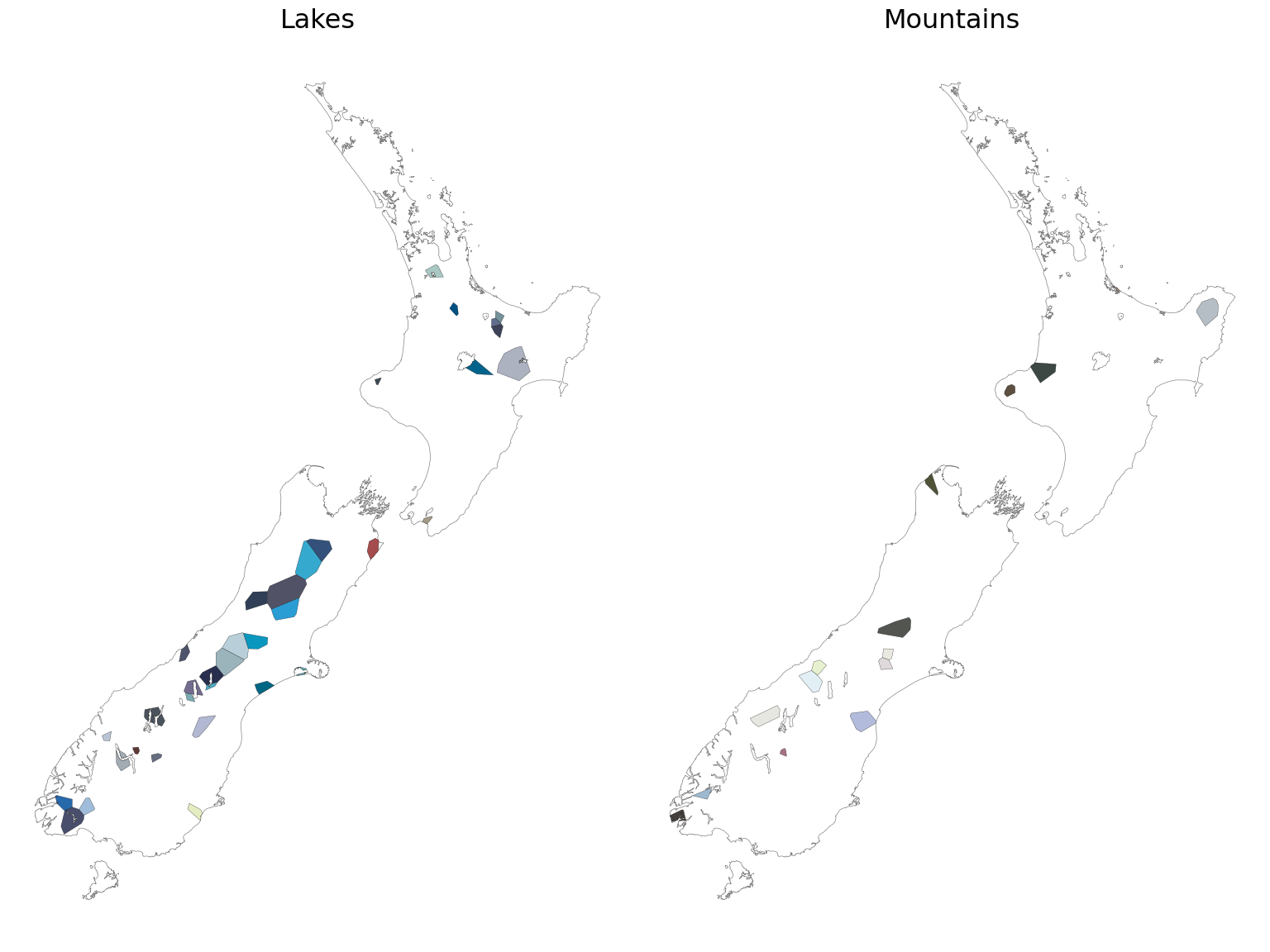
This sort of things makes one contemplate ones life choices. Or at any rate reflect on the never-ending comparison between R and Python. It wasn’t especially difficult to make these maps in either platform.
Python’s requests, BeautifulSoup, json combo is pretty amazing for pulling the data. Python’s general purpose lists, dictionaries, named tuples are much easier to deal with than always trying to make things work as dataframe pipelines in R. I know you can write functions in R too, it’s just that somehow the pipeline mindset takes over and you find yourself puzzling out how to do things using tables when a dictionary makes it trivial.
By the same token, I don’t know if I will ever get completely comfortable with pandas rather oblique subsetting and data transformation methods compared to tidyverse R’s dplyr pipelines, but saying that, splitting strings (the paint names) to remove the paint modifier suffixes was easier in Python that using tidyverse’s separate_wider.
I enjoyed using namedtuples here in the geocoding step to make the code a little clearer, although it may be overkill where a small table like this is involved. It’s never a bad thing to extend your use of language features like this.
As always, when it comes to visualization I miss ggplot, but geopandas explore method makes it trivial to create a web map, which was the end goal here.
Now, I should go and paint that room.
![]()