Weather data for all twelve months in a single map view
We’ve been writing up the tiled map work from the last couple of years and along the way came up with a neat way to use the approach to show annual weather data in an interesting way.
python
tutorial
tiling
visualization
maps
Author
David O’Sullivan
Published
August 15, 2025
In this post I show one way that a time series can be symbolised on a map using a tiling-based approach.
Because the example data in this post are monthly mean temperatures I’ve called this post ‘mean temperature dials’ but the idea is applicable to any sequential data.1 In this case, given monthly data, 12 slices make an analogy with clockfaces an obvious one, but there is no reason that this method couldn’t be used with other numbers of time steps.
I’m sure there are other ways to make maps like these,2 but here I apply the tiling tools in my weavingspace Python module. The tiling pattern used in this example particularly makes sense for cyclical data.
We can retrieve a months list from the column names in the data.
The average temperatures have somewhere along the way been granted fake super high precision, so we round to one decimal place, and also get the overall minimum and maximum temperatures. This is so we can symbolise all the temperatures on the same colour scale in the final maps.
Code
months = [m for m in nz_temps.columns if m !="geometry"]nz_temps.loc[:, months] = nz_temps.loc[:, months].round(1)t_min =min(nz_temps.loc[:, months].min())t_max =max(nz_temps.loc[:, months].max())
Make a tileable unit
Now we use some weavingspace uh… magic to make a suitable ‘clock face’ tileable unit. A tileable unit is a small set of geometries that if repeated across a map area give the appearance of a tiled or woven pattern.
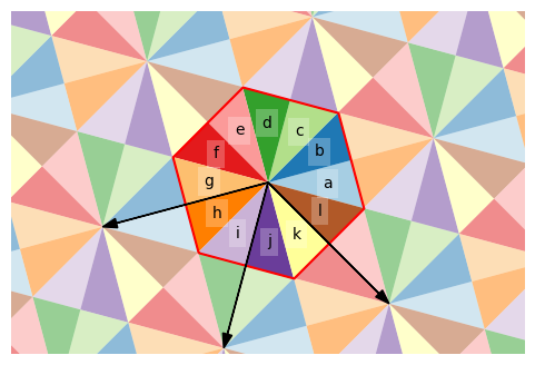
The starting point is a hexagon sliced radially into 12. The size of the unit is the distance between the faces of the hexagonal base tile, here set to 40km. We rotate the tile from its default orientation by 45° to get a slice at 12 o’clock which we will associate later with the January temperatures. The rotation also means that the hexagonal lattice arrangement of the tiling we get won’t have obvious east-west or north-south alignments, which I think makes for a more visually pleasing final map. The arrows on the plot below show the translations that will be used to copy and paste the tileable unit to create a tiled pattern.
Note that the tile element IDs start at ‘d’ and go backwards through the alphabet, wrapping at ‘a’ followed by ‘l’. This is important later for the mapping.
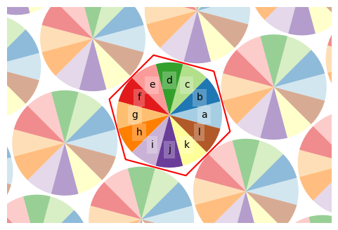
An enhancement of the final map in this application is to trim the tileable unit to a circle, including a slight gap between neighbouring circle. So we replace the tiles.geometry element of the tileable unit with a version clipped by a circle.
Figure 2: The tile unit clipped by a circle to create ‘dials’
As you can, the clipped tileable unit will still be repeated in the same way due to the hexagonal basis of the tiling, but now with circular 12-slice ‘pies’. Note here that we just clipped the simple 12 polygon tiles.geometryGeoSeries and weavingspace handles the process of copying this across a wider area to produce a different repeating pattern.
Make a tiled map dataset
Now we make a TiledMap using weavingspace. This is essentially an overlay operation underneath, but internally weavingspace handles ‘copying and pasting’ the tileable unit across the map area to give a tiled pattern. All the particulars are stored in a TiledMap object, which has a .map attribute that contains all the needed data.
tiled_map.map.shape = (5724, 15)
tile_id prototile_id geometry \
0 a 153 POLYGON ((19864662.651 -4511236.578, 19883478....
1 b 153 POLYGON ((19864662.651 -4511236.578, 19878451....
2 c 153 POLYGON ((19864662.651 -4511236.578, 19869704....
3 d 153 POLYGON ((19864662.651 -4511236.578, 19859621....
4 e 153 POLYGON ((19864662.651 -4511236.578, 19850874....
Jan Feb Mar Apr May Jun Jul Aug Sep Oct Nov Dec
0 18.3 18.4 17.3 15.1 12.8 10.8 10.1 10.4 11.8 13.3 14.9 16.8
1 18.3 18.4 17.3 15.1 12.8 10.8 10.1 10.4 11.8 13.3 14.9 16.8
2 18.3 18.4 17.3 15.1 12.8 10.8 10.1 10.4 11.8 13.3 14.9 16.8
3 18.3 18.4 17.3 15.1 12.8 10.8 10.1 10.4 11.8 13.3 14.9 16.8
4 18.3 18.4 17.3 15.1 12.8 10.8 10.1 10.4 11.8 13.3 14.9 16.8
We’re only showing a few lines of the data table here, but it contains 5724 tiles (i.e., 477×12).
The key attribute here in addition to the data sourced from the monthly temperatures is the tile_id, which we can use in mapping to split out the tiles into sets each of which we associate with a different variable. Here, we have 12 sets of tiles, and 12 variables, and we can make some maps.
Making tiled multivariate maps
The weavingspace.TiledMap class has a render() method which makes a map with a single call, but since we want to apply exactly the same colour palette to every set of tiles, here it makes sense to split the tiles out manually by looping over them.5
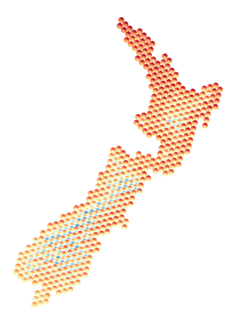
A static map
To make a static map, we loop over the tile_id variable and month variable names, do a selection on the map dataset to pick out only those tiles with a given tile_id, and add those to a geopandas.plot() coloured by the value of the associated month’s temperatures. Note the sequence of tile_id values required, as we saw in Figure 1 and #fig-clip-by-circle that is the order of the tile_id value starting at 12 o’clock and going clockwise round the tile unit. Data limits on the colour ramp are specified with vmin and vmax and are the same for every set of tiles.
Figure 3: A static map showing monthly average temperatures
A web map
Given the scale of the data, it’s useful to put them on a web map. The core of the code is essentially identical to the static map, but with slightly different parameter names needed to get a similar effect.
Make this Notebook Trusted to load map: File -> Trust Notebook
Figure 4: A web map of the monthly average temperatures
If you zoom in on the map you can see which month corresponds to which pie slice and get a better feel for how the visualization works.
If this post has piqued your interest in this approach to mapping multivariate data, then you can find out more at the weavingspace github repo or even experiment with making such maps using the MapWeaver web app.
Footnotes
This approach originated with a map of world anthromes designed by Luke Bergmann and myself, which was displayed in the 2022 NACIS meeting Map Gallery. However, that map had only three ‘snapshots’ in time so didn’t really convey a sequence of data points in the same way that the example developed in this post does.↩︎