Sixth in a series of posts supporting Geographic Information Analysis
geographic information analysis
transformational approach
geospatial
R
tutorial
Author
David O’Sullivan
Published
October 14, 2025
This quick post rounds out the GIS transformations from area data to other spatial types. It turns out—to my relief, if not my surprise—that a package is available that implements the suggested transformation from areas to field data in the table on page 26 of Geographic Information Analysis, making this one of the simpler posts in the series so far.
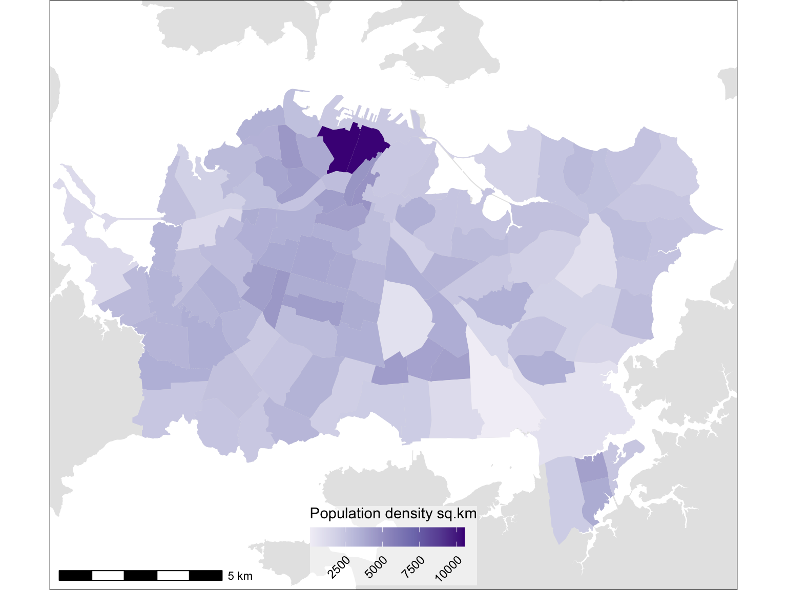
As always, we need some data. It’s surprisingly tricky to find an area of New Zealand where the population density is high(ish) and somewhat variable over an extensive area such that the result of density smoothing are likely to be interesting. Best I can do is some old census data by 100 or so Census Area Units for central Auckland back in 2006.
Figure 1: The SA2 population data, by count, and by density
There are a lot of people (many of them students) in apartments living at somewhat urban densities in the central city area, but the rest of this fairly extensive area (about 155 sq.km) is fairly suburban. Perhaps recent developments in Auckland are set to change that, although New Zealand has resisted densification for so long I wouldn’t bet the house on it.
… To fields
Anyway, we are here to create a pycnophylactic-ally smoothed surface from this. Pycnophylactic smoothing seems to me like a word that Waldo Tobler made up for a bet. In the original paper1 he suggests that the term means ‘mass preserving’, although the prefix ‘pycno-’ apparently refers to thickness or density in the Greek from whence it came. Either way it’s easier to think of it as meaning ‘volume-preserving’, as the volume under the surface produced by this transformation is equal to that of prisms extruded to a height given by the areal density of the countable phenomenon of interest. This is a desirable property for any smoothing process to have as it means that the sum across all cells in the resulting raster surface will match the total across all regions in the source data.
Anyway, the mechanics of the process consist of repeated local averaging and rescaling to ensure that the quantity attributed to each region after each round of averaging matches the starting quantity. Repeated application of averaging and rescaling sees the population of denser regions migrate towards those regions’ centres and of less dense regions towards more densely populated neighbouring regions.
A function to perform this iterative process is provided by the predicts package. The pycnophy function seems like a bit of an afterthought in the package, which is mostly concerned with species distribution models. Running the function is straightforward. Convergence can take a while if you go for a very small cell size. In this case 100m seems about right given the extent of the data.
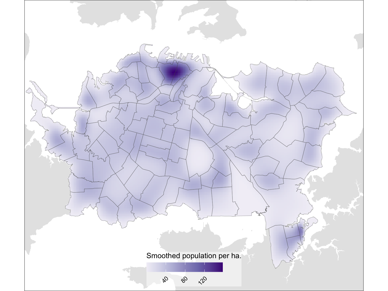
That’s it. Here’s a map of the result. Showing the boundaries of the regions makes clear how volume has migrated towards the centre of dense areas and away from the centre of low density areas.
Code
g2 <-ggplot() +geom_sf(data = context, colour =NA) +geom_raster(data = pycno, aes(x = x, y = y, fill = population_est)) +scale_fill_distiller("Smoothed population per ha.",palette ="Purples", direction =1) +geom_sf(data = polygons, fill =NA, lwd =0.1) +coord_sf(expand =FALSE) + themeg2
Figure 2: Pycnophylactic smoothed map of population
And we can confirm that the smoothing has preserved volume by summing the population from the source regions, and from the smoothed surface.
Code
polygons$population |>sum()
[1] 409941
Code
pycno$population_est |>sum()
[1] 409941
Hurrah! They are exactly equal.
There’s not a lot more to be said about this, other than perhaps to acknowledge yet another contribution by Waldo Tobler. I can’t help adding, in passing that in the opening paragraph of the paper he states that, “[A] common fact of geography is that places influence each other”,2 a rather less snappy take on his eponymous ‘first law’.