Code
library(sf)
library(terra)
library(stars)
library(dplyr)
library(stringr)
library(tmap)
library(whitebox)
library(cols4all)
library(ggplot2)
library(ggnewscale)
library(patchwork)
library(SAiVE)
What’s with the kākā (Nestor meridionalis)?1 Well, they are one of the native bird species now relatively commonly seen in Wellington, largely due to the conservation efforts of the Zealandia wildlife sanctuary, and Zealandia is where the data for this post are from.
But I digress… the point of this post is to round out the GIS transformations with Field → Area and Field → Field examples.
library(sf)
library(terra)
library(stars)
library(dplyr)
library(stringr)
library(tmap)
library(whitebox)
library(cols4all)
library(ggplot2)
library(ggnewscale)
library(patchwork)
library(SAiVE)dem <- rast("zealandia-5m.tif")
dem <- dem |> crop(ext(dem) + c(0, 0, -5, 0))
streams <- st_read("streams.gpkg") |> select()
lake <- st_read("lake.gpkg") |> select(name)
slope <- terrain(dem, unit = "radians")
aspect <- terrain(dem, v = "aspect", unit = "radians")
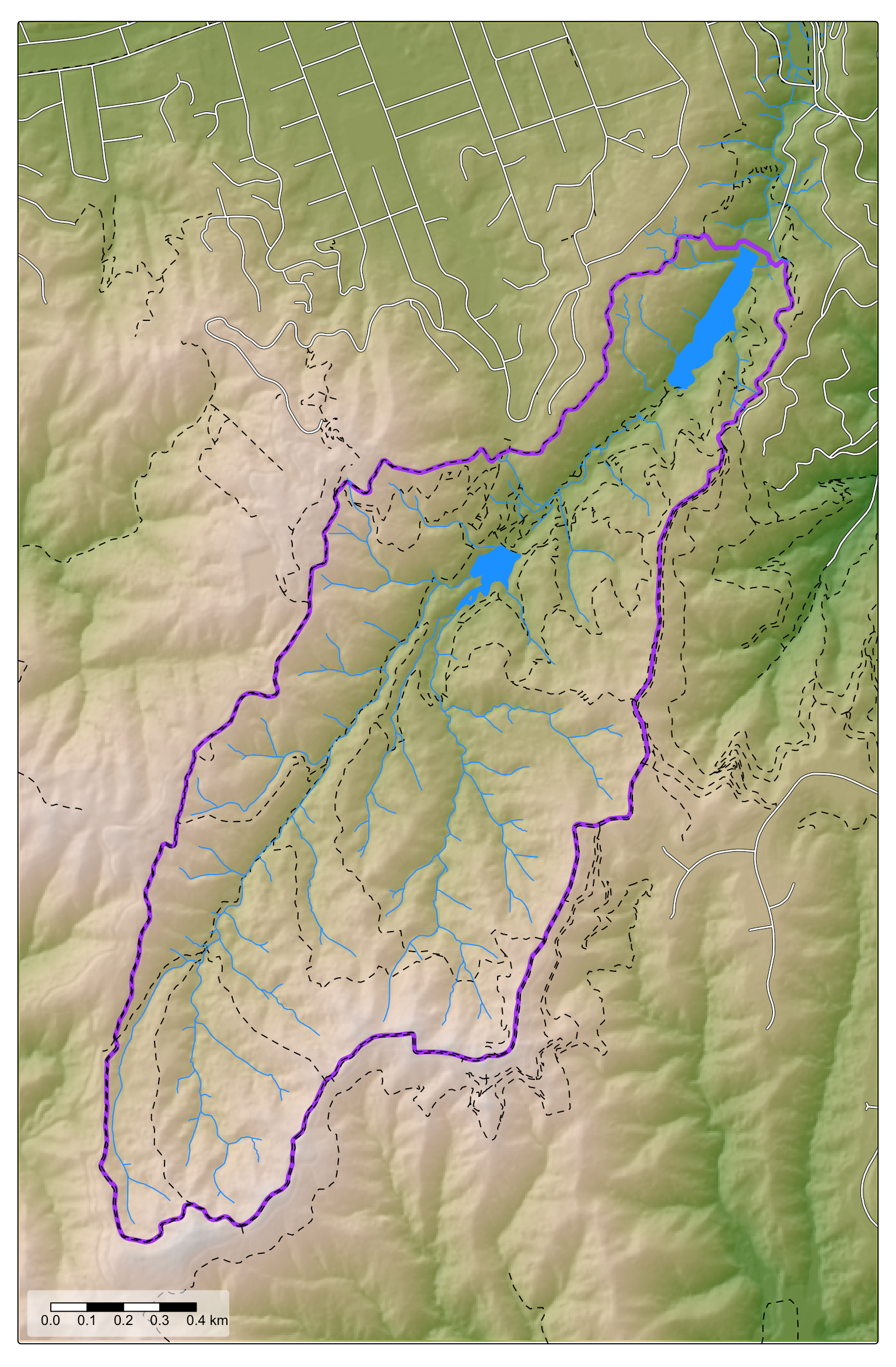
hillshade <- shade(slope, aspect, angle = 30, direction = 135)As noted, we are using the same study area as in the previous post. For some context (and to learn about surface networks) go there and take a look. Meanwhile, here’s a map for orientation again.
Rasters are already area data—what else are we supposed to call lots of little squares?—so any operation that somehow or other aggregates those little squares into larger groups2 on some basis is a Field→Area transformation. Herewith one interesting way to combine raster pixels, and one slightly less interesting one.
Delineating drainage basins is one of those GIS operations that we’ve come to take for granted, although it seems clear even to this outsider that the ‘hydrological modelling’ you can do in a GIS, and ‘real’ hydrological modelling remain distinct domains. This was written in 2025:
Research gaps and challenges in existing studies are identified, emphasizing the lack of standardized methodologies, limited integration between hydrological models and GIS technologies, and difficulties in scaling GIS-based strategies to broader regional or national levels.3
Meanwhile, in 1999, Sui and Maggio had this to say:
We believe that there are problems in both hydrological models and the current generation of GIS. These problems must be addressed before we can make the integration of GIS with hydrological modeling theoretically consistent, scientifically rigorous, and technologically interoperable.4
So… plus ça change, plus c’est le même chose. Without getting too deeply into it, the fundamental difference between the hydrological modelling readily available in GIS and hydrological modelling proper is that the former is generally static, while the latter is dynamic.
Having said that, watersheds are relatively static and a by now well-established workflow can derive, for a given terrain, with relative ease, plausible drainage basins, or perhaps more correctly, the upstream watershed of a specified location.
Probably the best freely available tools for this kind of work are John Lindsay’s Whitebox Tools although the options are somewhat bewildering. I found the drainageBasins() function available in the SAiVE package from Clement Bataille’s lab of the same name a handy one-liner solution for my purposes. It has the slightly unnerving side-effect of creating lots of files, and (like) Whitebox Tools, which it relies on for the analysis, often requiring that you work with shapefiles,5 but that’s a small price to pay for not having to think too hard about all the options. The options are certainly there in the Whitebox suite, and if you are doing this sort of stuff seriously, you should certainly explore them.
Anyway, here’s that one-liner.
drainageBasins(
  "./zealandia-5m.tif",
  points = "./basin-centre.shp",
  points_name_col = "name",
  save_path = "./watersheds"
)
The first argument is the file containing our DEM. The points argument specifies a file with points for which we want the upstream watershed, that is, all the land upstream that drains to that point. The points file should have a name column which is used to name resulting output files and folders. Even SAiVE::drainageBasins has more options than this, but let’s just go with the basic configuration.
The analysis generates a bunch of output raster layers:
output_rasters <- dir("./watersheds", pattern = "*.tif", full.names = TRUE)
output_rasters
[1] "./watersheds/D8fac.tif" "./watersheds/D8pointer.tif"
[3] "./watersheds/FilledDEM.tif" "./watersheds/streams_derived.tif"which we can stack together:
stack <- rast(output_rasters)Here’s what three of those outputs look like:
g1 <- ggplot() +
  geom_raster(
    data = stack$D8pointer |>
      as.data.frame(xy = TRUE) |>
      mutate(D8pointer = ordered(D8pointer)),
    aes(x = x, y = y, fill = D8pointer)) +
  scale_fill_discrete_c4a_seq(palette = "brewer.spectral") +
  coord_sf() +
  guides(fill = "none") +
  ggtitle("Flow direction") +
  theme_void()

g2 <- ggplot() +
  geom_raster(
    data = stack$D8fac |>
      as.data.frame(xy = TRUE),
    aes(x = x, y = y, fill = sqrt(D8fac))) +
  scale_fill_continuous_c4a_seq(palette = "-kovesi.blue_cyan") +
  coord_sf() +
  guides(fill = "none") +
  ggtitle("square-root Flow accumulation") +
  theme_void()

g3 <- ggplot() +
  geom_raster(
    data = stack$streams_derived |>
      as.data.frame(xy = TRUE),
    aes(x = x, y = y, fill = streams_derived)) +
  coord_sf() +
  guides(fill = "none") +
  ggtitle("Derived streams") +
  theme_void()

g1 | g2 | g3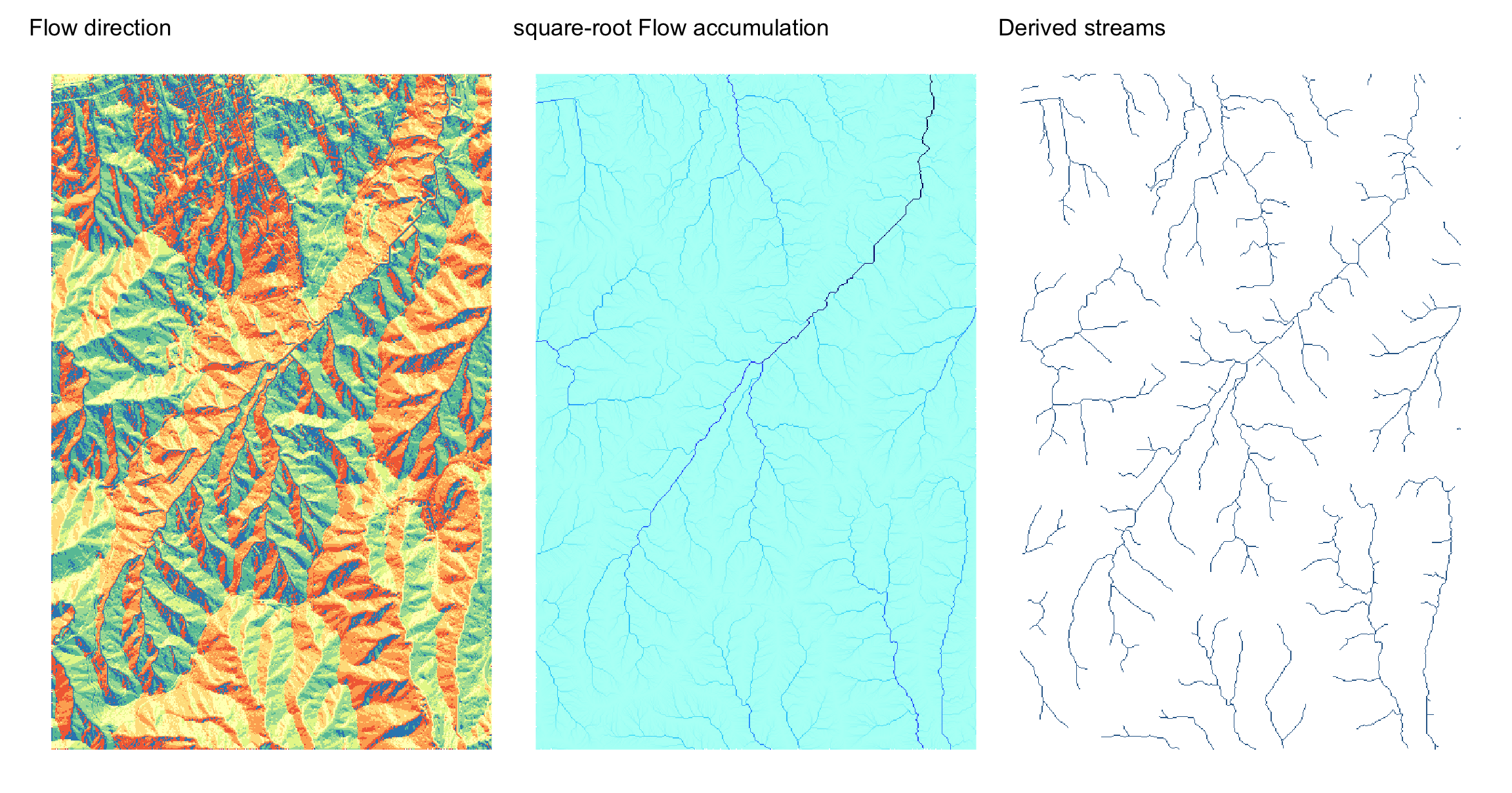
The flow direction raster records in which of the 8 directions out of each cell in the grid surface water will flow. The flow accumulation raster is derived from the flow direction raster and accumulates a count of how many cells are upstream from each cell. Finally, cells above some accumulated flow are designated as streams.
One critical layer not shown here is the original DEM with depressions removed. This pre-processing step fills depressions in the DEM which would otherwise end up as sinks where streams would terminate. In the real world, such ‘sinks’ fill up with water, which continues to flow downhill. In effect the static flow direction analysis needs some ‘nudging’ to account for this dynamic process.
Anyway, all that done, this workflow can identify for a given location or locations the associated upstream watershed.
fence <- st_read("fences.gpkg")
basin_centre <- st_read("./watersheds/basin-centre.shp")
basin <- st_read(
  "./watersheds/watersheds_2025-10-31/Lower Reservoir/Lower Reservoir_drainage_basin.shp")
And here it is:
tm_shape(hillshade) +
  tm_raster(
    col.scale = tm_scale_continuous(values = "brewer.greys"),
    col.legend = tm_legend_hide(), col_alpha = 0.5) +
  tm_shape(basin) +
  tm_fill(fill = "orange", fill_alpha = 0.35) +
  tm_shape(streams) +
  tm_lines(col = "dodgerblue") +
  tm_shape(lake) +
  tm_fill(fill = "dodgerblue") +
  tm_shape(fence) +
  tm_lines(col = "purple", lwd = 1) +
  tm_shape(basin_centre) +
  tm_dots()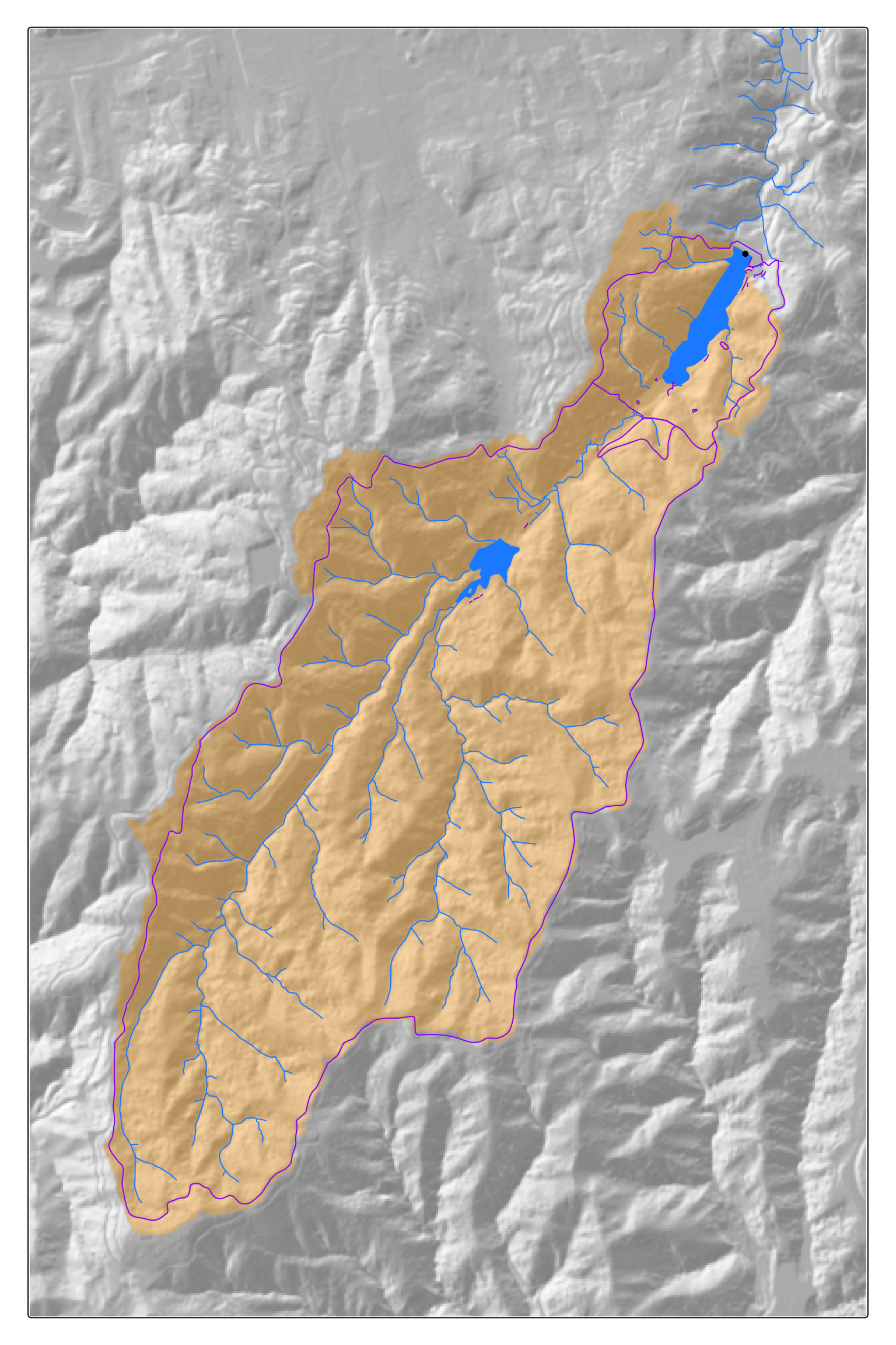
As is apparent, the Zealandia reserve is more or less congruent with the watershed of the reservoir near its (human6) entrance in the north.
Our lodestar table on page 26 of Geographic Information Analysis suggests hill masses as another possible outcome of transforming fields to areas. I am not 100% sure what that means,7 but I am going to go with areas enclosed by a given contour. So…
The obvious approach here might be to extract contour lines then, convert those to polygons. Unfortunately, this fails, because within the extent of a given DEM contours may not be closed shapes and so they don’t form proper polygons:
line <- dem |>
  as.contour(levels = c(250)) |>
  st_as_sf()
area <- line |>
  st_cast("LINESTRING") |>
  st_cast("POLYGON")

g1   <- ggplot(line) + geom_sf() + theme_void()
g2   <- ggplot(area) + geom_sf() + theme_void()

g1 | g2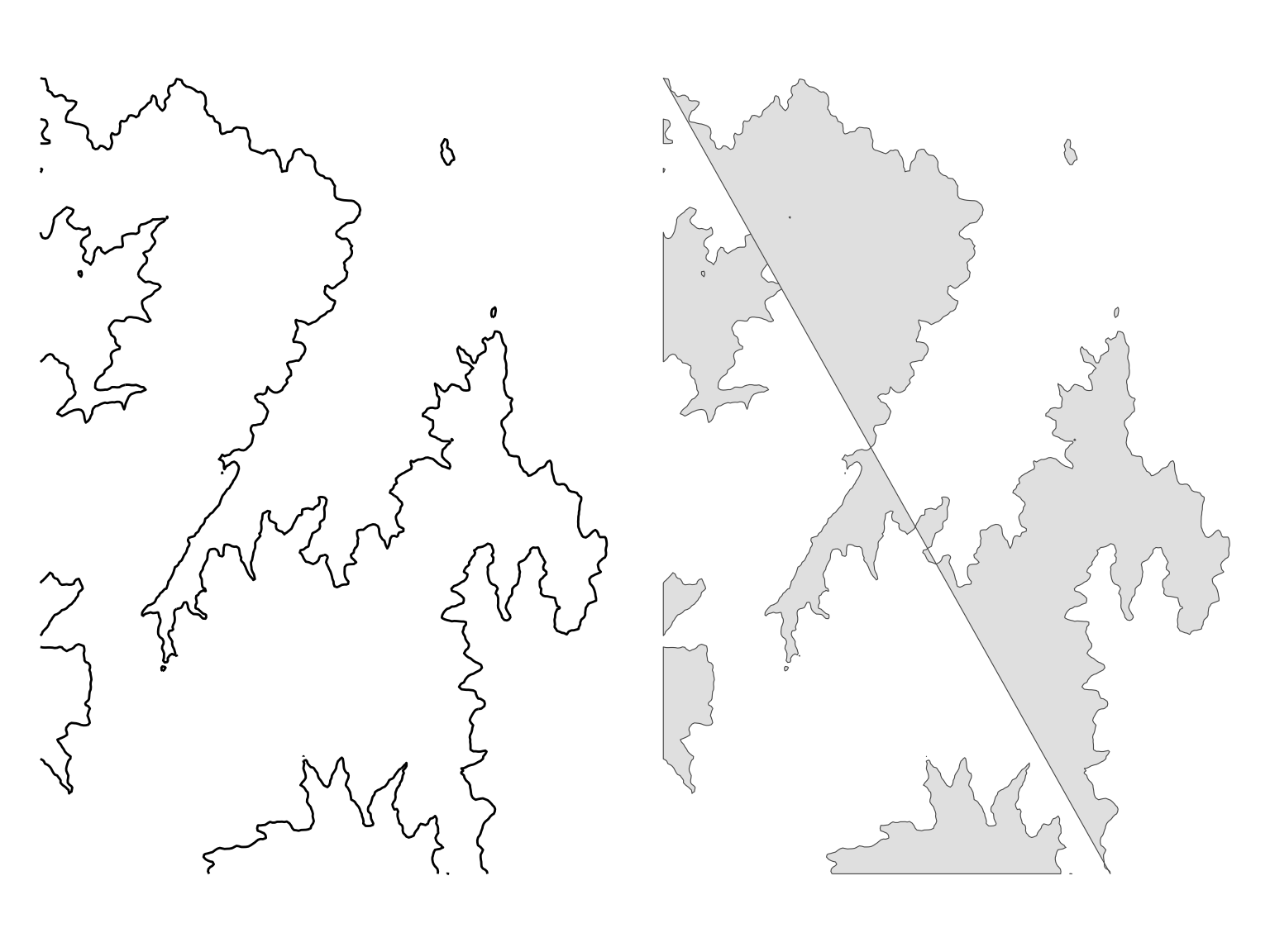
Conceptually, the proper way to resolve this might be by finding the full extent of a contour, and intersecting it with the extent of the DEM. All contours close eventually. Unfortunately, it’s hard to know where they might close and how far away that might be.8 Furthermore, wherever it is, it’s guaranteed to be beyond the scope of our current DEM.
More pragmatically, we might attempt to split a rectangular extent polygon of the study area by the contour lines. Using sf this this turns out to be a trickier proposition than you might assume, even if you enroll lwgeom::st_split(). Given just a line, you don’t know which side of the line is inside the larger closed shape of which it is a part, and you end up with a subdivision at any given level of the extent, and the problem of figuring out which subdivisions are above or below the contour. Ultimately the problem here is the artificiality of the study area extent and there’s not a lot we can do about that.9
Fortunately, smarter tools resolve the problem. In QGIS gdal_contour is invoked in the Contour polygons geoprocessing tool and it comes as no surprise to learn there is also a wrapper for this in the R ecosystem in the stars package, which handles this problem with aplomb!10 I’ve tended to avoid stars because generally I don’t need its complexity, and the learning curve is rather steep. But baby steps… here is some code that converts our DEM to a stars object, then extracts the contour bands as polygons.
levels <- seq(60, 400, 20)
contour_bands <- dem |>
  st_as_stars() |>
  st_contour(breaks = levels)
Here’s what we get:
g1 <- ggplot() +
  geom_sf(data = contour_bands, aes(fill = Min), colour = NA) +
  scale_fill_continuous_c4a_seq(palette = "hcl.terrain2") +
  theme_void()

g2 <- ggplot() +
  geom_sf(data = contour_bands, aes(fill = Max), colour = NA) +
  scale_fill_continuous_c4a_seq(palette = "hcl.terrain2") +
  theme_void()

g1 | g2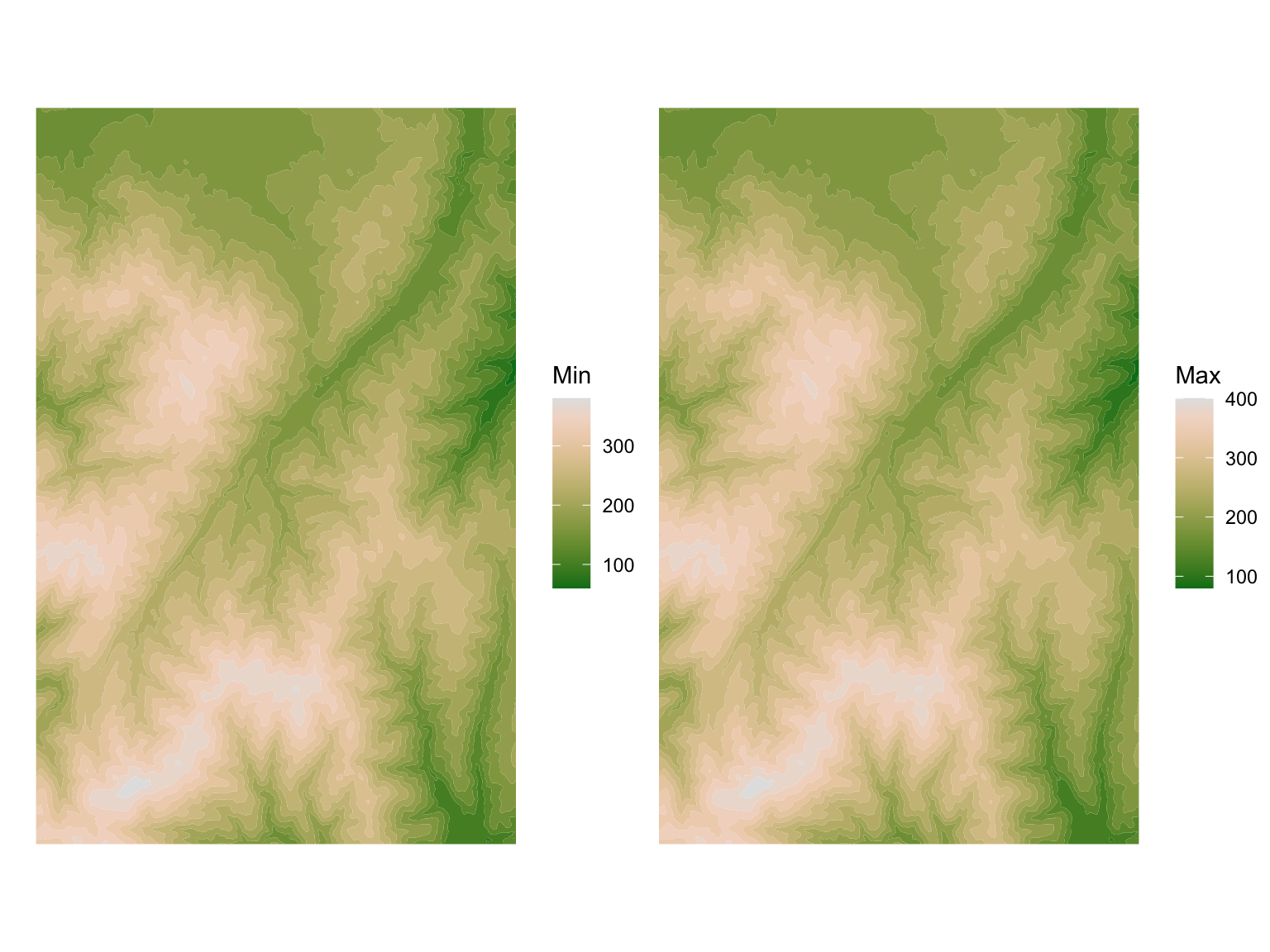
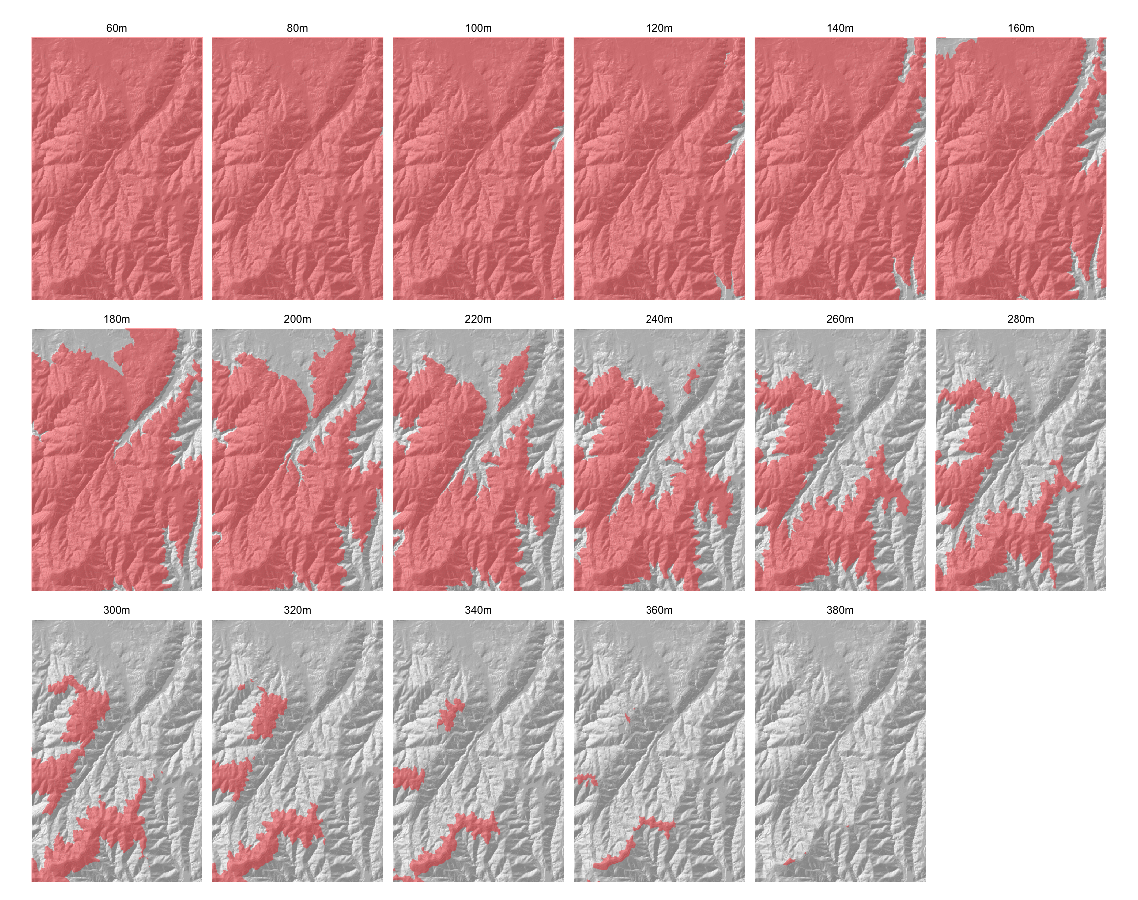
Then we can assemble these height bands into regions delineating all the land above each level.
hill_masses <- list()
level_names <- str_c(levels, "m")
for (i in seq_along(levels)) {
  hill_masses[[i]] <-
    contour_bands |>
    filter(Min >= levels[i]) |>
    mutate(level = level_names[i])
}
hill_masses <-
  hill_masses |>
  bind_rows() |>
  mutate(level = ordered(level, level_names))
And just for the hell of it, here’s a small multiple map series of ‘hill masses’ at 20m intervals.
tm_shape(hillshade) +
  tm_raster(
    col.scale = tm_scale_continuous(values = "brewer.greys"),
    col.legend = tm_legend_hide(), col_alpha = 0.5) +
  tm_shape(hill_masses) +
  tm_fill(fill = "#ff000060") +
  tm_facets(by = "level", ncol = 6) +
  tm_layout(
    frame.lwd = 0,
    panel.label.bg.color = "white",
    panel.label.frame.color = NA,
    panel.label.frame.lwd = 0
  )
And for my last trick11 deriving the vector field from a surface.
Every scalar surface has an associated vector field. At any point on the surface we can find the gradient vector, which is oriented downhill in the direction of steepest slope at that location. Derived slope and aspect surfaces can be used here, along with a little bit of trigonometry to create an array of line segments to represent the vector field.
The final visualization works better with some smoothing of the source slope, and some of the additional processing operations are sensitive to NA values, so before going further we run that smoothing and trim the datasets to a common size with no NA values.
gauss <- focalMat(dem, 4, "Gauss")
dem    <- dem    |> focal(gauss, mean, expand = TRUE)
slope  <- dem    |> terrain(unit = "radians")
aspect <- dem    |> terrain(v = "aspect", unit = "radians")
dem    <- dem    |> crop(ext(dem) + rep(-5, 4))
slope  <- slope  |> crop(dem)
aspect <- aspect |> crop(dem)cellsize <- res(dem)[1]
df <- slope |>
as.data.frame(xy = TRUE) |>
bind_cols(aspect |> as.data.frame()) |>
mutate(dx = sin(aspect) * tan(slope),
dy = cos(aspect) * tan(slope))
n <- nrow(df)
offsets <- rnorm(n, 0, cellsize / 5)
df <- df |>
mutate(x0 = x + sample(offsets, n) - dx * cellsize * 1.5,
x1 = x + sample(offsets, n) + dx * cellsize * 2.5,
y0 = y + sample(offsets, n) - dy * cellsize * 1.5,
y1 = y + sample(offsets, n) + dy * cellsize * 2.5)
vecs <- df |>
select(x0, x1, y0, y1) |>
apply(1, matrix, ncol = 2, simplify = FALSE) |>
lapply(st_linestring) |>
st_sfc() |>
as.data.frame() |>
st_sf(crs = 2193) |>
bind_cols(df |> select(slope))cxy <- dem |>
ext() |>
matrix(ncol = 2) |>
apply(2, mean)
ggplot() +
geom_sf(data = vecs |> filter(slope > 0.1),
aes(linewidth = slope / 2)) +
scale_linewidth_identity() +
coord_sf(xlim = cxy[1] + c(-500, 500),
ylim = cxy[2] + c(-500, 500)) +
theme_void()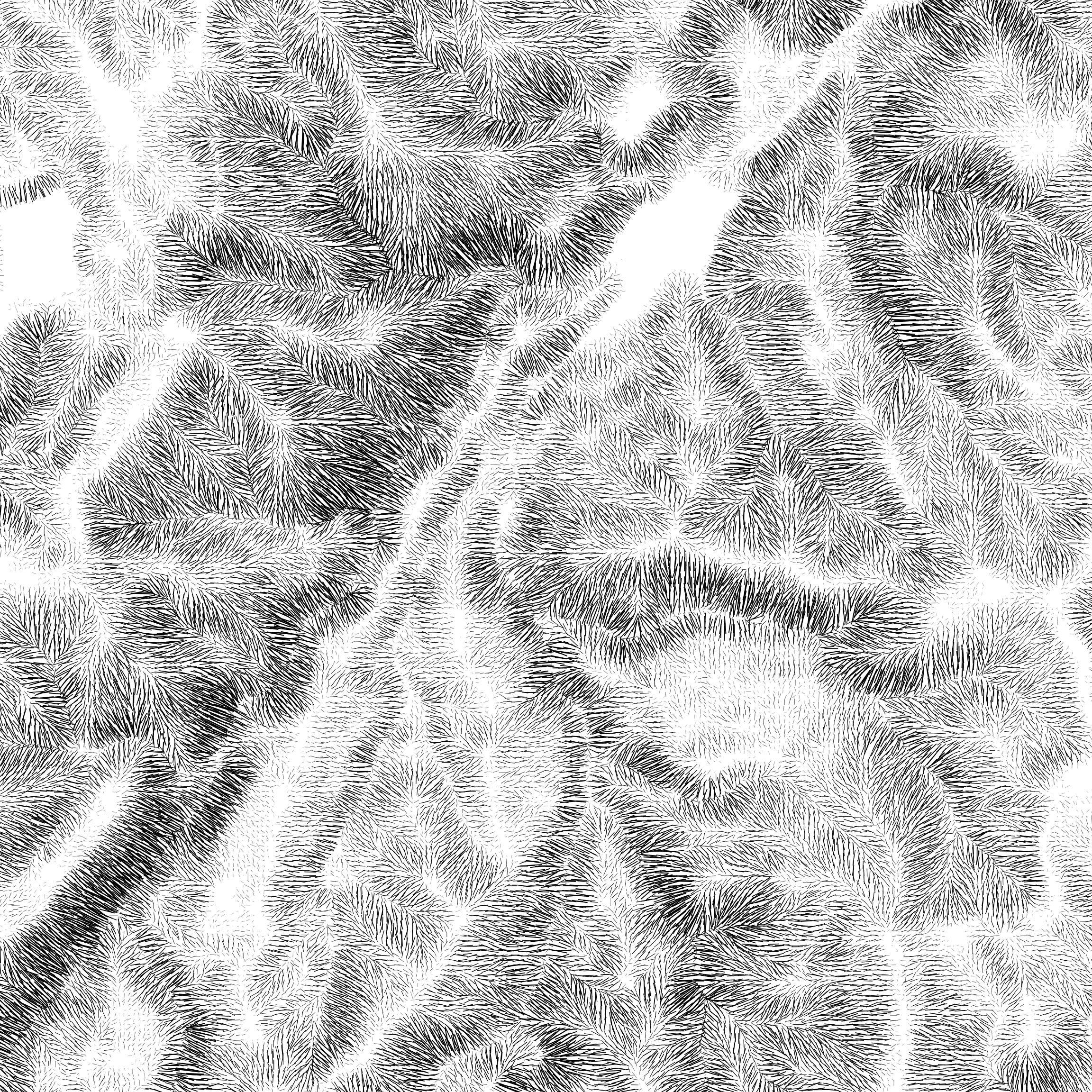
Hachure mapping has been having a moment in the last few years, and this is certainly not a map that advances developments in that art, although it does show how the idea works. The most obvious way to improve it would to be a bit more selective about which field lines to show and thin things out accordingly. That’s a big focus of the method just linked.
It’s fitting to wrap up this sequence of posts based on a table in Geographic Information Analysis co-authored with Dave Unwin with such a map. Dave has always insisted on the usefulness of the vector field associated with any scalar field, and way back in 1981 in Introductory Spatial Analysis12 he suggests that
a map of the vector field will always give a moderately good visualization of the surface relief and is the essence of the method of hachures used in early relief maps.13
For my crude example ‘moderately good’ would be a generous assessment, but hopefully it demonstrates the value of the vector field perspective on the more familiar scalar fields.
So that’s it for posts about a transformational approach to GIS and also for the supplementary material to Chapter 1 of Geographic Information Analysis. Next in that larger series will be material related to Chapter 2 ‘The Pitfalls and Potential of Spatial Data’.
Meanwhile, never forget: everything’s better with a bird on it.
![]()
The collective noun for kākā is allegedly a hoon—at least according to this podcast, and this website—although the former feels like wry comedy, and the latter doesn’t find much support anywhere else on the internet. More generally hoon, in New Zealand and Australia, according to the OED means “n lout or idiot’; v behave like a hoon”. The last thing kākā could be accused of being is idiotic, although like their more celebrated brethren the kea, while smart, they often hang around in groups, and look like they are up to no good. Seeing them in large groups in inner suburban Wellington is a blessing we largely owe to Zealandia.↩︎
Page 537, Pal D, S Saha, A Mukherjee, P Sarkar, S Banerjee and A Mukherjee. 2025. GIS-Based Modeling for Water Resource Monitoring and Management: A Critical Review. Pages 537-561 in SC Pal and U Chatterjee (eds) Surface, Sub-Surface Hydrology and Management Application of Geospatial and Geostatistical Techniques. Springer.↩︎
Page 38, Sui DZ and RC Maggio. 1999. Integrating GIS with hydrological modeling: practices, problems, and prospects. Computers, Environment and Urban Systems 23 33-51.↩︎
Birds can come and go as they please.↩︎
Keep in mind that the book is co-authored…↩︎
As a regular walker in Wellington’s hilly terrain, I can attest to the truth of this comment.↩︎
Interestingly, a related issue arises when we deal with large polygons on the Earth’s spherical surface, where every line defines two polygons. When the polygons are small, it’s perhaps obvious which one we mean, but when they are large it’s less clear. See this notebook for more on the problem on the sphere.↩︎
TIL…↩︎
Drum roll please!↩︎
To which Geographic Information Analysis is effectively an expanded sequel.↩︎
Page 156 in Unwin D. 1981. Introductory Spatial Analysis. Methuen. See also the rest of Chapter 6.↩︎