Code
library(sf)
library(terra)
library(tidyr)
library(dplyr)
library(ggplot2)
library(cols4all)
library(patchwork)

theme_set(theme_void())
set.seed(1)Channeling Nick Chrisman, on page 26 of Geographic Information Analysis we presented ‘a transformational approach to GIS operations’.1 in a table that looks something like this:2
| TO | ||||||
| point L0 | Line L1 | Area L2 | Field L3 | |||
|
F R O M |
|
Mean centre | Network paths | Proximity polygons, TIN, Point buffer, | Interpolation, Kernel density estimation, Distance surfaces | |
|
|
Intersection | Shortest distance path | Line buffer | Distance to nearest line object surface | ||
|
|
Centroid | Graph of area skeleton | Area buffer, Polygon overlay | Pycnophylactic smoothing and other surface models | ||
|
|
Surface specific points, VIPs | Surface network | Watershed delineation, Hill masses | Equivalent vector field | ||
This table is an artifact from early in giscience’s development, when imposing some kind of order on the multiplicity of ways that spatial data can be processed was one promising approach to formalising what it is people are doing when they ‘do GIS’. It shares some DNA with the flowcharts that used to show up in statistics textbooks as an aid to choosing the right statistical test given the nature of your data, although it’s perhaps a little less evolved than that, and more focused on simply getting oriented to the wide array of things you can do with spatial data.
But, if you have ever attempted to navigate the geoprocessing toolboxes in either Esri products or QGIS and find a specific operation you need as you piece together a workflow, the value of imposing this kind of order on things is probably clear. If nothing else, it might help you home in on a subset of tools that might work for you, narrowing the search space. Schemes like this are particularly important as efforts are made to automate geospatial workflows: it wouldn’t do your not-so-friendly neighbourhood LLM any harm to absorb the information in this table.3
In Geographic Information Analysis there is a text box immediately following the table that brightly suggests
If you already know enough to navigate your way around a GIS, we invite you to see how many of these operations can be achieved using it.
In the spirit of that innocuous little ‘exercise for the reader’, I thought I’d take some of my own medicine and give this exercise a go. At this precise moment (as I write these words) I don’t quite know what to expect of this exercise, but I can already see that some of these are going to be tricky.4
I can also see that 16 (count ’em!) geospatial transformations is a lot so rather than tackle them all in a single post, I’m going to do one row of the table in a series of four posts.5
My current everyday ‘GIS’ is the spatial stack in R, so here goes…
library(sf)
library(terra)
library(tidyr)
library(dplyr)
library(ggplot2)
library(cols4all)
library(patchwork)
theme_set(theme_void())
set.seed(1)Since we are in the ‘From point’ row of the table, we need a point dataset. We don’t need it to be real, so let’s just make one. In case we need to put the points on a map or relate them to some other dataset, and to prevent sf or terra moaning about projections, we’ll put the points in a known projection (New Zealand Transverse Mercator, EPSG 2193), somewhere near Wellington, but really, these could be anywhere. In time-honoured statistical fashion I’ve set \(n\) to 30.
points <- data.frame(x = rnorm(30, mean = 1.745e6, sd = 1000),
                     y = rnorm(30, mean = 5.425e6, sd = 1000),
                     z = rexp(30) * 500)
points_sf <- points |>
st_as_sf(coords = c("x", "y"), crs = 2193)The table of all geospatial knowledge™ proposes ‘mean centre’ as a transformation between points. More basic ones might be various kinds of translation, rotation, and so on. But as instructed, here’s one way to find the mean centre of a bunch of points.
points_centre <- points_sf |>
st_union() |>
st_centroid()
ggplot() +
geom_sf(data = points_sf, colour = "black") +
geom_sf(data = points_centre,
colour = "red", shape = 4, size = 5)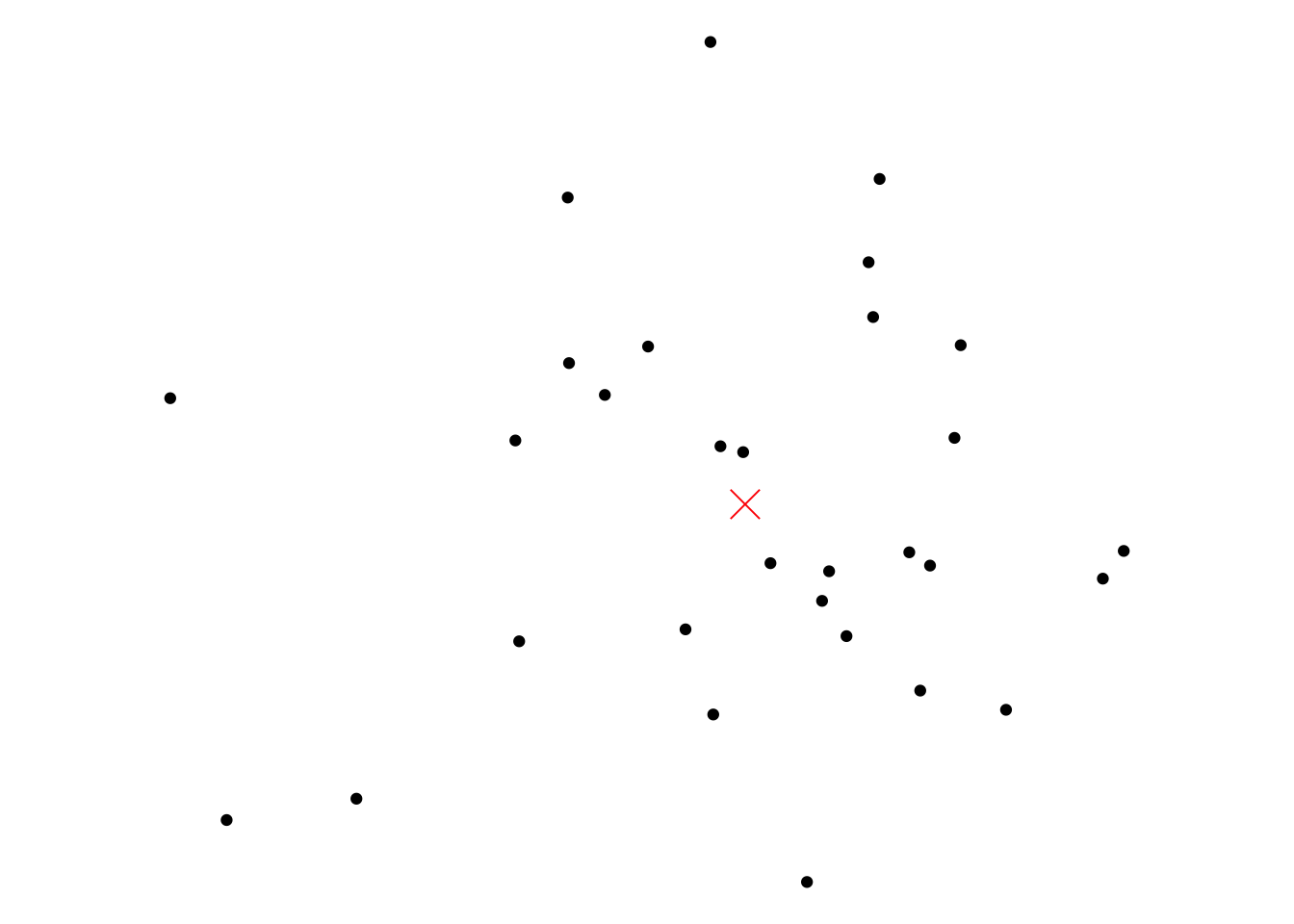
And we are off and running.
Unfortunately, the first hurdle shows up pretty quickly. ‘Network paths’ is open to many interpretations. I am going to go with making a network of connections among the points based on some notion of neighbourhood, although that doesn’t narrow things down a whole lot.
Using the now fairly mature sfdep package along with sfnetworks many options are available, so here are just two, the 3-nearest neighbours and Gabriel graph of our set of points. Once made, the networks contain both edge and vertex data, so to get strictly the lines as a standard sf object we have to ‘activate’ the edges and convert to an sf dataset.
library(sfdep)
library(sfnetworks)

G_k3 <- points_sf |>
  st_as_sfc() |>
  st_as_graph(
    points_sf |> st_knn(3)) |>
  activate("edges") |>
  st_as_sf()

G_gabriel <- points_sf |>
  st_as_sfc() |>
  st_as_graph(
    points_sf |> st_as_sfc() |> st_nb_gabriel()) |>
  activate("edges") |>
  st_as_sf()
And here they both are:
g1 <- ggplot() +
  geom_sf(data = G_k3) +
  geom_sf(data = points_sf) +
  ggtitle("3 nearest neighbours")

g2 <- ggplot() +
  geom_sf(data = G_gabriel) +
  geom_sf(data = points_sf) +
  ggtitle("Gabriel graph")

g1 | g2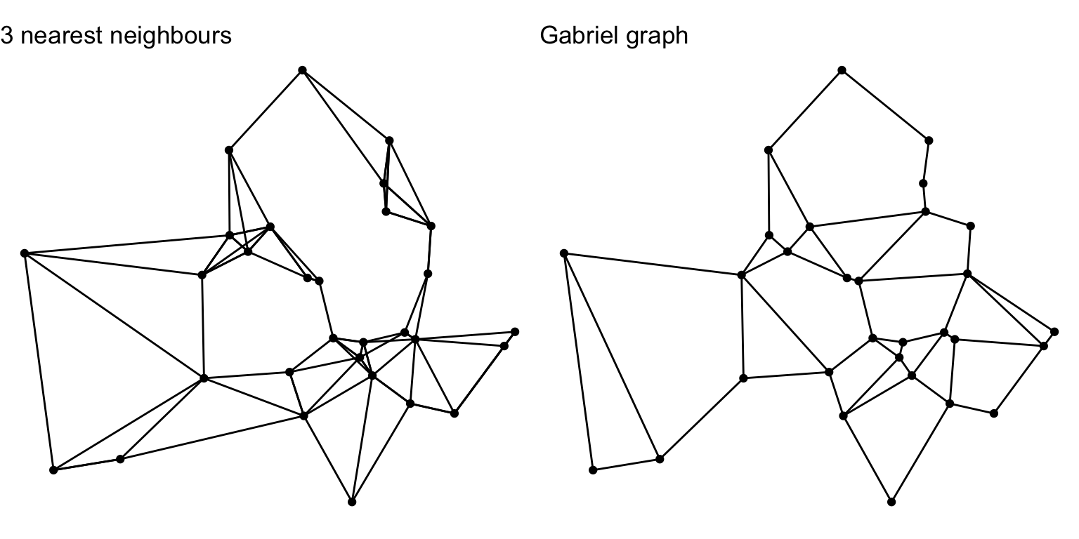
The Gabriel graph is a thinned out close relative of the Delaunay triangulation, which we’re about to see a couple of sections later in this post.
Following recent presentations by René Westerholt at GIScience 2025 I’ll have more to say about these kinds neighbourhood structures soon.6
This is straightforward enough. Sensible proximity polygons should probably be clipped to a region close to the input points, and you also have to join the data from the points back to the polygons. The minimal solution that yields the polygon geometries is shown in the first operation below, while reattaching the data and clipping are applied in the following operation.
prox_polygons_min <- points_sf |>
st_union() |>
st_voronoi() |>
st_cast()
prox_polygons <- prox_polygons_min |>
st_intersection(
points_sf |>
st_buffer(1500) |>
st_bbox() |>
st_as_sfc()) |>
data.frame() |>
bind_cols(
points_sf |> st_drop_geometry()) |>
st_sf()
ggplot() +
geom_sf(data = prox_polygons) +
geom_sf(data = points_sf)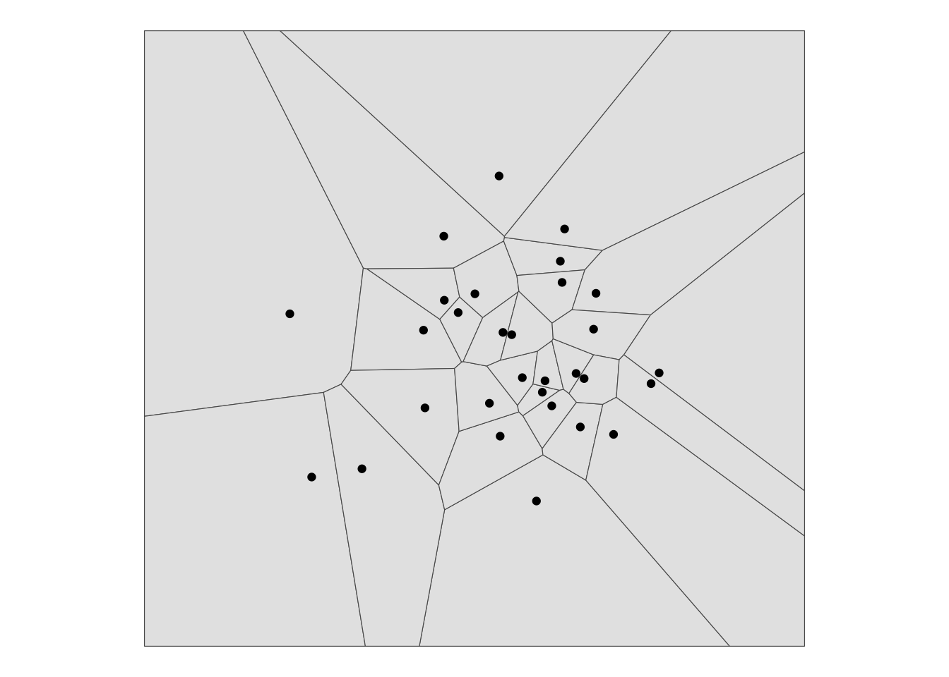
One way to make a TIN is the Delaunay triangulation, which is similar to operations in either of the previous two sections. There is an st_nb_delaunay function in sfdep which is applied in the same way as st_nb_gabriel. But that function yields a graph of edges, not areas, and since it’s areas we are trying to make, here is the vanilla sf method, which yields polygons.
As with the st_voronoi function, we have to apply a slightly bewildering series of operations to get the output as a bona fide sf.
tin <- points_sf |>
st_union() |>
st_triangulate() |>
st_cast() |>
st_sfc() |>
data.frame() |>
st_sf()
ggplot() +
geom_sf(data = tin) +
geom_sf(data = points_sf)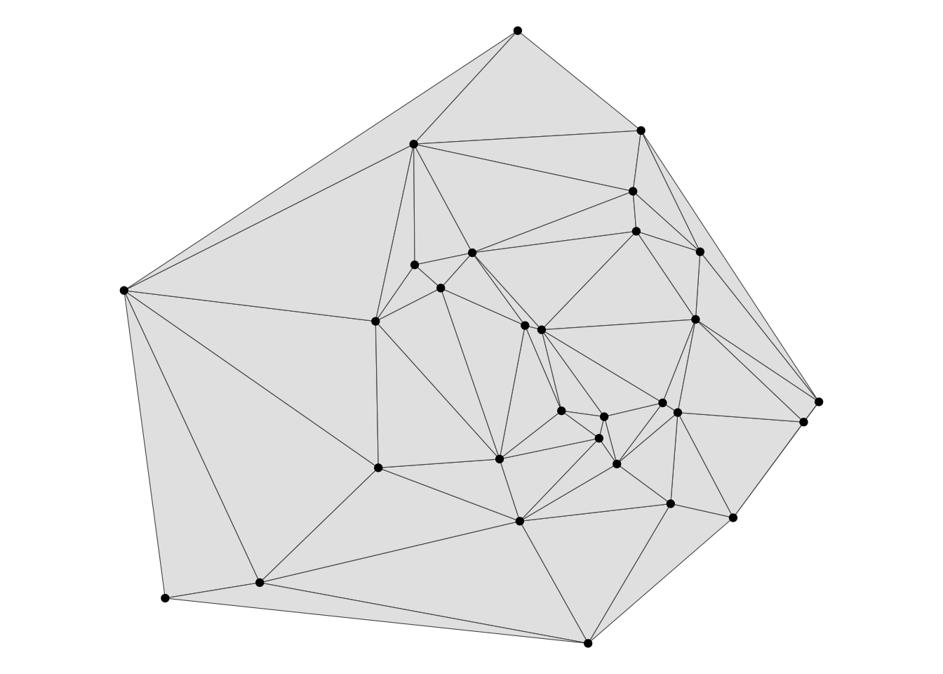
Buffers are the ur-method in GIS and easily generated. Since our points have a z attribute we’ll vary the buffer size using that variable.
pt_buffer <- points_sf |>
  st_buffer(dist = points_sf$z)

ggplot() +
  geom_sf(data = pt_buffer, fill = NA) +
  geom_sf(data = points_sf)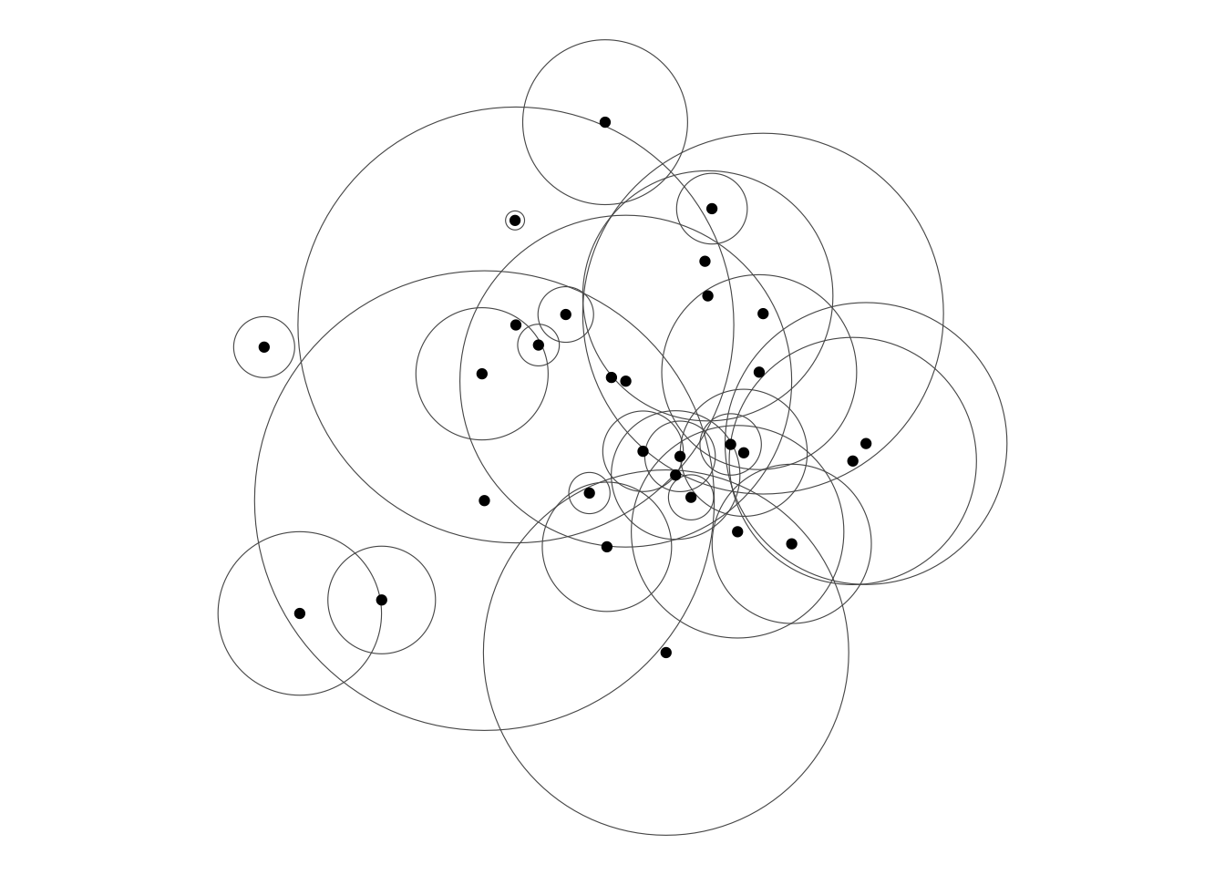
The buffer regions are actually polygons, but I’ve rendered them showing their boundaries only, so that we can see the overlaps.
This is where things start to get properly gnarly. The vector-raster divide remains surprisingly tricky to cross in almost all geospatial platforms. In R that’s exacerbated by the reliance on different packages with different APIs, which can make it less than obvious how to proceed.
I could be sneaky here, and argue as we do in Chapter 9 of the book that proximity polygons are already a form of interpolation. But you probably want to see some ‘real’ interpolation. That requires us to make a statistical model, and then apply it to predict values at some set of point locations.
Here’s the statistical model for inverse-distance weighting, made in gstat.
library(gstat)
fit_IDW <- gstat(
formula = z ~ 1,
data = as(points_sf, "Spatial"),
set = list(idp = 2)
)z is what we are interested in.
sf but converting to sp, which is required here.
idp = 2 specifies an inverse-distance square.
Next we set up some target locations in both raster and point formats where the model will be used to ‘predict’ values. The easiest way to do this is making an empty raster with some required resolution. I use the prox_polygons as a convenient extent extending beyond the range of the point data. Arguably, when interpolating we shouldn’t go much beyond the extent of the point data, but there’s no real harm in this situation.
target_raster <- prox_polygons |>
  as("SpatVector") |>
  rast(res = 25)

target_points <- target_raster |>
  as.points() |>
  st_as_sf()
Now we can interpolate into the target locations. First into the set of points, and then (since the purpose here is to make a raster), rasterizing the points into an actual raster data set. After doing that we rename the variable to something a bit more user-friendly than var1.pred.
interp_pts <- predict(fit_IDW, target_points)[inverse distance weighted interpolation]interp_rast <- rasterize(
as(interp_pts, "SpatVector"),
target_raster, field = "var1.pred")
names(interp_rast) <- "z"And finally, we can make a map of what we got. This is all a bit circular, because I am using geom_raster for plotting, which requires that I reconvert the raster back to xyz data, but the essential point is that we’ve completed the transformation from point data to an interpolated raster surface!
ggplot() +
  geom_raster(
    data = interp_rast |> as.data.frame(xy = TRUE),
    aes(x = x, y = y, fill = z)) +
  geom_sf(data = points_sf) +
  scale_fill_continuous_c4a_seq(palette = "hcl.terrain2")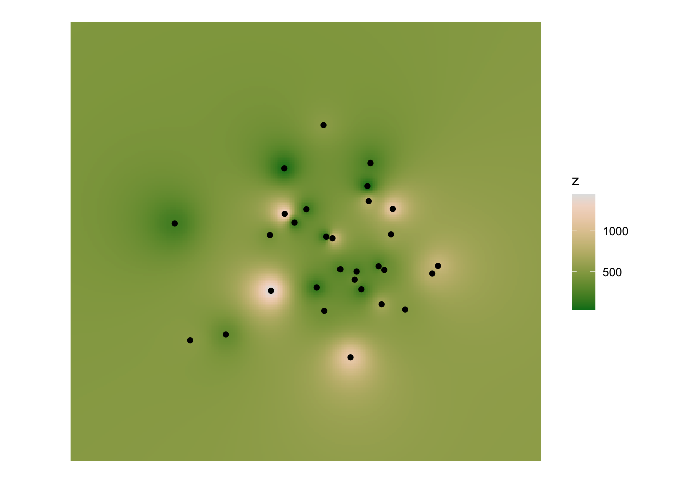
It’s rather mysterious that kernel density is not straightforward to apply in R ‘out of the box’.
One easy approach is that ggplot will do a form of density estimation purely visually, using geom_density2d and often a visual output is all we need. Purists have issues with the smoothing applied by geom_density2d—so I gather from the documentation of the eks package, which we look at in passing below—but this is quick and easy.
ggplot() +
  geom_density2d(data = points, aes(x = x, y = y)) +
  geom_sf(data = points_sf)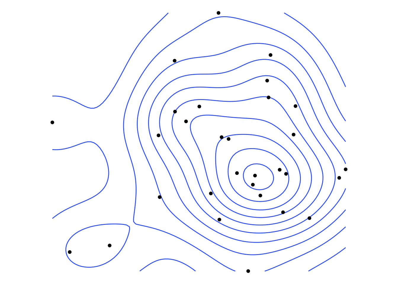
That’s all very well. But doesn’t get us the desired raster output data. One option would be to round trip the data via the density functionality in spatstat. I’ve shown how to do that in a post from four years ago here.
Other options are spatialEco::sf.kde() and eks::st_kde(). The latter does everything properly but insists on choosing its own kernel bandwidth, and how that bandwidth is determined is somewhat obscure, or at the very least highly technical. In day to day use I think of KDE as primarily a visualization method, and in that context, I want to be able to specify kernel bandwidths in units of the map projection and see how the map changes as the bandwith varies.
spatialEco::sf.kde gives me that control.
One oddity here is that the raw output from sf.kde has rectangular, not square cells, even though I supply the function call with a ‘reference’ raster that has square cells! I think this is because spatialEco is using eks::st_kde behind the scenes. Anyway, this behaviour accounts for my reprojecting the results into the target_raster.7
library(spatialEco)

kde <- points_sf |>
  sf.kde(bw = 1500, ref = target_raster, res = 25,
         standardize = FALSE, scale.factor = 1) |>
  terra::project(target_raster)

kde_weighted <- points_sf |>
  sf.kde(y = points_sf$z,
         bw = 1500, ref = target_raster, res = 25,
         standardize = FALSE, scale.factor = 1) |>
  terra::project(target_raster)

g1 <- ggplot() +
  geom_raster(
    data = kde |> as.data.frame(xy = TRUE),
    aes(x = x, y = y, fill = z)) +
  geom_sf(data = points_sf) +
  scale_fill_continuous_c4a_seq(palette = "brewer.reds") +
  ggtitle("Unweighted KDE")

g2 <- ggplot() +
  geom_raster(
    data = kde_weighted |> as.data.frame(xy = TRUE),
    aes(x = x, y = y, fill = z)) +
  geom_sf(data = points_sf, aes(size = z), alpha = 0.35) +
  scale_fill_continuous_c4a_seq(palette = "brewer.reds") +
  ggtitle("Weighted KDE")

g1 | g2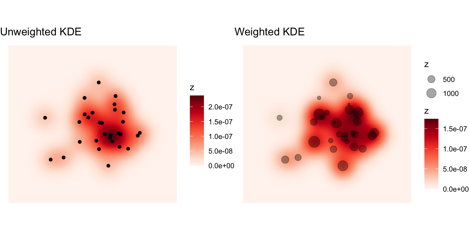
sf.kde’s scaling behaviour is not especially well documented, but by setting standardize = FALSE and scale.factor = 1 I get estimates of the density that appear to be in the units of the projection, i.e. counts per square metre in the present example. This is nice to know if you do happen to want to use an estimated density surface to, for example, aggregate cell densities up to estimaged counts for a set of areas.
You can also weight the points using the y parameter in the sf.kde function call, but it’s not clear to me that the resulting density estimate respects the total weight associated with the data. If it did, I would expect the value of the weighted surface to be 100 or more times greater than in the unweighted case.
Another possibility here, if you’d rather not use Gaussian kernels, but instead stick with the kernels that are typically available in a GIS, then the SpatialKDE package has you covered.
library(SpatialKDE)

kde_2 <- points_sf |>
  kde(band_width = 1500, scaled = TRUE,
      grid = target_raster |> as("Raster"), quiet = TRUE) |>
  as("SpatRaster")
names(kde_2) <- "kde_value"

kde_2_weighted <- points_sf |>
  kde(band_width = 1500, scaled = TRUE, weights = points_sf$z,
      grid = target_raster |> as("Raster"), quiet = TRUE) |>
  as("SpatRaster")
names(kde_2_weighted) <- "kde_value"

g1 <- ggplot() +
  geom_raster(
    data = kde_2 |> as.data.frame(xy = TRUE),
    aes(x = x, y = y, fill = kde_value)) +
  geom_sf(data = points_sf) +
  scale_fill_continuous_c4a_seq(palette = "brewer.reds") +
  ggtitle("Unweighted KDE")

g2 <- ggplot() +
  geom_raster(
    data = kde_2_weighted |> as.data.frame(xy = TRUE),
    aes(x = x, y = y, fill = kde_value)) +
  geom_sf(data = points_sf) +
  scale_fill_continuous_c4a_seq(palette = "brewer.reds") +
  ggtitle("Weighted KDE")

g1 | g2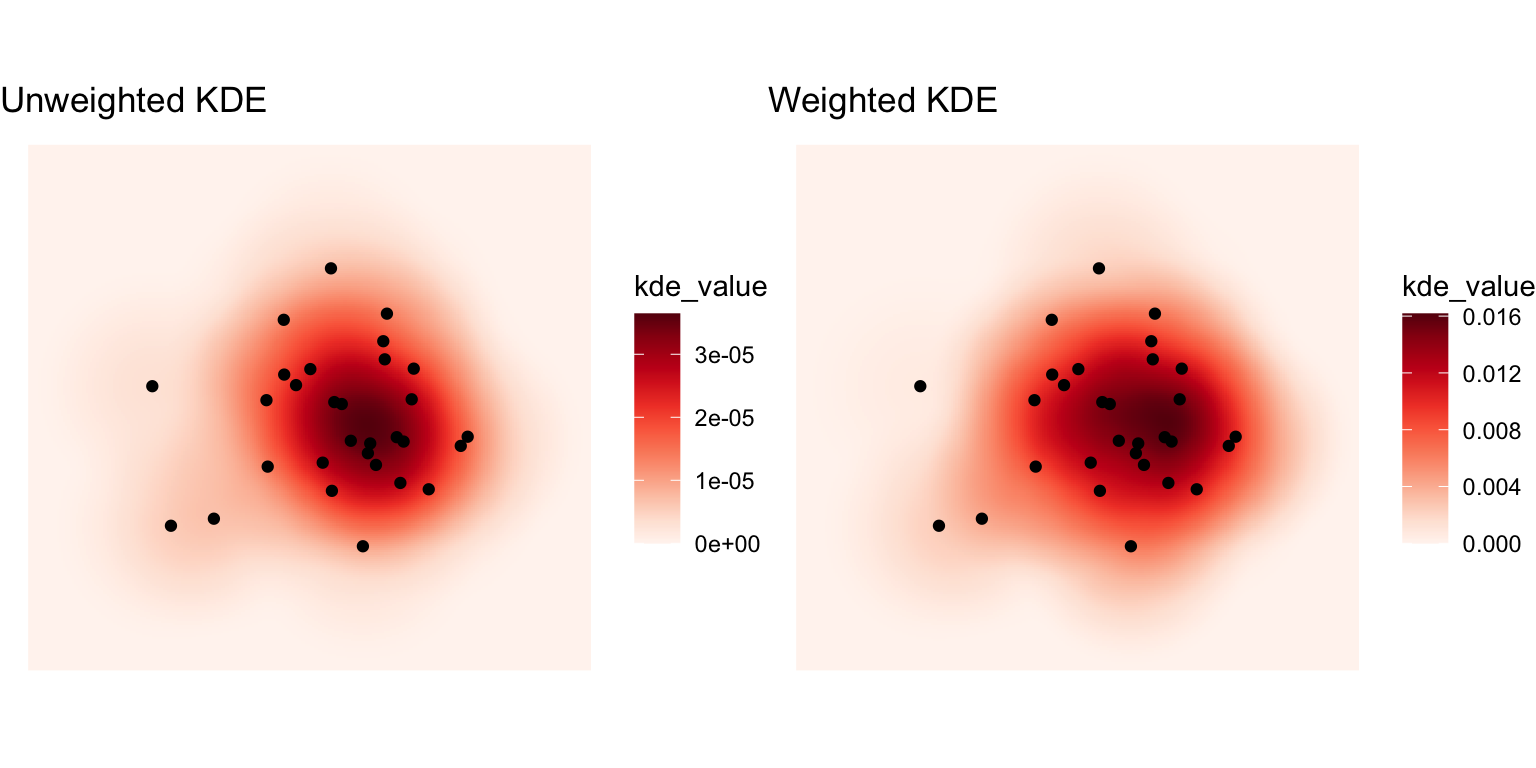
Here, we get the difference in densities we expect between the unweighted and weighted case. The SpatialKDE::kde() function complains about the size of the target raster being large, so it likely doesn’t scale especially well. As is apparent, the interpretation of the specified bandwidth is not directly comparable to the bandwidth associated with the Gaussian kernel produced by the spatialEco::sf.kde function.
All in all, there are no shortage of options for kernel density estimation in R. SpatialKDE::kde() is probably the closest to running the operation in a GIS, other than using a package like qgisprocess to access this functionality in QGIS directly.
After the complexities of KDE, it’s nice that calculating the minimum distance to any one of a set of points from every cell in a raster is straightforward, although we do the calculation using the target_points data and then convert to a raster.
distance_surface <- target_points |>
  mutate(
    distance = st_distance(geometry, points_sf) |>
    apply(MARGIN = 1, min)) |>
  as("SpatVector") |>
  rasterize(target_raster, field = "distance")
names(distance_surface) <- "distance"

ggplot() +
  geom_raster(
    data = distance_surface |> as.data.frame(xy = TRUE),
    aes(x = x, y = y, fill = distance)) +
  geom_sf(data = points_sf, colour = "white", shape = 1) +
  scale_fill_continuous_c4a_seq(palette = "brewer.prgn")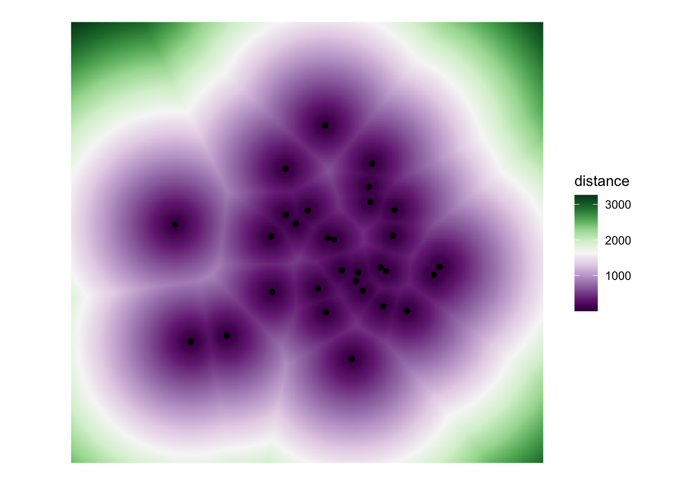
It’s fun to notice here that the approximate boundaries of many of the proximity polygons (more or less) emerge in the distance surface, at least when coloured on a diverging scheme as here.
OK. That’s quite enough of that for one day. Next time I post one of these, I’ll assume you have line data.
![]()
Chrisman N. 1999. A transformational approach to GIS operations. International Journal of Geographical Information Science. 13(7) 617-637. doi: 10.1080/136588199241030.↩︎
I can’t begin to tell you how long it took to make this table in HTML. At some point it was obvious that a screenshot of the actual table from the book would be a better idea, but my obstinate streak kicked in, and here we are. Saying that, I expect it took almost as long to make the original in Word, back in the day. Plus ça change.↩︎
Come to think of it, I expect it long since has.↩︎
Enjoy the schadenfreude.↩︎
Note from future self: that’s not quite how it turned out when things got messy in transformations from areas.↩︎
And also thoughts on GIScience 2025 itself…↩︎
Call me old fashioned, but I like my raster cells square.↩︎