Code
library(spatstat)
library(sfdep)
library(sfnetworks)
library(tidygraph)
library(sf)
library(ggplot2)
library(terra)
library(tidyr)
library(dplyr)
library(ggplot2)
library(cols4all)
library(patchwork)

theme_set(theme_void())
set.seed(1)In the previous post I explained the genesis of this short series of ‘Got ____?’ posts. This post comes hard on the heels of the last one because I’d already written some of it before realising that attempting all sixteen transformations in a single post would be too much of a good(?) thing.
Let’s gone!1
library(spatstat)
library(sfdep)
library(sfnetworks)
library(tidygraph)
library(sf)
library(ggplot2)
library(terra)
library(tidyr)
library(dplyr)
library(ggplot2)
library(cols4all)
library(patchwork)
theme_set(theme_void())
set.seed(1)As before, we need some data. It will make sense to make both some random lines, and also a network.
Random lines are simple enough. Again, we’ll have thirty of them, in time-honoured statistical tradition.
cx <- 1.745e6
cy <- 5.425e6
get_random_line <- function(offset_e, offset_n) {
st_linestring(matrix(
rnorm(4, sd = 1000) + rep(c(offset_e, offset_n), 2),
ncol = 2, byrow = TRUE))
}
lines <- mapply(get_random_line,
offset_e = rep(cx, 30),
offset_n = rep(cy, 30),
SIMPLIFY = FALSE) |>
st_sfc() |>
data.frame() |>
st_as_sf(crs = 2193)
ggplot() +
geom_sf(data = lines)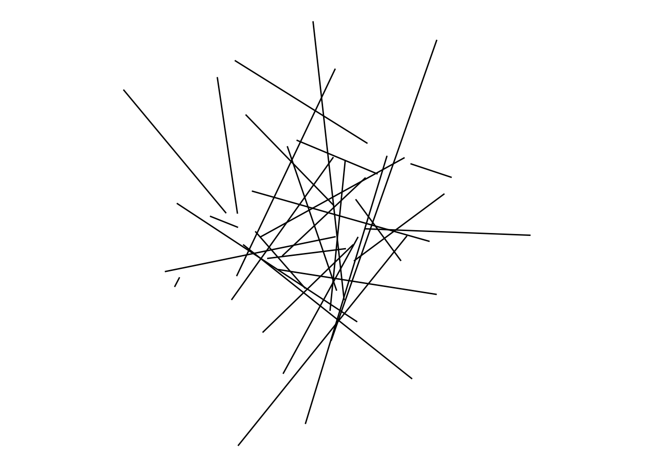
Networks are a little trickier, because they necessarily also include points. The code below uses spatstat::rMatClust to first make a clustered set of points, then sfdep::st_nb_gabriel and sfdep::st_as_graph to make a Gabriel graph among those points. The result nw is a tidygraph network object, from which we can extract edges (lines) as a sf object.
pp <- rMatClust(
kappa = 1e-6,
scale = 400,
mu = 10,
win = owin(c(-2500, 2500), c(-2500, 2500))
)
pp_sf <- pp |>
as.data.frame() |>
mutate(x = cx + x, y = cy + y) |>
st_as_sf(coords = c("x", "y"), crs = 2193) |>
mutate(ID = row_number())
nw <- pp_sf |>
st_as_sfc() |>
st_as_graph(
pp_sf |>
st_as_sfc() |>
st_nb_gabriel())
edges <- nw |>
activate("edges") |>
st_as_sf()
ggplot() +
geom_sf(data = edges) +
geom_sf_label(data = pp_sf, aes(label = ID), size = 3) +
theme_void()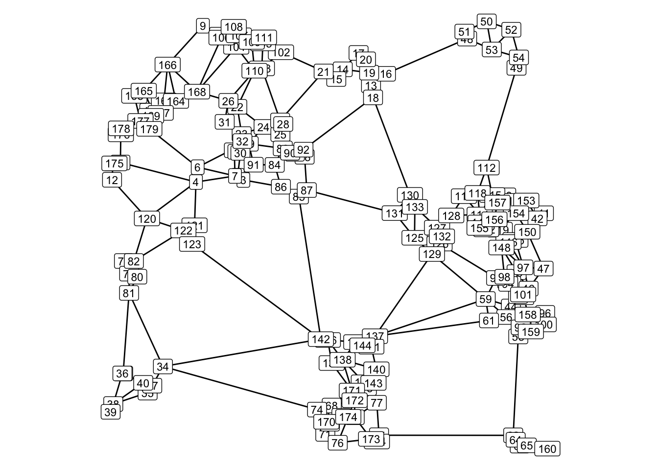
The network is at least somewhat reminiscent of the connections we might see among a collection of small towns.
Our oracular table demands that we make points from lines by intersection. We already know that all the lines in our network intersect at nodes, so it makes more sense to generate the points of intersection of our random arrangement of lines.
intersections <- lines |>
  st_intersection() |>
  filter(st_geometry_type(geometry) == "POINT")

ggplot() +
  geom_sf(data = lines, colour = "lightgray") +
  geom_sf(data = intersections)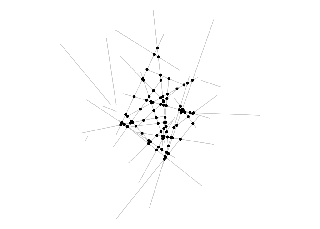
This is very straightforward. The process slows down rather dramatically if there are a lot more objects, but with only 30 lines is quick. It’s worth noting that I have to filter out all the ‘intersections’ that are themselves lines, in other words not points. That’s because left to its own devices st_intersection treats each line as intersecting with itself. If I omit the filter, you can see what I mean:
lines |>
  st_intersection()
Simple feature collection with 127 features and 2 fields
Geometry type: GEOMETRY
Dimension: XY
Bounding box: xmin: 1743195 ymin: 5422785 xmax: 1747402 ymax: 5427173
Projected CRS: NZGD2000 / New Zealand Transverse Mercator 2000
First 10 features:
n.overlaps origins geometry
1 1 1 LINESTRING (1744374 5425184...
2 1 2 LINESTRING (1745330 5424180...
3 1 3 LINESTRING (1745576 5424695...
4 1 4 LINESTRING (1744379 5422785...
2.1 2 2, 5 POINT (1745487 5425734)
5 1 5 LINESTRING (1744984 5425944...
4.1 2 4, 6 POINT (1745388 5424039)
3.1 2 3, 6 POINT (1745591 5424706)
6 1 6 LINESTRING (1745919 5425782...
2.2 2 2, 7 POINT (1745359 5424468)Shortest paths are next. This was interesting to figure out. The tidygraph semantics are quite nice once you get used to them, but at least at first, and for me, a little confusing.
tidygraph wraps igraph and applies many of the igraph functions that yield subgraphs (such as shortest path) using a morph function, which may yield several subgraphs. For example, a connected subgraphs algorithm might find many potential subgraphs. In such cases, to extract a particular graph of interest another function crystallise is used. In a case such as shortest path where only one subgraph is expected, we can morph and crystallise in one step with convert.
So here’s what that looks like for shortest path between two vertices, selected using the vertex ID labelled map above, for the fact that they involved diagonally traversing most of the network. I make two different shortest paths, one topological based on counting only the number of edges traversed, and one distance-based where the weights parameter for shortest path is calculated from the lengths of edges.
sp_edges <- nw |>
  convert(to_shortest_path, from = 166, to = 160) |>
  activate("edges") |>
  st_as_sf()

sp_distances <- nw |>
  convert(to_shortest_path, from = 166, to = 160, weights = st_length(edges)) |>
  activate("edges") |>
  st_as_sf()

ggplot() +
  geom_sf(data = edges, colour = "lightgrey") +
  geom_sf(data = sp_edges, colour = "black") +
  geom_sf(data = sp_distances, colour = "red")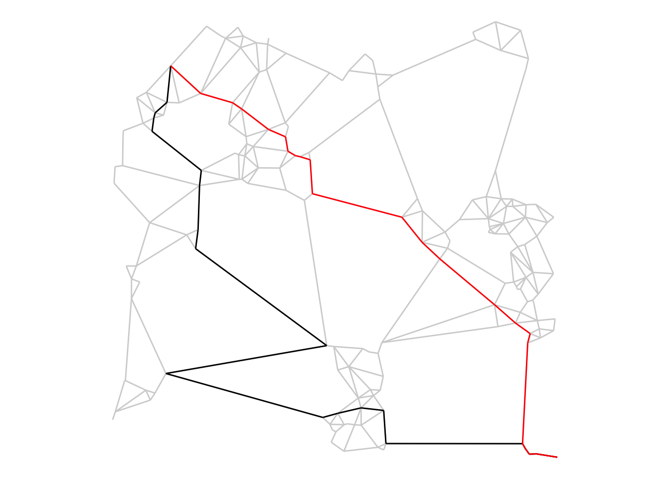
The two shortest paths produced are quite different, as we would expect, with the distance-based one a much more directly ‘diagonal’ path across the space.
I’ve used igraph a fair amount (see e.g. this post and this project) but have found its plotting interface confusing. In addition, maintaining spatial coordinates for vertices is difficult at times, and of course igraph knows nothing about cartographic projections. The sfnetworks and tidygraph combination seems a very promising development in this space.
After the excitement of network analysis, it seems rather pedestrian to go back to boring old buffering, but the table of all geographical knowledge knows what it wants, and buffers it will be.
line_buffers <- edges |>
  st_buffer(100)

ggplot() +
  geom_sf(data = line_buffers, colour = NA) +
  geom_sf(data = edges, lwd = 0.35)
Not a compelling chunk of code, but the visual effect of buffering the lines in a network is very pleasing.
It would perhaps be better accomplished in a drawing package, but it’s worth knowing you can create single-sided buffers too.
left_buffers <- edges |>
  st_buffer(100, singleSide = TRUE)

right_buffers <- edges |>
  st_buffer(-100, singleSide = TRUE)

ggplot() +
  geom_sf(data = left_buffers, fill = "#FF883E", colour = NA) +
  geom_sf(data = right_buffers, fill = "#169B62", colour = NA) +
  geom_sf(data = edges, lwd = 2, colour = "white")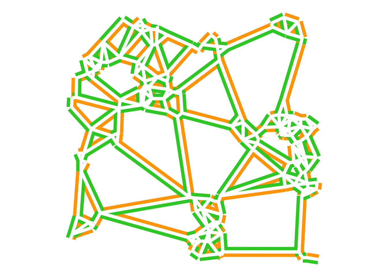
I am, of course, channeling the flag of Cóte d’Ivoire here, and not the flag of Ireland.2
As in the previous post concerning transformations from points, the distance to nearest object surface is the output here, and we can adopt a similar approach.
target_raster <- edges |>
  as("SpatVector") |>
  rast(res = 25)

target_points <- target_raster |>
  as.points() |>
  st_as_sf()

distance_surface <- target_points |>
  mutate(
    distance = st_distance(geometry, edges) |>
    apply(MARGIN = 1, min)) |>
  as("SpatVector") |>
  rasterize(target_raster, field = "distance")
names(distance_surface) <- "distance"

ggplot() +
  geom_raster(
    data = distance_surface |> as.data.frame(xy = TRUE),
    aes(x = x, y = y, fill = distance)) +
  geom_sf(data = edges) +
  scale_fill_continuous_c4a_seq(palette = "brewer.prgn")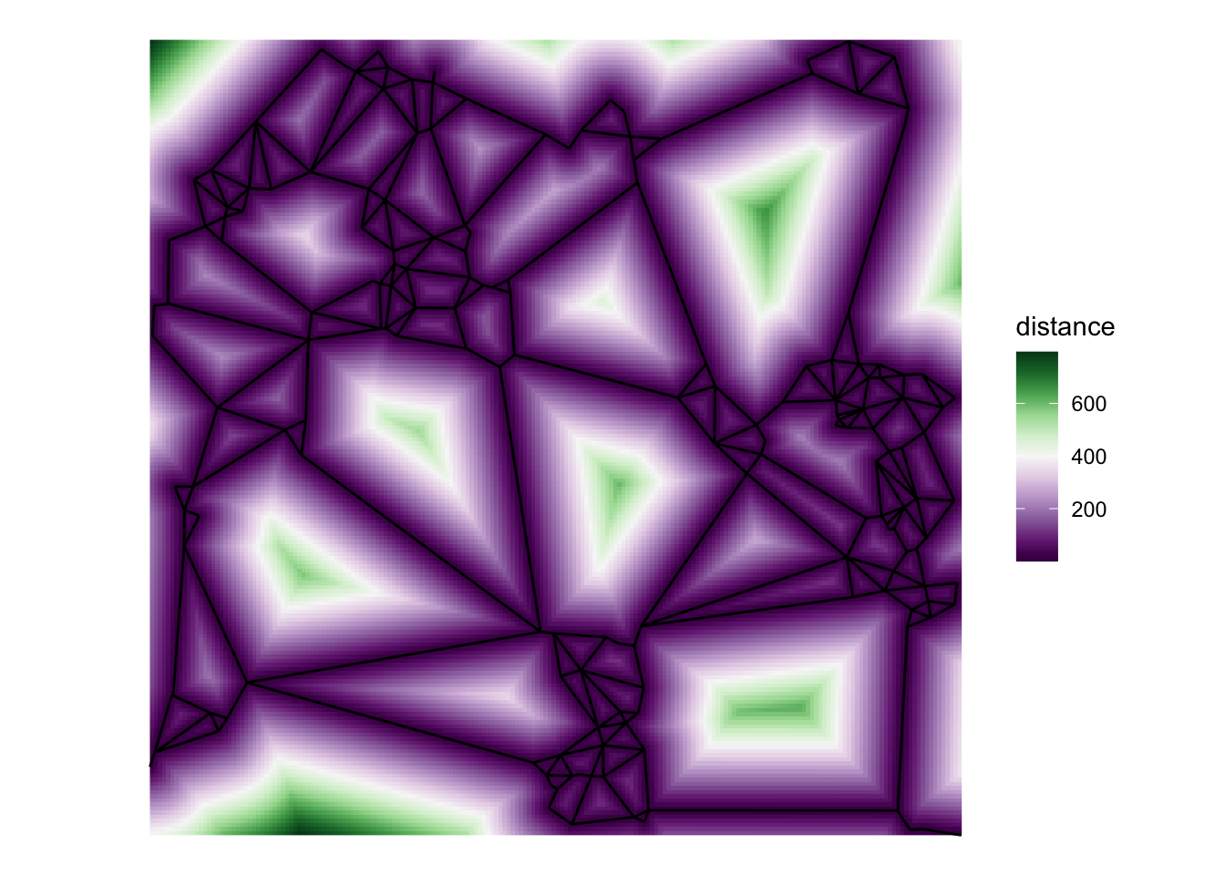
As with the points distance surface output the visual effect here is quite pleasing. Results similar to this may be useful when it comes to the area to line transformation based on polygon skeletonisation.3
![]()