Code
library(sf)
library(units)
library(dplyr)
library(stringr)
library(smoothr)
library(geosphere)
library(ggplot2)
library(patchwork)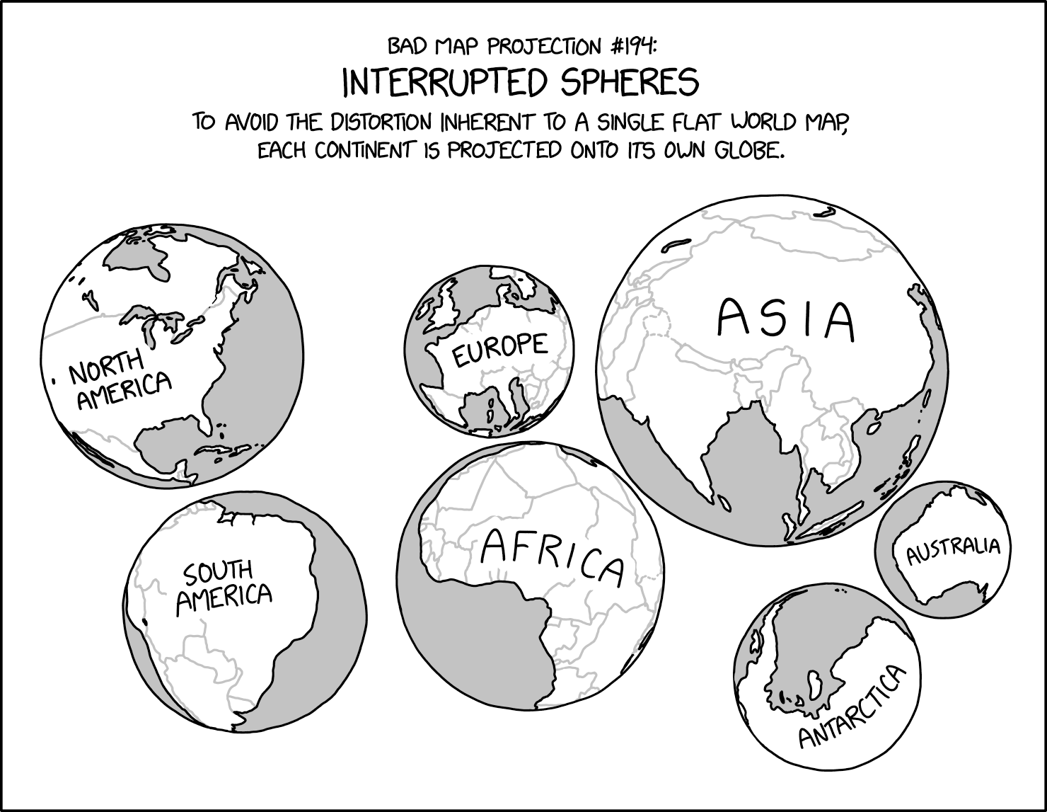
library(kableExtra)Not long ago I posted my ranking of xckd‘s ’bad map projections’ comics. Not long after that a new one appeared ‘interrupted spheres’ in comic #3122. For the record, I’d place it at number 4 in my list. It’s definitely a bad projection in all kinds of ways, but it is also thought provoking as I hope this post, where I reverse-engineer a version of the projection, will show.
library(sf)
library(units)
library(dplyr)
library(stringr)
library(smoothr)
library(geosphere)
library(ggplot2)
library(patchwork)
library(kableExtra)One thing to note about the data in this post is that I made the file from two Natural Earth datasets—the countries data at 1:110M differenced with the lakes at 1:110M. This is because the countries, without the lakes, especially in North America just look wrong. By the time we are done, they’ll look a whole lot wronger, but it seems advisable to start from a good place.
world <- st_read("world.gpkg") |>
st_set_geometry("geometry")ggplot() +
geom_sf(data = world)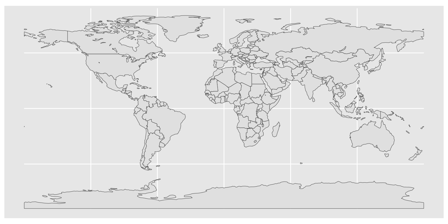
It’s also worth noting that I had to repair a couple of minor issues in the data which were ultimately the root cause of some strange issues I was having running distance-based filtering. Lesson-learned: don’t ignore st_is_valid() == FALSE problems in your data if you’re planning on any analysis, but perhaps especially if you are doing weird projection transformations.
Reverse-engineering a projection is, as cartographers are fond of saying, an art and a science.1 My plan of attack as far as it went was to make a series of localised spherical views of subsets of the data, filtered based on the CONTINENT attribute in the dataframe. This wasn’t a terrible place to start, but Russia in particular—classified as Europe—presents some challenges to this approach. It also turns out that my chosen local spherical projection near-sided perspective(NSP) frequently introduces irreparable topological errors into data. That led to a diversion via the azimuthal equidistant projection to make it easier to select regions of Earth surface that approximate to continents based on distance from some central location, which reduced the topology problems.2
So what follows, traces the process of arriving at my approximation of the interrupted spheres projection, before assembling everything into a couple of functions that allow it to be run in a line or two of code.
We start by looking at making a single sphere.
We start with a single continent. For no particular reason,3 let’s go with Africa.
africa <- world |> filter(CONTINENT == "Africa")
ggplot() +
  geom_sf(data = africa)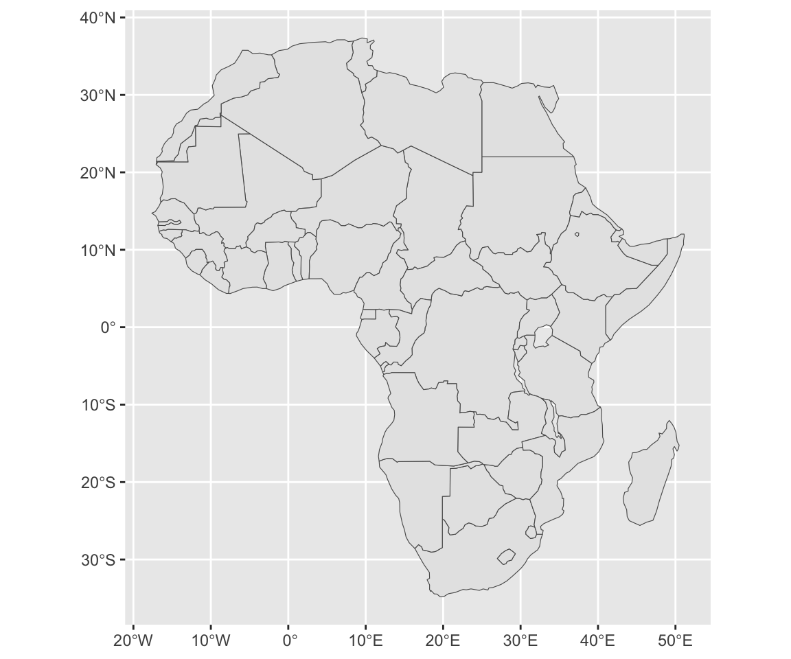
The near-sided perpsective projection simulates the view from space looking directly down at a specified central point, from some specified height above Earth’s surface. Here are three examples at a series of heights.
plots <- list()
for (h in c(1500e3, 3000e3, 6000e3)) {
  proj <- str_glue("+proj=nsper +lon_0=15 +lat_0=0 +h={h}")
  plots[[length(plots) + 1]] <- ggplot() +
    geom_sf(data = africa |> st_transform(proj)) +
    ggtitle(str_glue("From {h/1000}km")) +
    theme_void()
}
wrap_plots(plots, nrow = 1)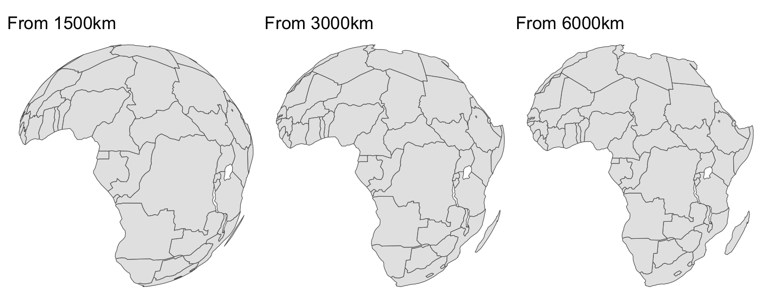
The shape distortions introduced by more close-up, lower height views appear similar to those we see in the comic map. Eventually, if you go far enough out, the NSP projection becomes the orthographic projection’s view from infinity.
It’s useful to know the radius of the circles (of the sphere) in this projection. My initial attempts to do this involved converting polygons in the projected data to points and calculating the distance of the farthest point from the centre. It turns out that the radius of the circle is directly calculable. According to Snyder4 (who can be trusted on such matters), this is given by
\[ r=R\sqrt{\frac{(P-1)}{(P+1)}} \] where \(R\) is Earth’s radius, \(P=h/R+1\), and \(h\) is the height above Earth’s surface of the projection. We can make a function to return this result for an instance of the projection, or even more usefully to return a circle of that size.
get_limit_of_nsper_proj <- function(h, projstring, R = 6371008) {
  P <- h / R + 1
  r <- R * sqrt((P - 1) / (P + 1))
  st_point(c(0, 0)) |>
    st_sfc() |>
    data.frame() |>
    st_sf() |>
    st_buffer(r) |>
    densify(20) |>
    st_set_crs(projstring)
}
This allows us to make a map in the style of the xkcd projection (more or less).
h <- 2000e3
proj <- str_glue("+proj=nsper +lon_0=15 +lat_0=0 +h={h}")
globe <- get_limit_of_nsper_proj(h, proj)
ggplot() +
  geom_sf(data = globe, fill = "grey", colour = NA) +
  geom_sf(data = africa |> st_transform(proj), fill = "white", color = "black") +
  geom_sf(data = africa |> st_transform(proj) |> st_union(),
          fill = NA, color = "black", lwd = 0.65) +
  geom_sf(data = globe, fill = NA, colour = "black", lwd = 1) +
  theme_void()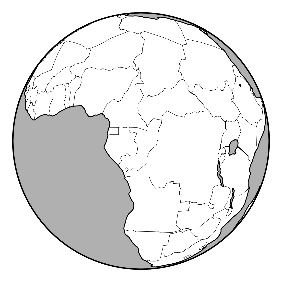
So far so good. We’re halfway there already.5
As I mentioned above, selecting by continent name isn’t entirely satisfactory. I could (in fact I did) edit the data to put Russia in Asia, but that felt a bit ad hoc, and instead I decided to base selection of shapes to include in each sub-sphere on specifying a distance on Earth’s surface along with a centre point of the projection. So the included shapes would be any that fall within that distance from the centre point.
You would assume6 that with ability we already have to create a circle for any given NSP projection, this would be simple enough. In practice, I found that the shapes resulting from the NSP projection, when I try to union them throw topological errors that seemed not to be repairable with st_make_valid(). The reason I union the shapes is to get the xkcd look where the outlines of landmasses are heavier than national boundaries. The easy option would be to not worry about that detail. I took the harder road of figuring out a workaround.
After quite a bit of experimentation this involved selecting the world data based on a distance criterion, then transforming to a projection where it was safe to do the intersection of the globe with the selected shapes. This turned out to be an equidistant projection centred on the same spot as the NSP projection. The manual filtering by distance seems unnecessary, given the subsequent intersection step, but again, I found cases where this threw topological errors. My guess is that this would be caused by very small differences in the projected circle in the equidistant and NSP projections. In any case, the approach I have now seems not to run into such problems.7
Anyway, here’s some code working through that process.
height_for_horizon <- function(d, R = 6371008) {
R / cos(d / R) - R
}
d <- 3500e3
lon_0 <- 15
lat_0 <- 0
centre <- st_point(c(lon_0, lat_0)) |>
st_sfc() |>
st_set_crs(4326)
h <- height_for_horizon(d)
aeqd_proj <- str_glue("+proj=aeqd +lon_0={lon_0} +lat_0={lat_0}")
nsper_proj <- str_glue("+proj=nsper +lon_0={lon_0} +lat_0={lat_0} +h={h}")
globe_nsper <- get_limit_of_nsper_proj(h, nsper_proj)
globe_aeqd <- globe_nsper |>
st_transform(aeqd_proj)
shapes_to_map <- world |>
filter(drop_units(st_distance(geometry, centre)) < d) |>
densify(20) |>
st_transform(aeqd_proj) |>
st_intersection(globe_aeqd) |>
st_transform(nsper_proj)And here is an output map, confirming that everything is still working.
ggplot() +
  geom_sf(data = globe_nsper, fill = "grey", colour = NA) +
  geom_sf(data = shapes_to_map, fill = "white") +
  geom_sf(data = shapes_to_map |> st_union(), fill = NA, lwd = 0.65) +
  geom_sf(data = globe_nsper, fill = NA, colour = "black", lwd = 1) +
  theme_void()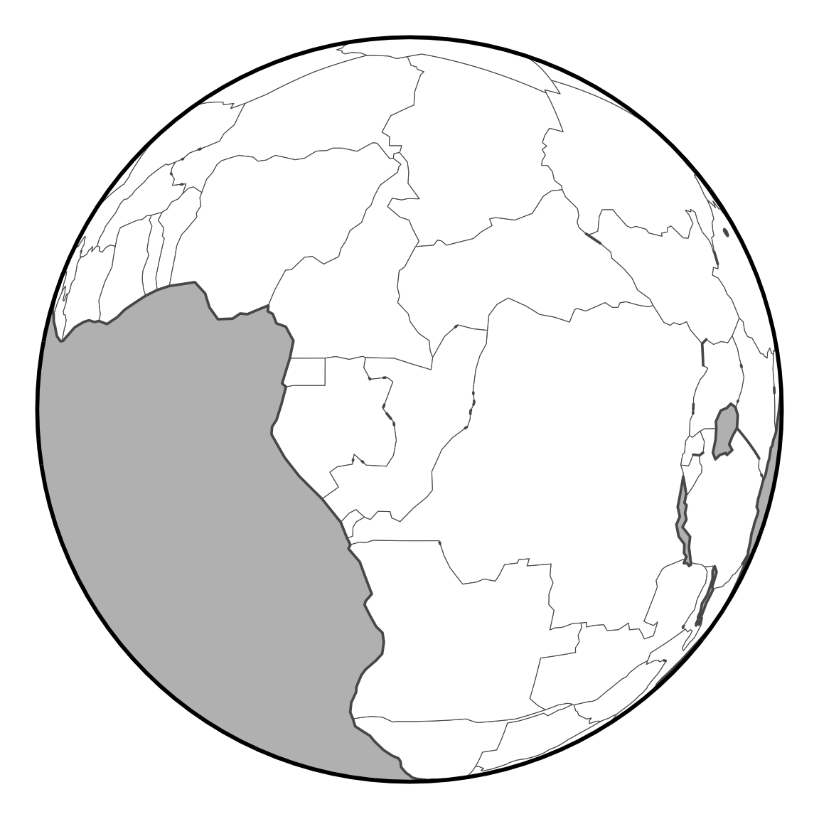
Putting all this together, we can make a function that for a given central point and specified distance returns the ‘shapes’ and ‘globe’ datasets needed to make a multi-sphere map.
make_local_spherical_projection <- function(lon_0, lat_0, d) {
  centre <- st_point(c(lon_0, lat_0)) |>
    st_sfc() |>
    st_set_crs(4326)
  h <- height_for_horizon(d)
  aeqd_proj <- str_glue("+proj=aeqd +lon_0={lon_0} +lat_0={lat_0}")
  nsper_proj <- str_glue("+proj=nsper +lon_0={lon_0} +lat_0={lat_0} +h={h}")
  globe_nsper <- get_limit_of_nsper_proj(h, nsper_proj)
  globe_aeqd <- globe_nsper |>
    st_transform(aeqd_proj)
  world_nsper <-
    world |>
    filter(drop_units(st_distance(geometry, centre)) < d) |>
    densify(20) |>
    st_transform(aeqd_proj) |>
    st_intersection(globe_aeqd) |>
    st_transform(nsper_proj)
  list(shapes = world_nsper, globe = globe_nsper)
}Using the helper functions already written, we can now make a further function to iterate over multiple combinations of central location, radius, and a couple of other parameters (explained a little later) to give us a final map.
make_world_map <- function(df) {
  shapes <- list()
  globes <- list()
  for (i in 1:dim(df)[1]) {
    shift <- c(df$dx[i], df$dy[i])
    a <- df$rotn[i] * pi / 180
    rot_m <- matrix(c(cos(a), sin(a), -sin(a), cos(a)), 2, 2)
    results <- do.call(make_local_spherical_projection, df[i, 2:4])
    shapes[[i]] <-
      results$shapes |>
      mutate(facet = df$facet[i],
             geometry = (geometry * rot_m) + shift)
    globes[[i]] <-
      results$globe |>
      mutate(facet = df$facet[i],
             geometry = (geometry * rot_m) + shift)
  }
  shapes <- shapes |> bind_rows()
  globes <- globes |> bind_rows()
  outlines <- shapes |> group_by(facet) |> summarise()
  ggplot() +
    geom_sf(data = globes, fill = "grey", colour = NA) +
    geom_sf(data = shapes, fill = "white", colour = "black", lwd = 0.25) +
    geom_sf(data = outlines, fill = NA, colour = "black", lwd = 0.5) +
    geom_sf(data = globes, fill = NA, colour = "black", lwd = 0.75) +
    theme_void()
}
Here’s a dataframe with settings for the required arguments.
args <- data.frame(
  facet = c("North America", "Europe", "Asia", "South America",
            "Africa", "Antarctica", "Oceania"),
  lon_0 = c(  -88,    12,    95,   -55,    15,   -30,   148),
  lat_0 = c(   40,    53,    35,   -18,     0,   -85,   -30),
  d     = c(4.5e6, 2.7e6, 7.0e6, 4.5e6, 5.0e6, 3.0e6, 3.8e6),
  dx    = c(-0.79, -0.11,  0.43, -0.67, -0.13,  -0.5,  0.79) * 1e7,
  dy    = c( 0.38,  0.44,  0.39, -0.09,  0.03, -0.45, -0.09) * 1e7,
  rotn  = c(    5,     0,   -25,    10,     0,   -15,     5)
)
args |>
  kable() |>
  kable_styling("striped", full_width = FALSE) |>
scroll_box(height = "340px")| facet | lon_0 | lat_0 | d | dx | dy | rotn |
|---|---|---|---|---|---|---|
| North America | -88 | 40 | 4500000 | -7900000 | 3800000 | 5 |
| Europe | 12 | 53 | 2700000 | -1100000 | 4400000 | 0 |
| Asia | 95 | 35 | 7000000 | 4300000 | 3900000 | -25 |
| South America | -55 | -18 | 4500000 | -6700000 | -900000 | 10 |
| Africa | 15 | 0 | 5000000 | -1300000 | 300000 | 0 |
| Antarctica | -30 | -85 | 3000000 | -5000000 | -4500000 | -15 |
| Oceania | 148 | -30 | 3800000 | 7900000 | -900000 | 5 |
The lon_0, lat_0, and d columns here correspond to the arguments of the same name in the make_local_spherical_projection function. I’ve chosen centre coordinates and radii for each continent by a process of trial and error. Having realised that I had this kind of flexibility I decided not to replicate the xkcd map, but to make my own new and improved version.
The facet attribute is in part to help keep track of which row is which, but more importantly is used in make_world_map to dissolve the shapes in each sphere into a single multi-polygon which can be outlined in a thicker line xkcd-style.
Additional arguments for the final map are dx, dy, and rotn. These are offsets in the x and y directions and a rotation to be applied to each sphere. The units of the offsets are uncertain, since we are mixing the output from seven different projections. Nominally, everything is in metres, but given the perspectival aspect and the fact that each of the seven projections is from a different height, they are not the same metres in each sphere. So for present purposes it made more sense to experiment until I got numbers that put the different spheres where I wanted them!
And so… to a final map!
make_world_map(args)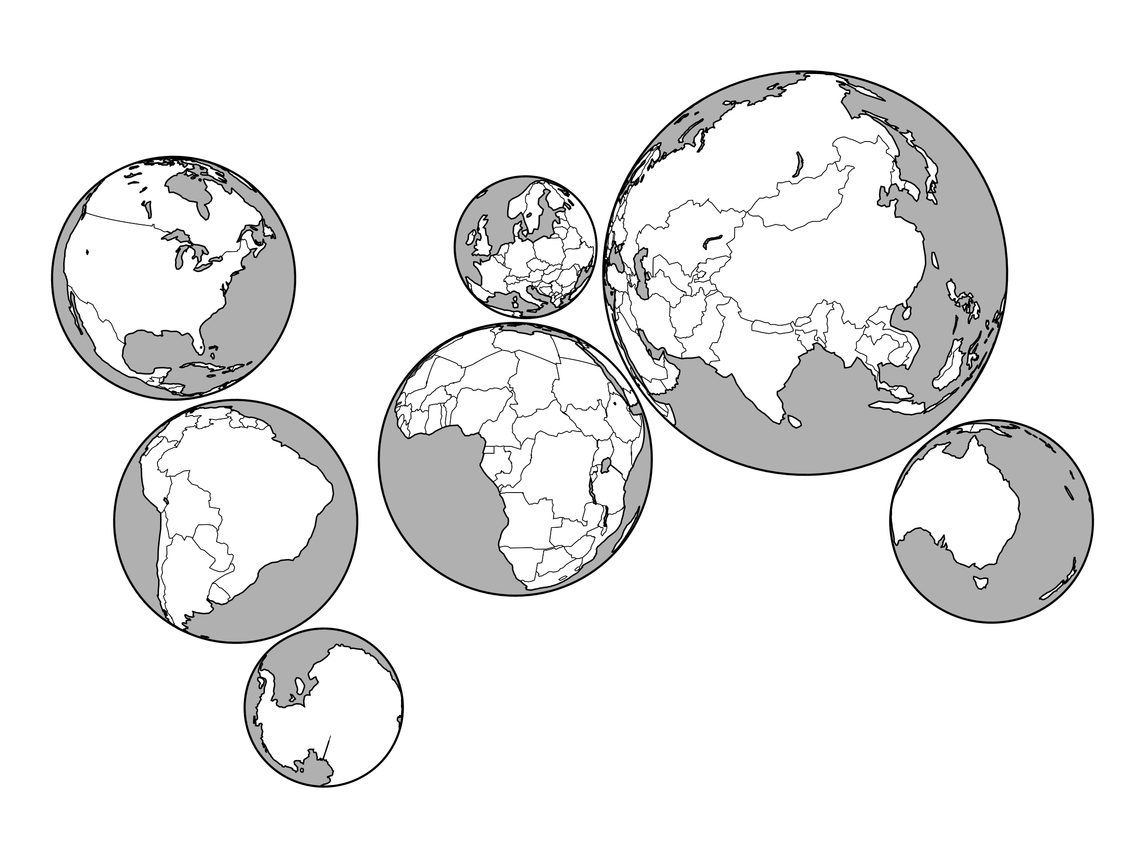
I think we can all agree this map is a considerable improvement on the original.9 I decided to have each sphere provide a more complete representation of its assigned continent. That means New Zealand is included in this map, and Iceland just sneaks in. Alaska still misses out. I feel quite strongly10 that Antarctica in the orientation shown in the xkcd original really belongs below South America, so I moved it.
It’s a fiddly process, but if you would prefer a replica of the original map, then feel free to reuse the code and modify the arguments dataframe. The worst part is that changing the area of coverage of a globe changes its size and requires changing all the positional offsets. There is certainly a better way. With any luck, some d3 guru (see the next section) will help us out.
Having taken this thing as far as I have it seems worth noting that there is clearly a point where these interrupted sphere projections bump into a genre of properly serious world projections, the polyhedral projections.11
Polyhedral projections are where a polyhedron is wrapped around the sphere and that part of Earth’s surface ‘covered’ by each facet of the polyhedron is projected on to it, usually by gnomonic projection. In other words, a point on Earth surface is projected on to a facet of the enclosing polyhedron by drawing a line from the centre of Earth, through the point and on to the facet.
The d3 visualization platform is probably the best tool to use if you are a fan of this projection style, which is unfortunate, because I am a fan, and have bounced off d3 more than once. And of course it works with its own coordinate system and doesn’t play nice with the various standards for exchanging information about projections in geospatial. The results are very cool though. See for example: this, this, this, and this. Peak polyhedrality is to be found in van Wijk’s _myriahedral projections.12
Anyway, I mention all this because with a bit of effort you can make a kind of ‘polyspherical’ (except they are obvious circles because they are flat) projection using the code I’ve written. Here’s a dodecahedral projection:
map(d3.geoDodecahedral())And here’s an interrupted spheres projection arranged the same way.
args2 <- data.frame(
  facet = 1:12,
  lon_0 = c(-12, -156, -84, -12, 60, 132, -120, -48, 24, 96, 168, -48),
  lat_0 = c(90, 30, 30, 30, 30, 30, -30, -30, -30, -30, -30, -90),
  d     = rep(5e6, 12),
  dx    = c(3, 1.24, 2:4, 4.76, 1:4+0.5, 5.26, 2.5) * 6.2e6,
  dy    = c(1.72, 1.1, rep(0.5, 3), 1.1, rep(-0.5, 4), -1.1, -1.72) * 4.4e6,
  rotn  = c(0, 36, rep(0, 3), -36, rep(0, 4), 36, 0)
)
make_world_map(args2)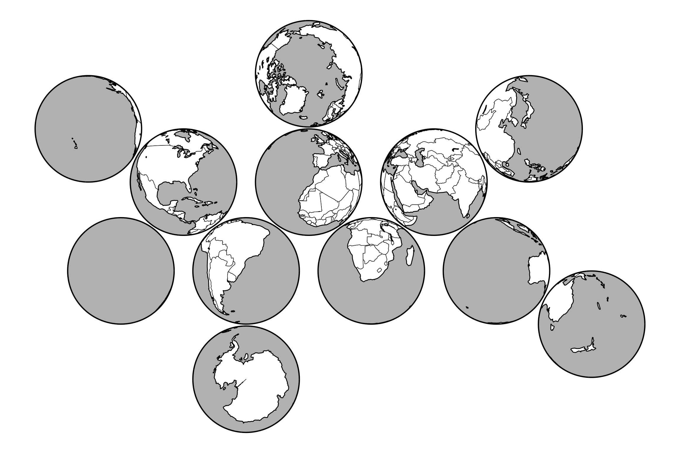
Maybe, given that my criterion in ranking the xkcd bad map projections was how thought-provoking they are, this one should be even higher than my provisional #4. Grappling with reverse-engineering it forced me to look into a few interesting rabbit holes.
More than anything it reinforces my sense that we really could use much more flexible architecture around map projections in geospatial. I am somewhat in awe of what has been done in the d3-verse in that regard, which is one reason for grabbing some code from that realm to show a dodecahedral map. Maybe I should give the 30 Day Map Challenge a go again, this time with a view to finally cracking d3/plot.
With that… I look forward with some trepidation to the next time an xkcd bad map projection appears…
function map(projection) {
  const context = DOM.context2d(width, width / 2);

  projection.fitExtent([[2,2],[width-2, width/2-2]], {type:"Sphere"})

  var path = d3.geoPath(projection, context);
  context.beginPath(), path({type:"Sphere"}), context.fillStyle = "#bbb", context.fill();
  context.beginPath(), path(land), context.fillStyle = "white", context.fill();
  context.beginPath(), path({type: "Sphere"}), context.strokeStyle = "#000", context.stroke();

  // Polyhedral projections expose their structure as projection.root()
  // To draw them we need to cancel the rotate
  var rotate = projection.rotate();
  projection.rotate([0,0,0]);

  // run the tree of faces to get all sites and folds
  var sites = [], folds = [];
  function recurse(face) {
    var site = d3.geoCentroid({type:"MultiPoint", coordinates:face.face});
    // site.id = face.id;
    sites.push(site);
    if (face.children) face.children.forEach(function(child){
      folds.push({type:"LineString", coordinates: child.shared.map(
        e => d3.geoInterpolate(e, site)(1e-5)
      )});
      recurse(child);
    });
  }
  recurse((projection.tree || projection.root)());

  // folding lines
  folds.forEach(fold => {
      context.beginPath(),
        context.lineWidth = 0.5, context.setLineDash([3,4]), context.strokeStyle = "#000",
        path(fold), context.stroke();
  });

  // restore the projection’s rotate
  projection.rotate(rotate);

  return context.canvas;
}

d3 = require("d3-geo", "d3-fetch", "d3-geo-polygon")

land = d3.json(
  "https://unpkg.com/visionscarto-world-atlas@0.0.4/world/110m_land.geojson"
)![]()
In this case, I think both words probably over-dignify the activity.↩︎
Perhaps even solves them, but my code has not been exhaustively tested…↩︎
Alphabetical is as good an order as any.↩︎
Page 173 in Snyder PJ. 1987. Map Projections a Working Manual United States Government Printing Office↩︎
Technically, since there are seven continents (opinions vary), 1/7th of the way there.↩︎
I certainly did.↩︎
This is all no doubt associated with floating point calculations, the perennial bugbear of all geometry in geospatial. Don’t get me started…↩︎
IMHO.↩︎
No correspondence will be entered into on this matter.↩︎
Sometimes I surprise myself.↩︎
To be fair, polyhedral world projections weren’t really taken seriously until relatively recently.↩︎
See van Wijk JJ. 2008. Unfolding the Earth: Myriahedral projections Cartographic Journal 45(1) 32-42, and also here.↩︎