Code
library(sf)
library(tidyr)
library(dplyr)
library(stringr)
library(patchwork)
library(ggplot2)
library(tmap)

theme_set(theme_void())Earlier posts in this series, wherein I exhaustively implement many of the GIS transformations possible among the four main data types, point, lines, areas, and fields, are linked below:
As noted in the last of these, “area data are complicated”, so I gave up chose to split the post on area transformations halfway through and now I’m back to slay the dragon of area → area transformations. Yep… there will be yet another post after this one dealing with area → field transformations sometime soon.
library(sf)
library(tidyr)
library(dplyr)
library(stringr)
library(patchwork)
library(ggplot2)
library(tmap)
theme_set(theme_void())As always, we need some data.
polygons <- st_read("sa2-generalised.gpkg") |>
  mutate(
    area_km2 = (st_area(geom) |> units::drop_units()) / 1e6,
    pop_density_km2 = population / area_km2)
These are Statistics New Zealand census data from 2023. I have augmented the data with a population density attribute to make a point later on. Before I get to that, a personal bug-bear here is how annoying I find it that I have to suppress sf’s default addition of units to calculated areas to do something as simple as create a population density, without getting caught up in endlessly assigning units to simple scaling factors.
Anyway, here are what those look like.
g1 <- ggplot() +
  geom_sf(data = polygons, aes(fill = population), colour = NA) +
  scale_fill_distiller("Population", palette = "Reds", direction = 1) +
  theme_minimal() +
  theme(legend.position = "bottom",
        legend.title.position = "top",
        legend.key.width = unit(1, "cm"),
        legend.text = element_text(angle = 45, hjust = 1))

g2 <- ggplot() +
  geom_sf(data = polygons, aes(fill = pop_density_km2), colour = NA) +
  scale_fill_distiller("Population per sq.km",
                       palette = "Reds", direction = 1) +
  theme_minimal() +
  theme(legend.position = "bottom",
        legend.title.position = "top",
        legend.key.width = unit(1, "cm"),
        legend.text = element_text(angle = 45, hjust = 1))

g1 | g2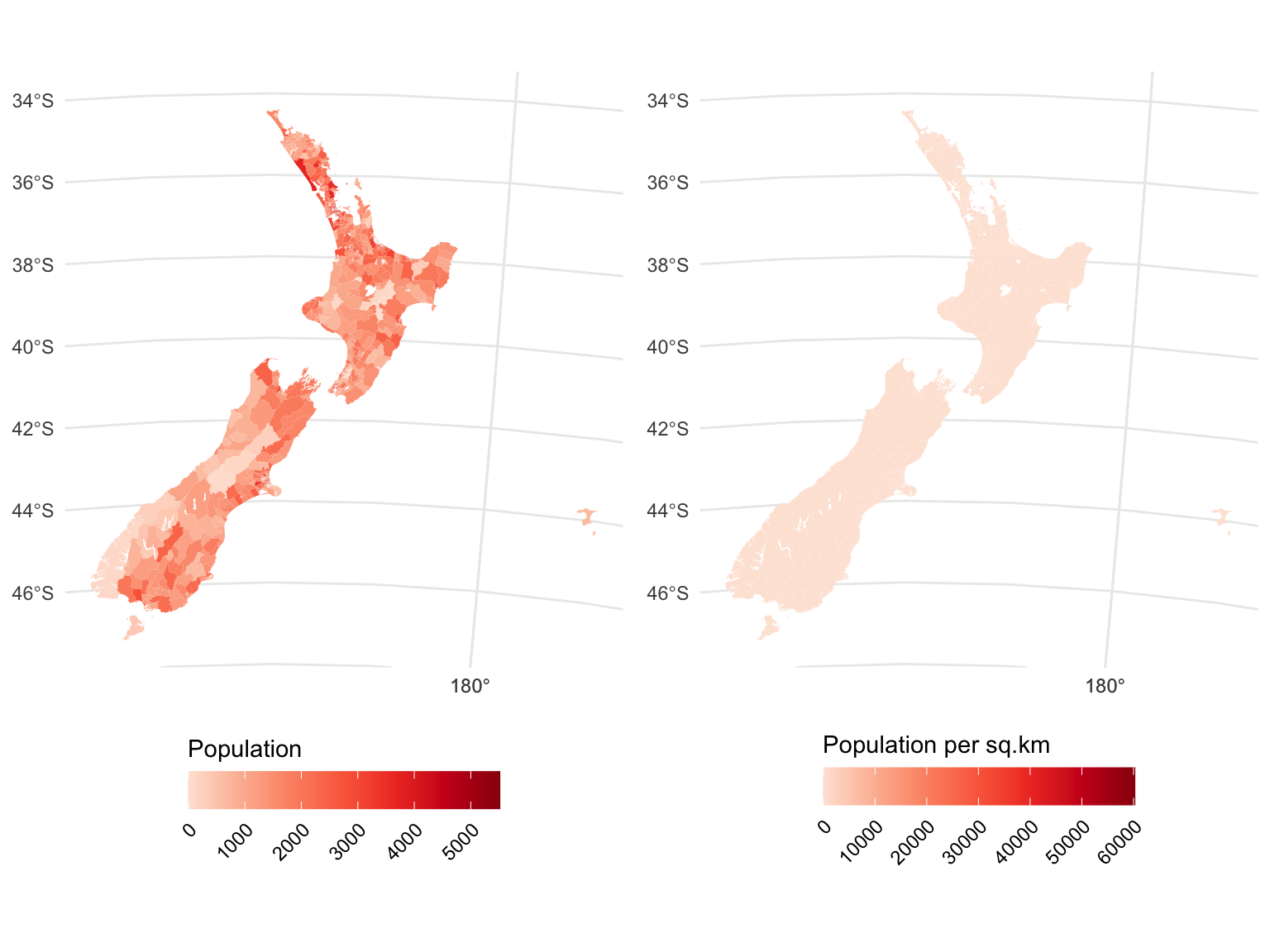
A year or two ago, a nice alternative here would have been to use tmap, which had a convert2density option for choropleth maps, which seamlessly did all the work required to make your map a density map. In version 4, you get a warning that the convert2density option is deprecated, and a recommendation to perform the calculation I performed above anyway. Oh well. Progress, gotta love it!
tmap does make it easier to classify the map, which emphasises the essential lack of much in the way of population density in New Zealand. I promise, there are some census areas with those higher population densities, you just can’t see them at this scale.
tm_shape(polygons) +
  tm_fill(
    "pop_density_km2",
    fill.scale = tm_scale_intervals(n = 10, values = "brewer.reds"),
    fill.legend = tm_legend(title = "Pop density sq.km", frame = FALSE)) +
  tm_options(frame = FALSE)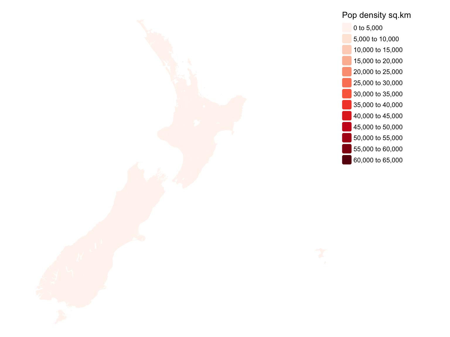
tmap. Is there anybody home? Anybody at all?!
OK, on to the transformations.
Well… we can dispense with this one quickly. Rather than apply it to all the polygons, I’ll just grab one and apply it to that, to demonstrate a couple of things.
poly <- polygons$geom[100]
bb <- st_bbox(poly)
xr <- bb[c(1, 3)] + c(-400, 400)
yr <- bb[c(2, 4)] + c(-400, 400)

poly_b_400 <- poly |> st_buffer(400)
poly_b_400sq <- poly |> st_buffer(400, nQuadSegs = 0, joinStyle = "MITRE")

par(mfrow = c(1, 2), mai = rep(0.1, 4))
plot(poly, col = "grey", xlim = xr, ylim = yr)
plot(poly_b_400, add = TRUE)
plot(poly, col = "grey", xlim = xr, ylim = yr)
plot(poly_b_400sq, add = TRUE)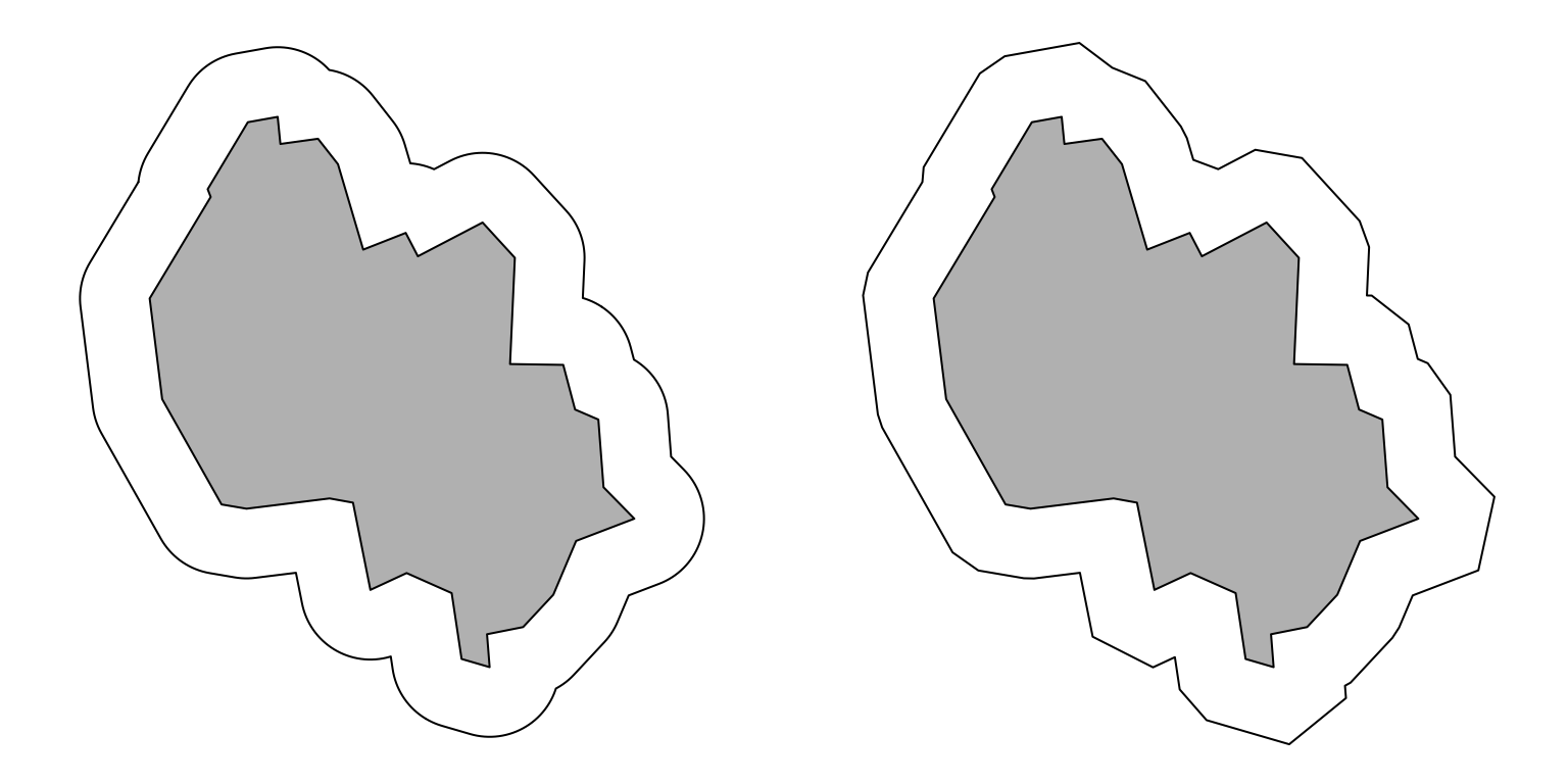
nQuadSegs = 0 and joinStyle = "MITRE".
The first of these with the default settings is what we tend to think of buffering as doing. Why would you want to use the other options?
So maybe we can’t dispense with this quite so quickly.
Just to clarify what’s going on it’s worth zooming in on the figure above.
par(mfrow = c(1, 2), mai = rep(0.1, 4))
bb <- poly |> st_bbox()
xr <- bb[c(1, 3)] + c(2000, -200)
yr <- bb[c(2, 4)] + c(1500, -500)
plot(poly, col = "grey", xlim = xr, ylim = yr)
plot(poly_b_400, add = TRUE)
plot(poly_b_400 |> st_cast("POINT"), add = TRUE, cex = 0.5)
plot(poly, col = "grey", xlim = xr, ylim = yr)
plot(poly_b_400sq, add = TRUE)
plot(poly_b_400sq |> st_cast("POINT"), add = TRUE, cex = 0.5)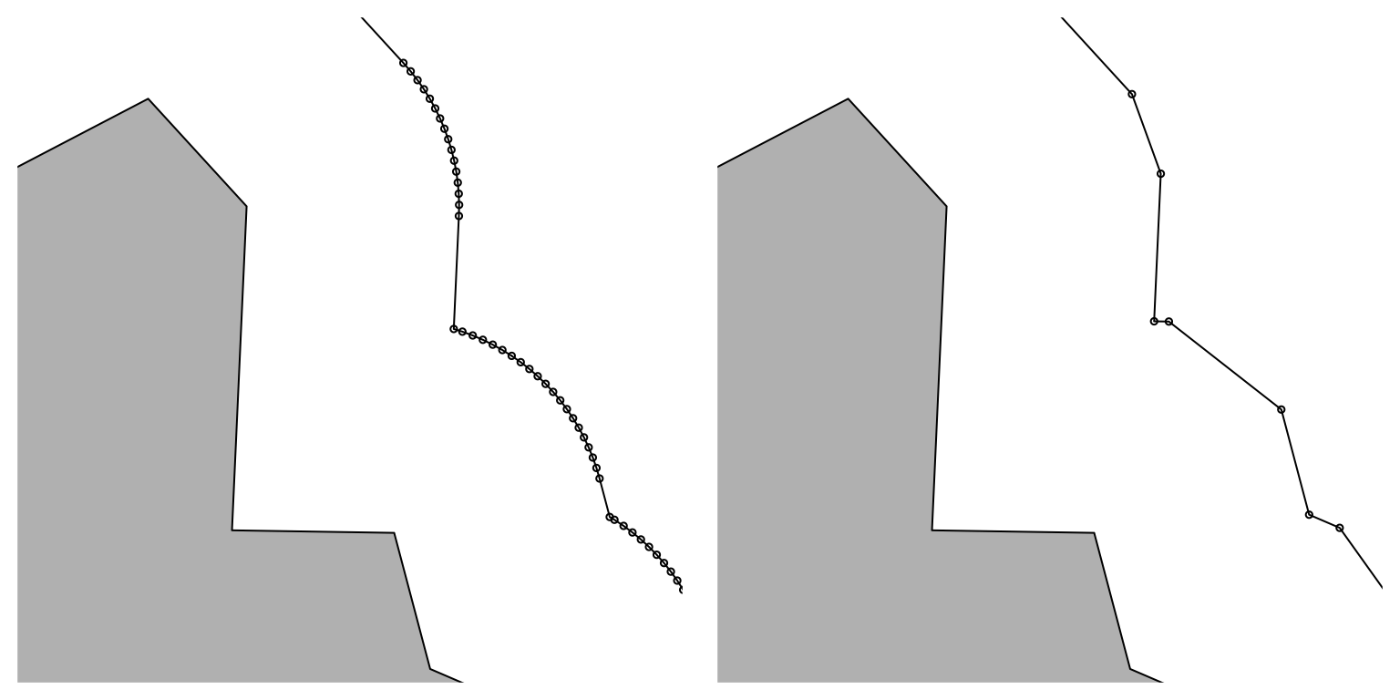
So default buffering adds a lot of points to create the curve associated with each corner. Setting nQuadSegs to 0 reduces this explosion in points.
Generally speaking, the st_buffer defaults are fine, and limiting the number of additional corners inserted using nQuadSegs is unnecessary. You want nice rounded corners. But it’s good to know the option to limit the number of added corners is available, and there is at least one case I can think of where it can be useful.
Sometimes if you encounter polygon topology errors, either as a result of a series of transformations, or if those errors are present in supplied data, and repair methods like st_make_valid aren’t working, a recommended ‘fix’ is to ‘buffer up then buffer down’1 the offending polygons, by a small amount. Now, really, I recommend that you figure out where the topology error came from in the first place. Sometimes however, if you’re working on some problem, fixing topology is something you’d prefer to come back to later, and you just need a quick fix for the time being, and buffer-up buffer-down might be that quick fix.
But beware: here be dragons! To see this, make a square, and see how many points it has.
square <- st_polygon(
  list(matrix(c(0, 0, 1, 1, 0,
                0, 1, 1, 0, 0) * 100,
              ncol = 2))) |> st_sfc()
square |>
  st_cast("POINT") |>
  length()
[1] 5Allowing for sf’s requirement that polygons be explicitly closed so that the first corner is repeated, there are four corners, and five is the correct answer. Now, buffer up and down, per the quick topology fix, and what do we get?
square1 <- square |>
  st_buffer( 1) |>
  st_buffer(-1)
square1 |>
  st_cast("POINT") |>
  length()
[1] 13We can repair things, although repairing a repair seems like it’s missing the point a bit!
square1 |>
  st_simplify(preserveTopology = TRUE, dTolerance = 2) |>
  st_cast("POINT") |>
  length()
[1] 5If you are doing a lot of this kind of thing, it can get very ugly. If I sound like I’ve been burned by this problem, it’s because I have. When developing the weavingspace module in both its early R and more recent python incarnations, I am working with polygons at a low-level all the time and before I had realised this was a problem it wasn’t unusual for me to be working with ‘rectangles’ with dozens or even hundreds of corners!
Using nQuadSegs we can avoid the problem (usually!):
square2 <- square |>
  st_buffer( 1, nQuadSegs = 0, joinStyle = "MITRE") |>
  st_buffer(-1, nQuadSegs = 0, joinStyle = "MITRE")
square2 |>
  st_cast("POINT") |>
  length()
[1] 5Having said that, the vagaries of floating point might still have messed up your data anyway:
square2Geometry set for 1 feature
Geometry type: POLYGON
Dimension: XY
Bounding box: xmin: 0 ymin: -4.524159e-15 xmax: 100 ymax: 100
CRS: NAOh well. The lesson here is that it’s probably better to figure out where the problem with your data came from than to attempt running repairs with quick fixes from the internet.2 The other lesson is that if you care deeply about geometries and their integrity as opposed to using them as a step along the way to perform analyses, then one or more of the following is true:
You should read up on floating point, or
You need to look into sf’s precision options, or
You should look into topology aware formats, such as topojson, or
You should look into libraries that can do precise geometry such as euclid3, or
If this sort of thing is going to drive you nuts, then you should consider a career in something other than geospatial, because this is not going to be fixed any time soon, if ever.
Ah… polygon overlay. If there’s a more iconic GIS transformation, I’m not sure what it is.4
Having said that it’s a little hard to be entirely clear what ‘polygon overlay’ even is. I am going to interpret it here to mean any transformation that moves data from one set of polygon units to a different set of polygon units, in some more or less principled way.
group_byA dissolve operation allows us to combine polygons into larger polygons based on some shared attribute, and is a cornerstone of many administrative geospatial data sets, such as, for example, census data.5
For mysterious reasons, although Aoteroa New Zealand in common with other countries organises census data hierarchically, it does not assign nice hierarchical IDs to the census units. So the smallest units in the hierarchy, meshblocks, can’t be conveniently merged based on IDs into Statistical Area 1 (SA1), or Statistical Area 2 (SA2), or anything else for that matter without access to a concordance table, which is a front runner in the race to be the most boring dataset on Earth, recording as it does, for every meshblock, the SA1, SA2, and the many other administrative and statistical areas of which it is a part.
To add to the fun, all the meshblock IDs are strings composed of digits… with leading zeros. Let that sink in.6 Anyway, the data we loaded, which are SA2s7 have an additional attribute from the concordance file included, designating which Territorial Authority (TA) each SA2 belongs to.
glimpse(polygons)Rows: 2,155
Columns: 7
$ SA22018_V1_00 <chr> "100100", "100200", "100400", "100500", "100600", "…
$ SA22018_V1_00_NAME <chr> "North Cape", "Rangaunu Harbour", "Karikari Peninsu…
$ population <int> 1602, 2310, 1251, 1134, 1230, 2388, 3483, 936, 846,…
$ TA2018_V1_00_NAME <chr> "Far North District", "Far North District", "Far No…
$ geom <MULTIPOLYGON [m]> MULTIPOLYGON (((1613644 614..., MULTIP…
$ area_km2 <dbl> 826.726679, 272.222494, 174.138272, 177.231255, 4.5…
$ pop_density_km2 <dbl> 1.937763, 8.485706, 7.183946, 6.398420, 272.296015,…We can use this column as a basis for a dissolve operation, which in R is actually a tidyverse standard group_by operation.
tas <- polygons |>
  group_by(TA2018_V1_00_NAME) |>
  summarise(
    population = sum(population),
    area_km2 = sum(area_km2),
    pop_density_km2 = population / area_km2)
The key point to notice here is that different variables may need to be recalculated in different ways when we move data from one set of polygons to another. In this case population and area sum, but we can’t add densities together and instead ‘combine’ the population densities by recalculating it from the new attributes of the dissolved dataset.
g1 <- ggplot() +
  geom_sf(data = tas, aes(fill = population), colour = NA) +
  scale_fill_distiller("Population", palette = "Reds", direction = 1) +
  theme_minimal() +
  theme(legend.position = "bottom",
        legend.title.position = "top",
        legend.key.width = unit(1, "cm"),
        legend.text = element_text(angle = 45, hjust = 1))

g2 <- ggplot() +
  geom_sf(data = tas, aes(fill = pop_density_km2), colour = NA) +
  scale_fill_distiller("Population per sq.km",
                       palette = "Reds", direction = 1) +
  theme_minimal() +
  theme(legend.position = "bottom",
        legend.title.position = "top",
        legend.key.width = unit(1, "cm"),
        legend.text = element_text(angle = 45, hjust = 1))

g1 | g2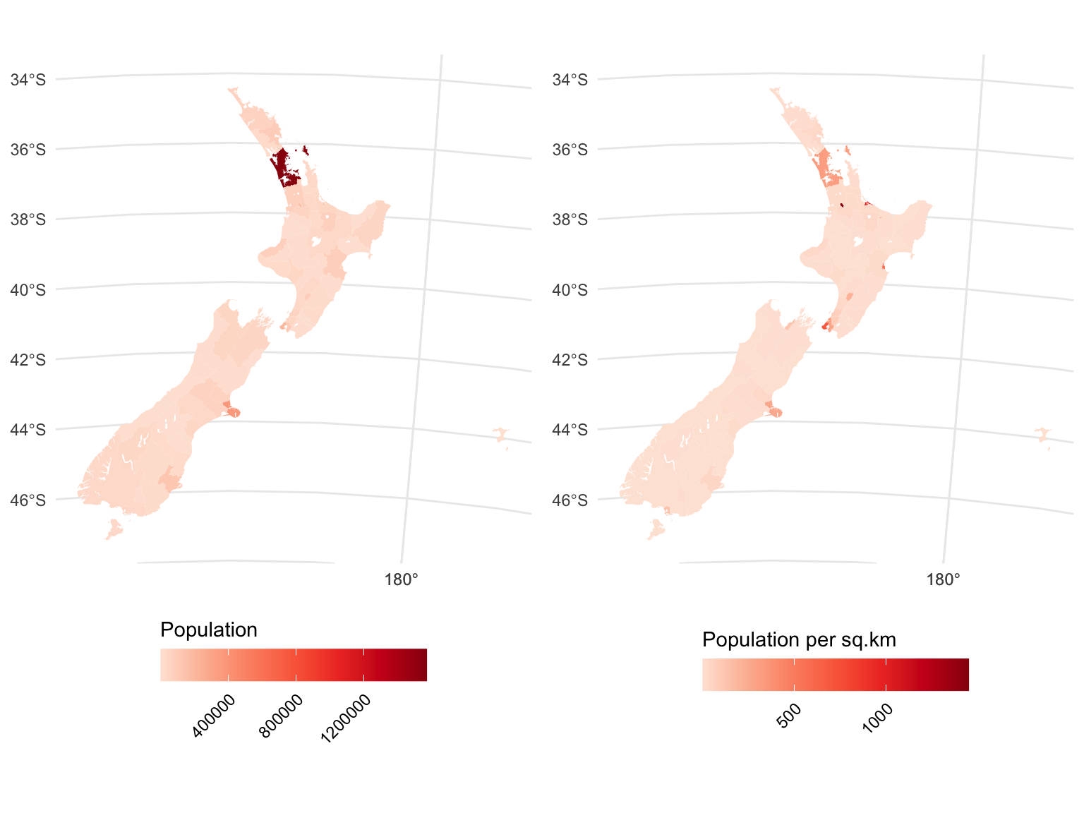
There are now a few glimmers of life outside of Auckland, but further confirmation that to a first order approximation, everyone in New Zealand is crammed into the cities.8
Regular readers will be surprised by how long I have tolerated the Chatham Islands in this post. I will now get rid of them focus on a more manageable subset of the data, and zoom in on Wellington.
wellington <- polygons |>
  filter(TA2018_V1_00_NAME == "Wellington City")
bb <- st_bbox(wellington)
xr <- bb[c(1, 3)]
yr <- bb[c(2, 4)]

basemap <- ggplot() +
  geom_sf(data = tas, fill = "lightgrey", colour = NA) +
  theme_void() +
  theme(panel.border = element_rect(fill = NA))

basemap +
  geom_sf(data = wellington, aes(fill = pop_density_km2)) +
  scale_fill_distiller("Pop density sq.km", palette = "Reds", direction = 1) +
  coord_sf(xlim = xr, ylim = yr)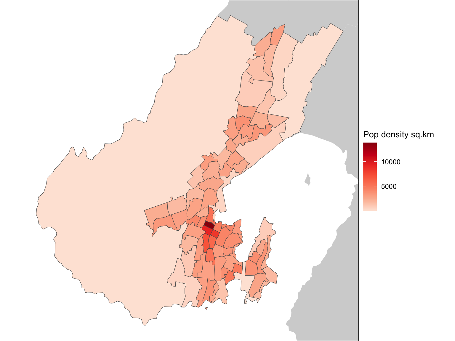
Like the country as a whole, Wellington has a big low population area (Makara-Ohariu), which is that huge zone along the west coast.
A lot of folks won’t consider dissolve to really be an overlay operation, although I don’t see why not. But for the overlay enthusiasts, here’s another polygon dataset, not aligned with the SA2 data.
schoolzones <- st_read("school-zones.gpkg") |>
mutate(School_name = str_replace(School_name, "\x20*School", ""))glimpse(schoolzones)Rows: 19
Columns: 3
$ School_ID <int> 660, 2816, 2826, 2827, 2854, 2874, 2875, 2876, 2883, 2894,…
$ School_name <chr> "Kahurangi", "Brooklyn (Wellington)", "Clifton Terrace Mod…
$ geom <MULTIPOLYGON [m]> MULTIPOLYGON (((1751570 542..., MULTIPOLYGON …These are primary school zones for the region. Unfortunately, they overlap one another, because school enrolment zones in New Zealand are not centrally administered exclusive areas9—in GIS terms they are not a coverage. That makes mapping them a bit of a pain, but that’s not our central concern for now.
basemap +
  geom_sf(data = wellington, fill = "grey", colour = "white") +
  geom_sf(data = schoolzones, fill = NA, colour = "black") +
  geom_sf_text(data = schoolzones, aes(label = School_name),
               size = 3, check_overlap = TRUE) +
  coord_sf(xlim = xr, ylim = yr)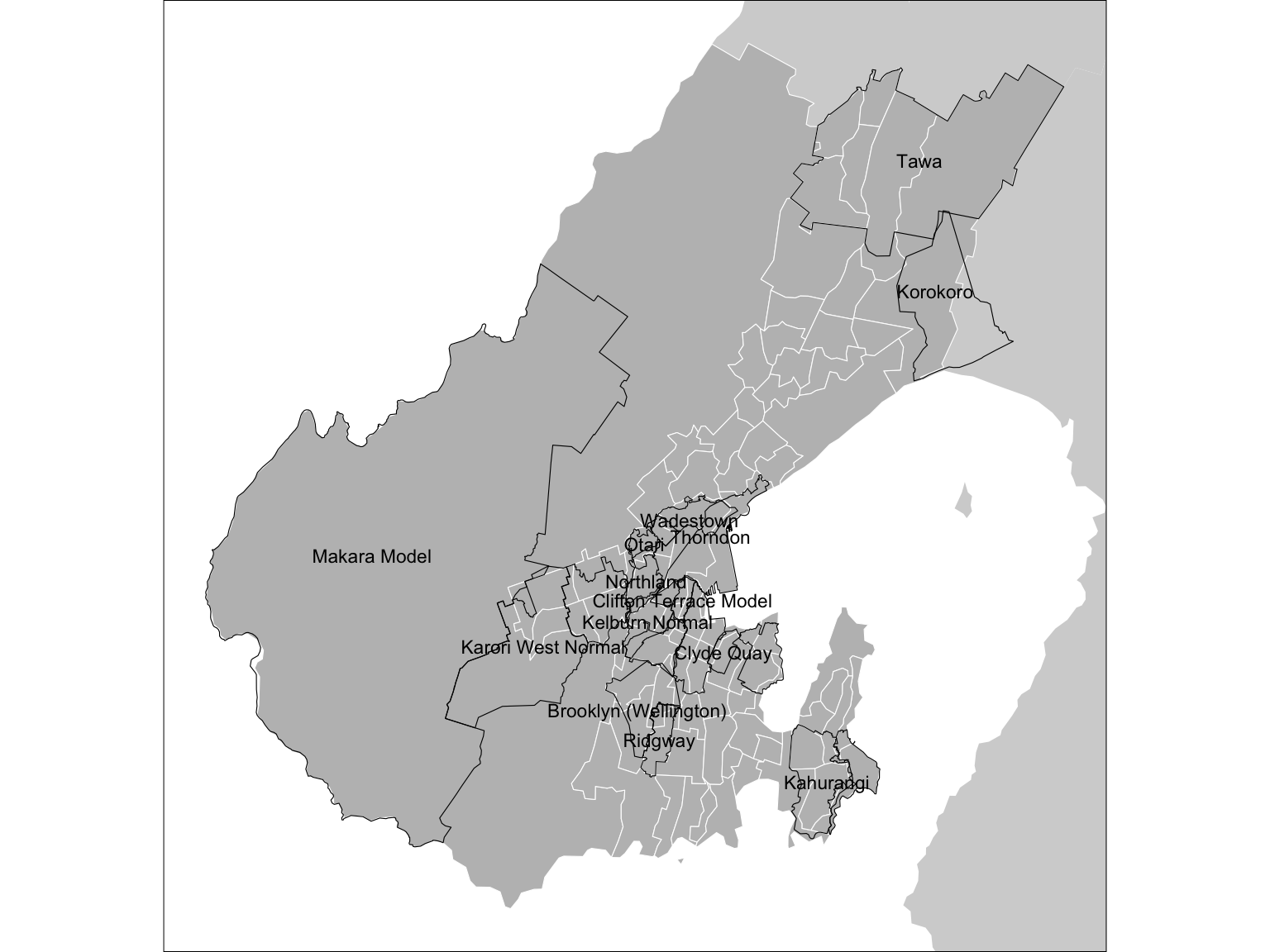
A classic polygon overlay operation is to estimate population for the school zones based on populations in the SA2s.
This is where one of sf’s best kept secrets st_interpolate_aw comes into its own. We could go through the tedious business of spatially joining polygons and calculating areas of overlap and using those to assign fractions of the population from the source SA2s to the overlap areas, and so on, but st_interpolate_aw allows us to do all of this in a single step.
schoolzones_pop <- wellington |>
  select(population, pop_density_km2) |>
  st_interpolate_aw(schoolzones, extensive = TRUE) |>
  bind_cols(schoolzones |> st_drop_geometry())

glimpse(schoolzones_pop)
Rows: 19
Columns: 5
$ population <dbl> 8686.39072, 5134.15226, 2021.22267, 2899.79282, 5923.1…
$ pop_density_km2 <dbl> 7816.40278, 5008.60164, 4262.77765, 4940.75692, 9242.2…
$ School_ID <int> 660, 2816, 2826, 2827, 2854, 2874, 2875, 2876, 2883, 2…
$ School_name <chr> "Kahurangi", "Brooklyn (Wellington)", "Clifton Terrace…
$ geometry <MULTIPOLYGON [m]> MULTIPOLYGON (((1751570 542..., MULTIPOLY…And now we can map them:
g1 <- basemap +
  geom_sf(data = schoolzones_pop, aes(fill = population)) +
  scale_fill_distiller("Population", palette = "Reds", direction = 1) +
  coord_sf(xlim = xr, ylim = yr)

g2 <- basemap +
  geom_sf(data = schoolzones_pop, aes(fill = pop_density_km2)) +
  scale_fill_distiller("NOT REALLY\npop density\nsq.km", palette = "Reds",
                       direction = 1) +
  coord_sf(xlim = xr, ylim = yr)

g1 | g2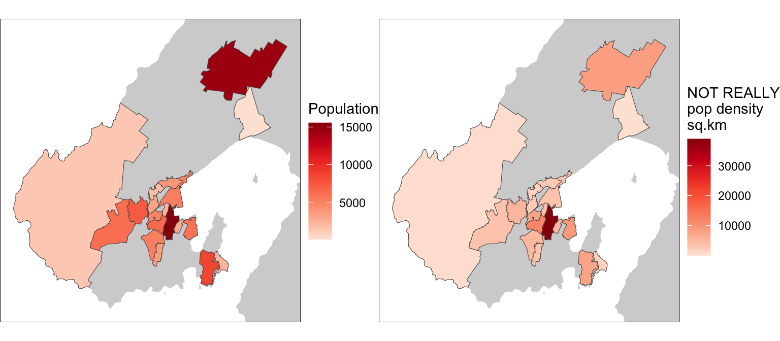
BUT (and it’s big but10) we have to be careful here. While population can be interpolated this way, population density cannot. That’s what the extensive option in st_interpolate_aw is for. As the documentation points out
extensivelogical; if TRUE, the attribute variables are assumed to be spatially extensive (like population) and the sum is preserved, otherwise, spatially intensive (like population density) and the mean is preserved.
So, the proper way to proceed is.
sz_pop <- wellington |>
  select(population) |>
  st_interpolate_aw(schoolzones, extensive = TRUE)

sz_pop_density <- wellington |>
  select(pop_density_km2) |>
  st_interpolate_aw(schoolzones, extensive = FALSE)
Which gives us the correct result below.
g1 <- basemap +
  geom_sf(data = sz_pop, aes(fill = population)) +
  scale_fill_distiller("Population", palette = "Reds", direction = 1) +
  coord_sf(xlim = xr, ylim = yr)

g2 <- basemap +
  geom_sf(data = sz_pop_density, aes(fill = pop_density_km2)) +
  scale_fill_distiller("Pop density\nsq.km", palette = "Reds",
                       direction = 1) +
  coord_sf(xlim = xr, ylim = yr)

g1 | g2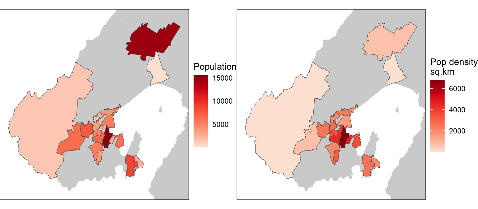
Provided we keep this aspect in mind st_interpolate_aw is a great tool. You can even use it to assign polygon data to ‘raster’ layers, if you are so inclined. Below, I make a ‘raster’ layer, which is actually a set of grid cell polygons, and assign population to them.
cells <- wellington |>
  st_make_grid(cellsize = 100) |>
  st_sf() |>
  st_filter(wellington) |>
  st_interpolate_aw(x = wellington |> select(population),
                    extensive = TRUE)

basemap +
  geom_sf(data = cells, aes(fill = population), colour = NA) +
  scale_fill_distiller("Population\n(per ha.)",
                       palette = "Reds", direction = 1) +
  coord_sf(xlim = xr, ylim = yr)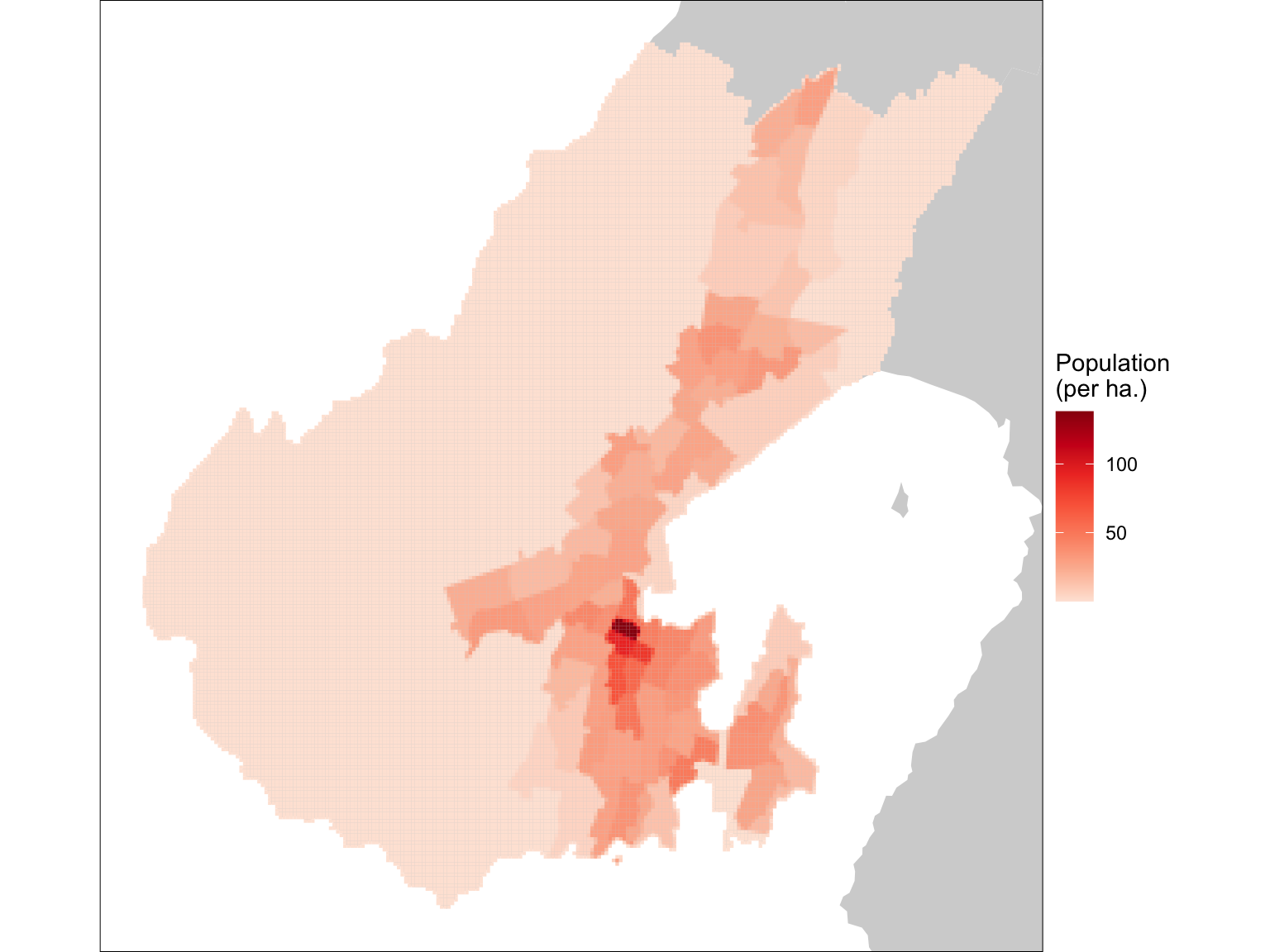
What’s (potentially) interesting about this idea, is that at polygon boundaries this process assigns different populations to the ‘raster’ cells. We can see this if we zoom in a bit.
basemap +
  geom_sf(data = cells, aes(fill = population), colour = NA) +
  scale_fill_distiller("Population\n(per ha.)",
                       palette = "Reds", direction = 1) +
  geom_sf(data = wellington, fill = NA) +
  coord_sf(xlim = c(1.746e6, 1.749e6), ylim = c(5.425e6, 5.428e6))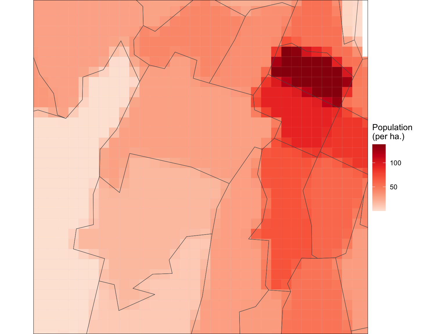
And there we have it, at least for now. This is a good point to stop before the next post which will be about area → field transformations, because, after all, raster data sets are actually large numbers of small, albeit identical polygons…
![]()
Or down then up…↩︎
Says the person offering advice on the internet…↩︎
I have not been able to install this on a Mac↩︎
It’s buffering, you fool.↩︎
Seriously, some of the locked-in decisions around the New Zealand census almost make me glad to see the back of it. Almost.↩︎
Previously known by the more descriptive if equally anodyne name Census Area Unit.↩︎
Many schools don’t even have an enrolment zone.↩︎
©Stan Openshaw.↩︎