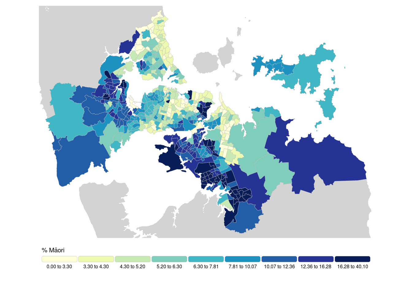
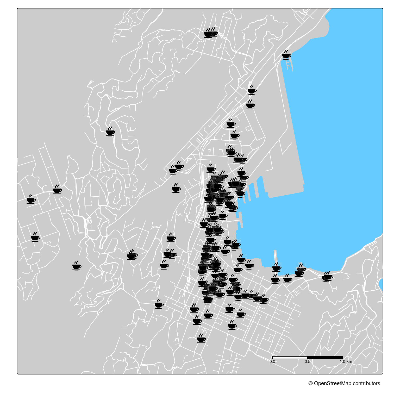
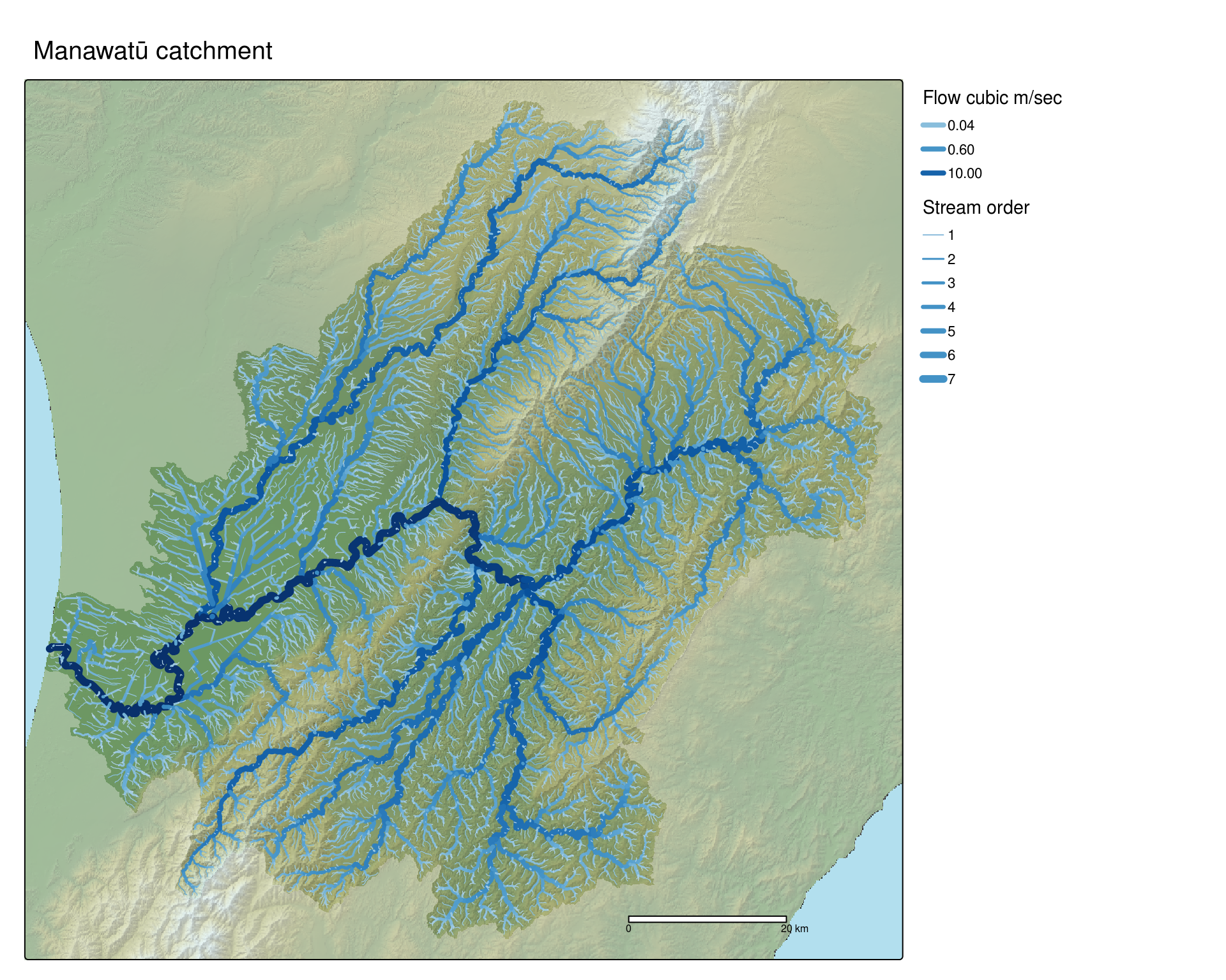
So what’s this all about then?
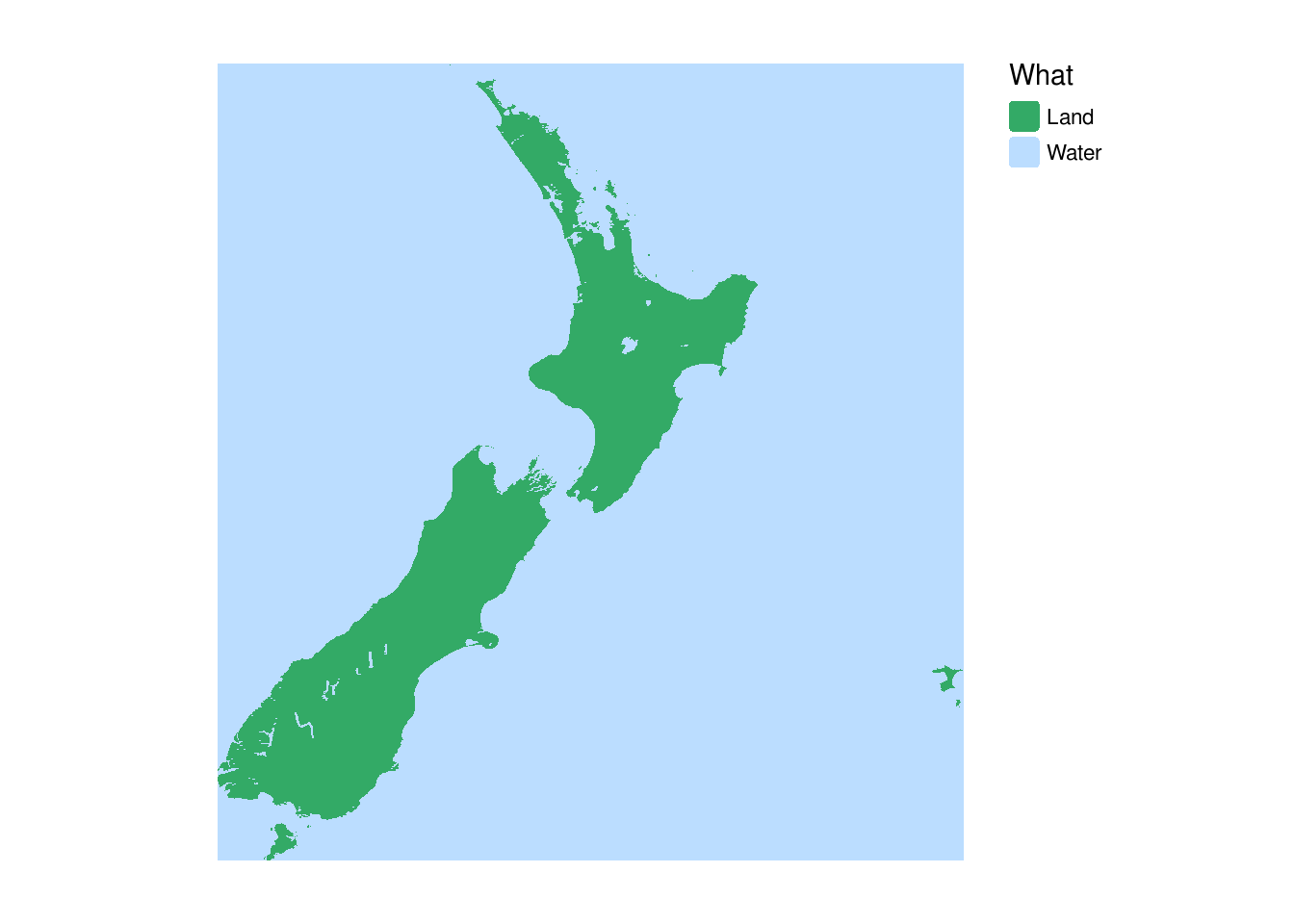
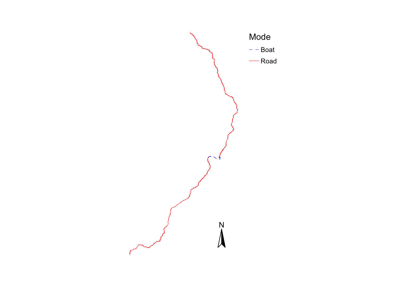
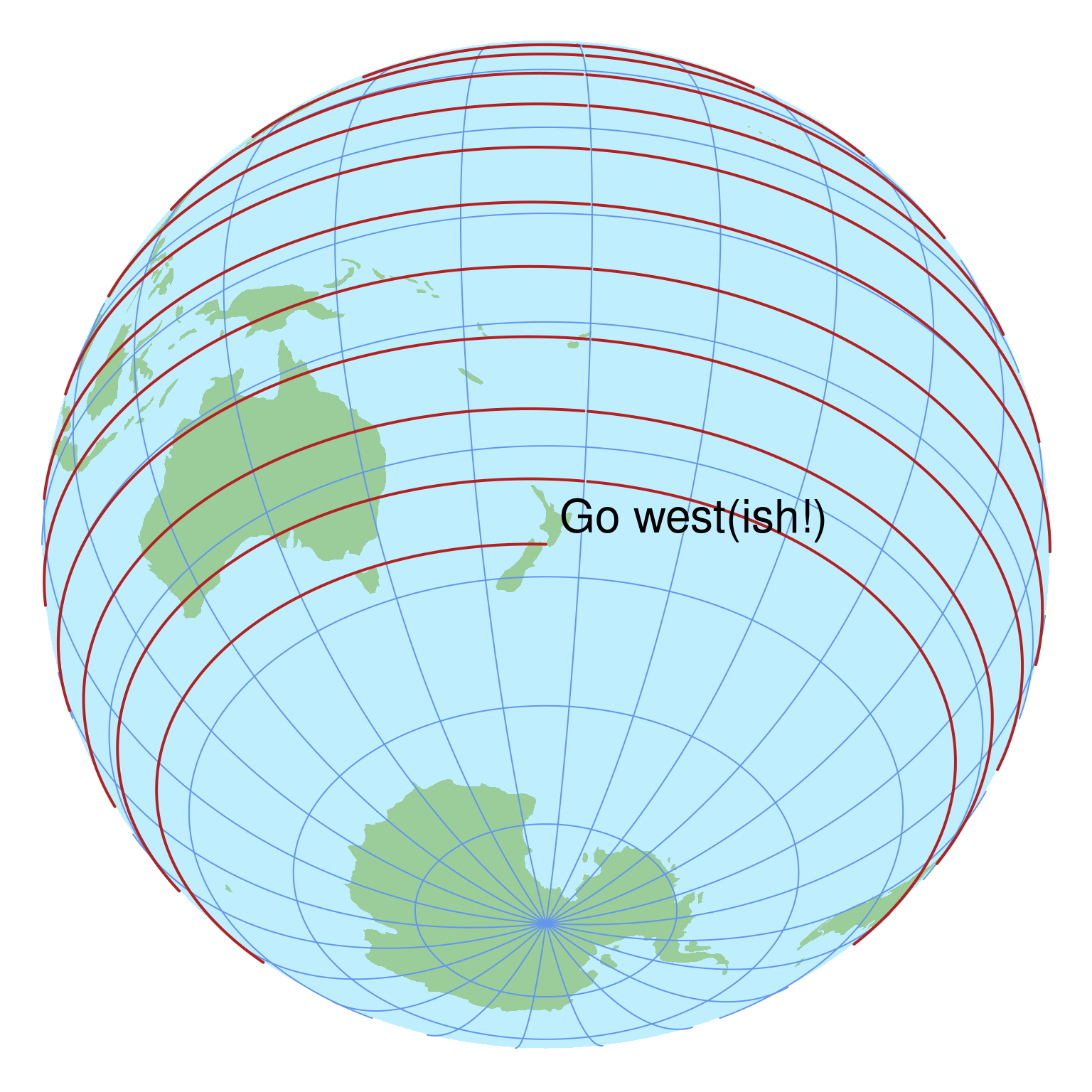
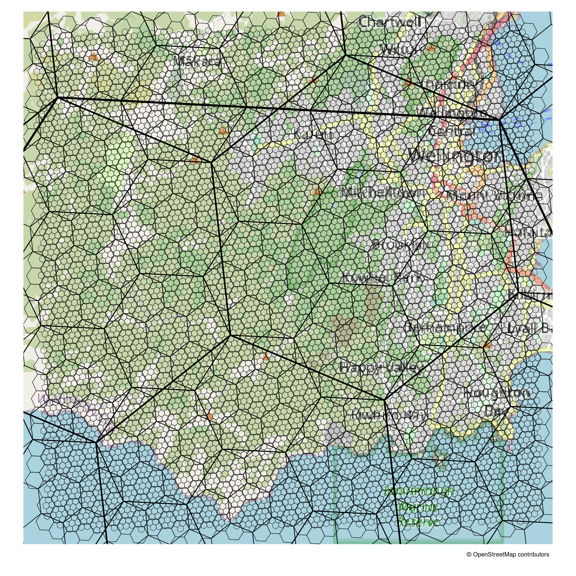
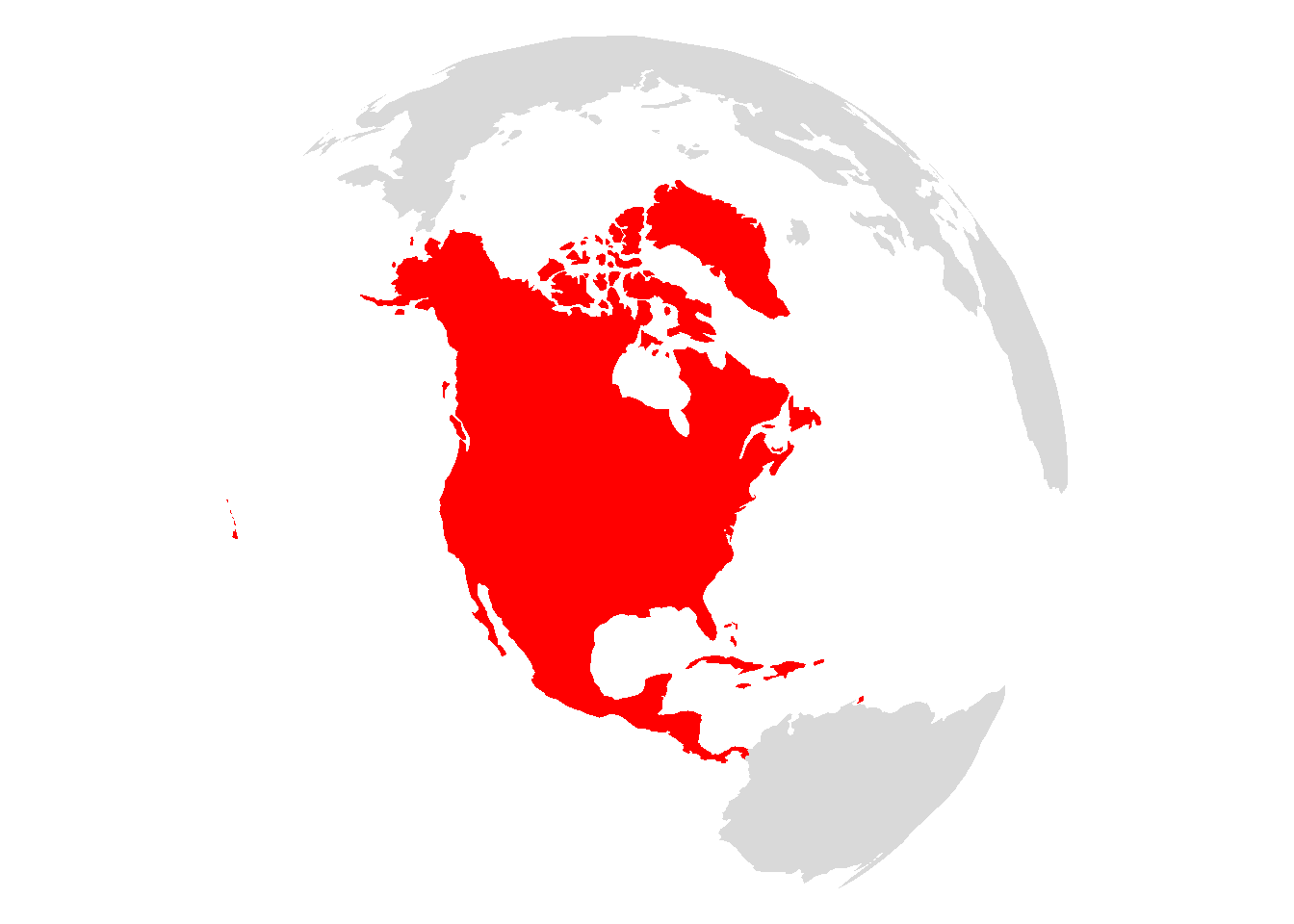
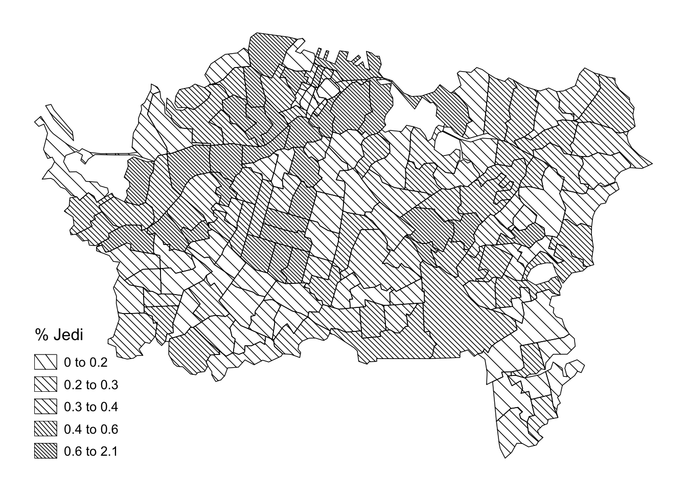
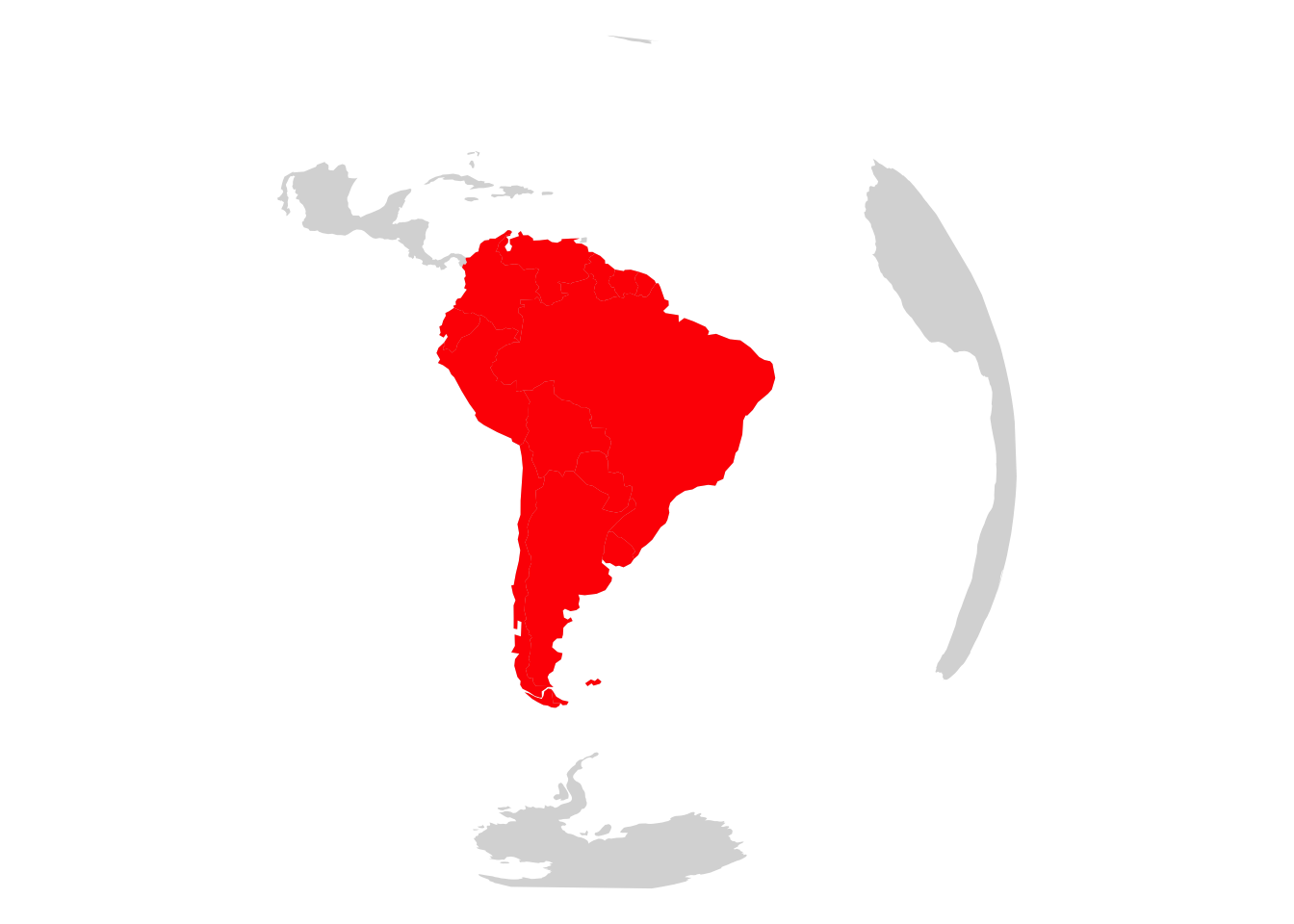
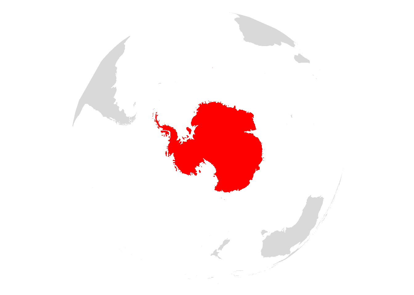
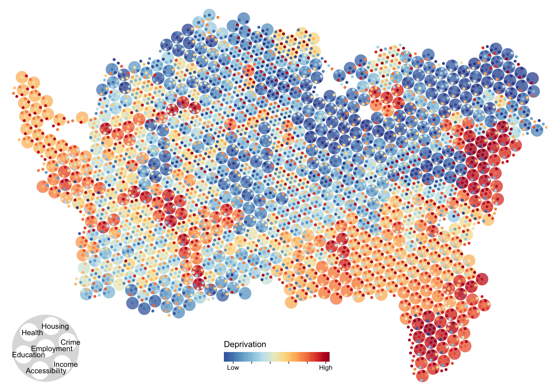
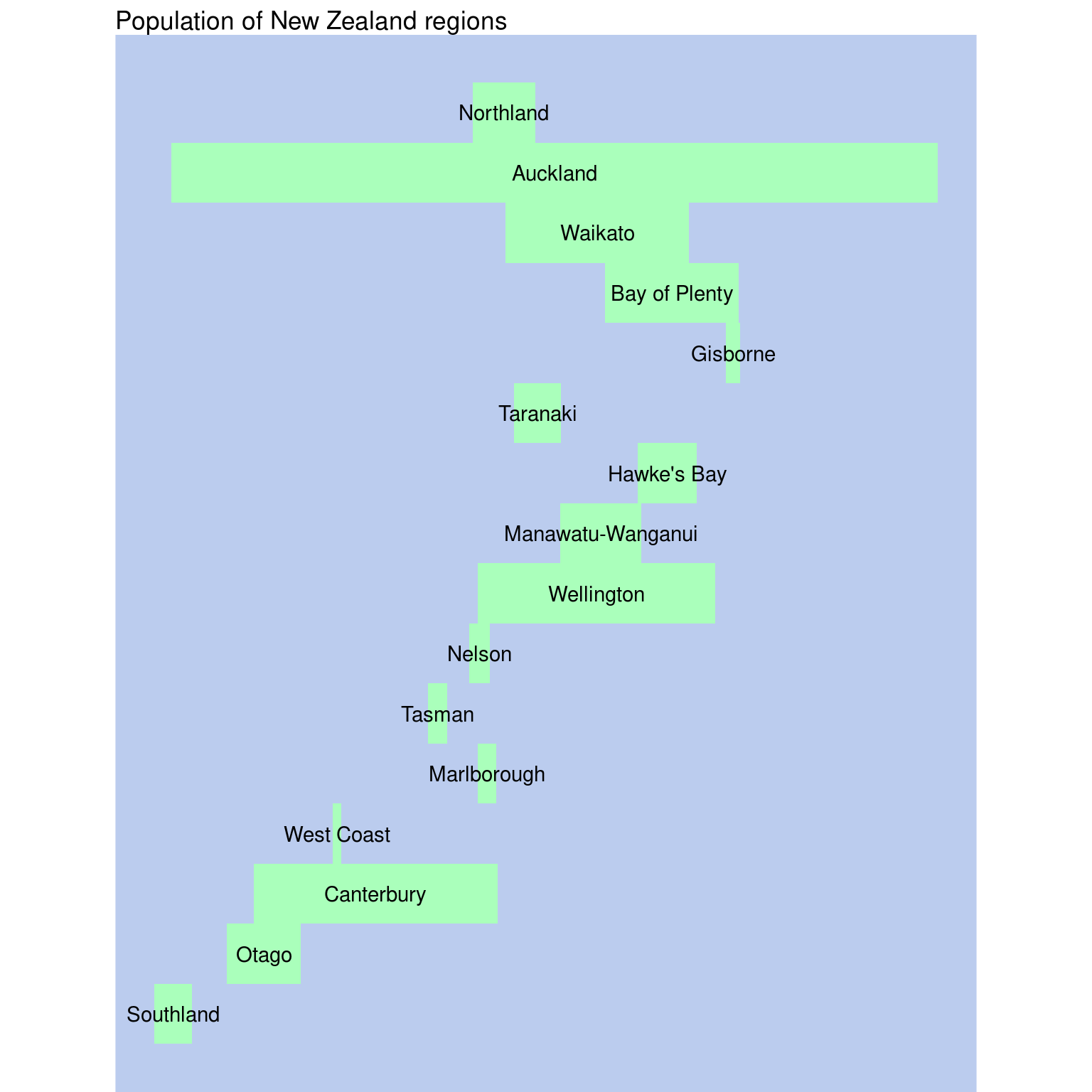
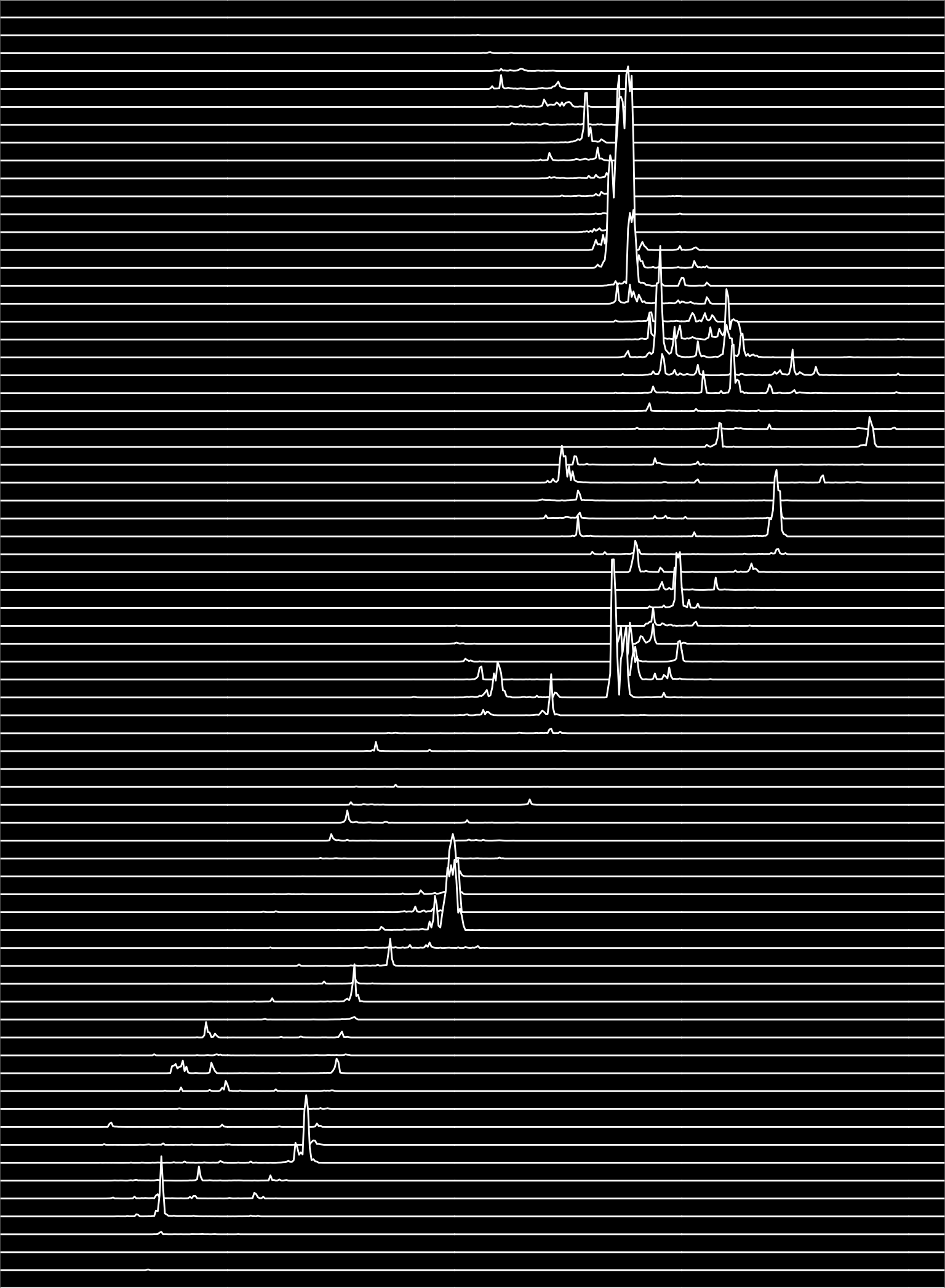
I decided to give the 30 Day Map Challenge a go this year.
My efforts are not an exercise in flashy cartographic design. I’ve been using tmap for a few years. Version 4.0 is due soon and includes major changes, which at first glance make it more similar in many ways to ggplot2, which I have often dabbled with. So… I thought I’d make some simple maps using both platforms to get a feel for the pros and cons of each.
As the month wore on, I tried some other things, there being only so many things you can do using tools optimised for relatively simple thematic mapping.
Final thoughts
I don’t know that I arrived at any specific conclusions concerning the relative merits of tmap and ggplot2. It’s often easier to use ggplot2 if you need tools from the wider R ecosystem (e.g. see 29 Population). But if you want to play fast and loose with colour palettes, tmap is more forgiving than ggplot2, and crucially it is OK with letting you apply the same aesthetic (e.g. colour) to more than one dataset. In mapping applications that is a pretty commonly encountered requirement. tmap also has more traditional ‘map junk’ (scale bars, north arrows, web basemaps) baked in, so you don’t have to call on other packages like ggspatial. For what it’s worth, if you are doing additional work on a graphic in Inkscape or Illustrator, I have generally found the SVGs exported by tmap to be more easily managed (the layering is better, for example).
A cop out, probably, but they are both great packages!


