Code
library(sf)
library(ggplot2)
library(dplyr)
library(stringr)In thematic maps you can’t always tell. Try to stretch the limits.
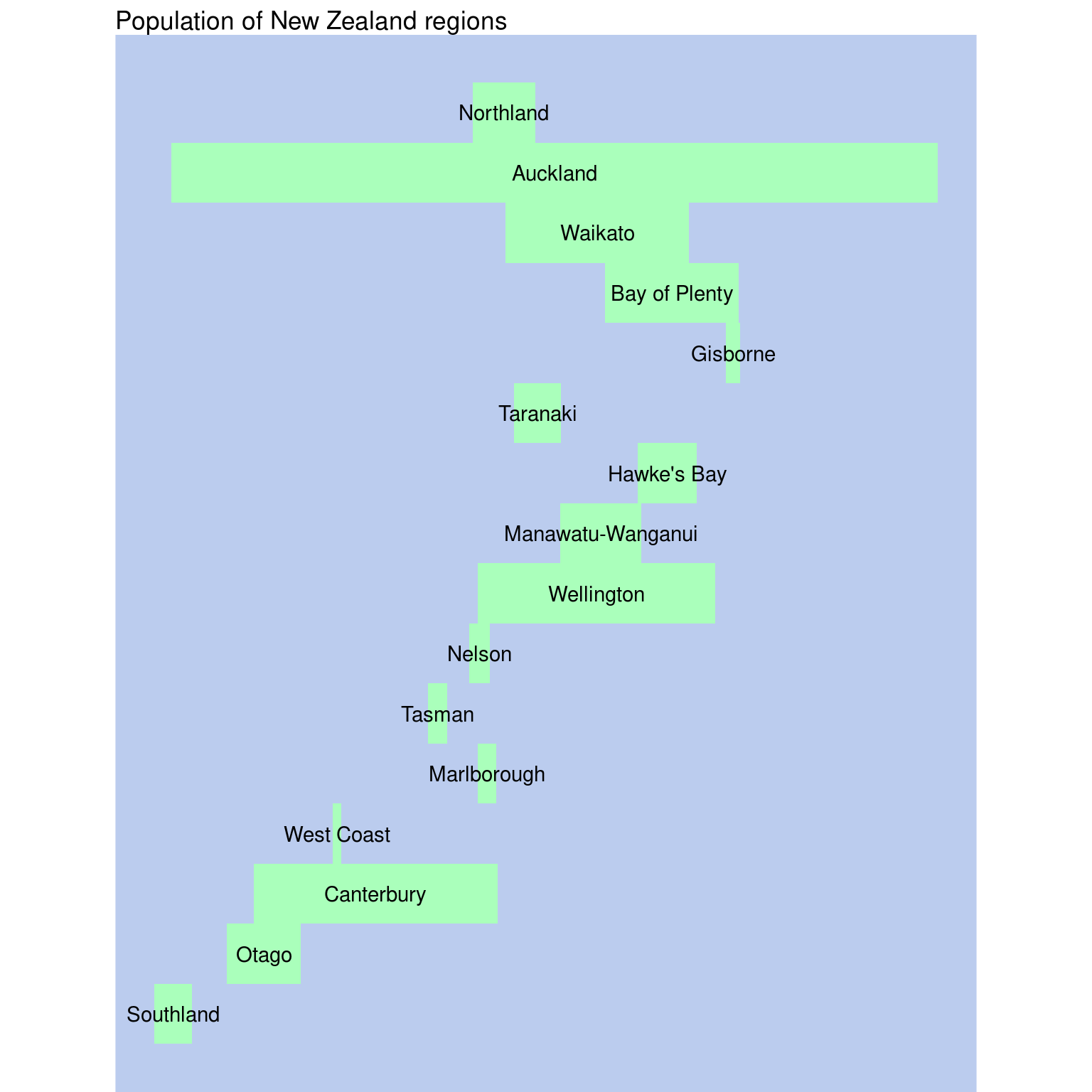
In New Zealand drop down lists of regions are almost always presented from north to south almost like a map. It works because the country is ‘narrow’ from east to west. Picking up on that idea here is a population bar chart ‘map’.
library(sf)
library(ggplot2)
library(dplyr)
library(stringr)pop <- st_read("data/regional-population.gpkg")
bb <- st_bbox(pop)
hght <- (bb[4] - bb[2]) / nrow(pop)
pop_df <- pop %>%
st_centroid() %>%
st_coordinates() %>%
as_tibble() %>%
mutate(Population = pop$pop, Region = pop$region) %>%
arrange(Y) %>%
mutate(order = bb[2] + row_number() * hght - hght / 2,
y = Y, x = X, h = hght, w = Population / 20,
name = str_remove(Region, " Region"))Since I’ve organised the data as a data table not a spatial dataset, it makes sense to use ggplot2. The geom_tile function can handle rectangles at given location with specified width and height.
ggplot(pop_df) +
  geom_tile(aes(x = x, y = order, width = w, height = h),
            fill = "#aaffbb", linewidth = 0) +
  geom_text(aes(x = x, y = order, label = name), hjust = 0.5) +
  coord_equal() +
  labs(title = "Population of New Zealand regions") +
  theme_void() +
  theme(panel.background = element_rect(fill = "#bbccee", linewidth = 0))