Code
library(sf)
library(dplyr)
library(tmap)
library(ggplot2)
library(cols4all)  # extra palettes for ggplot
library(smoothr) # for adding extra points along geometriesYou choose!
Well OK then, I will: my favourite random experiment from the month past.
Making these maps you do a lot of mucking about with the tools and with data, and try a lot of things, most of which don’t make the final cut. Here’s one I liked that falls into that category (but didn’t fall under any of the other 29 daily prompts).
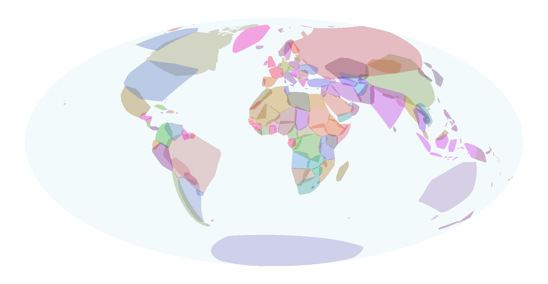
This inspiration was the recently launched 2024 geohipster calendar cover of bounding box world, which obviously immediately sparked the thought (no disrespect) “how hard can that be?!”
An obvious tweak is to change the projection and see how it looks (at least that was the obvious thing for me). A pseusdocylindrical with curved parallels produces a particularly nice effect, so Hammer-Aitoff it is…
So without further ado…
library(sf)
library(dplyr)
library(tmap)
library(ggplot2)
library(cols4all) # extra palettes for ggplot
library(smoothr) # for adding extra points along geometriesThe dataset I used is the tmap built in World dataset, cast to simple polygons.
Making a bounding box layer using sf is fiddly, because st_bbox applies to the whole layer, not to each individual polygon. For that, I need to use lapply. Then, because bounding boxes are not spatial objects but a vector c(xmin, ymin, xmax, ymax) I have to do some more processing steps to make them back into polygons, and rejoin the source data. The unlist(recursive = FALSE) step is key here for unpacking the list of polygons so they can be collected back into a simple feature collection. Also important for the reprojection is densifying the bounding boxes so we follow parallels and meridians. I do this using smoothr::densify. The last group by step (in spatial terms a ‘dissolve’) removes some oddities like offshore island bounding boxes entirely bounded by the ‘parent’ geometry bounding box.
I’ve also made a ‘disc’ polygon to show the ‘globe’. This is not as simple to do as you might imagine, and has been complicated recently by the advent of the S2 spherical geometry stuff in R. Generally a good thing, S2 knows that that ‘disc’ has zero area (think about it…) and so to force it to trace out the disc, I have to densify the edges of a simple rectangle with the world ‘extent’.
data("World")

World <- World %>%
  st_cast("POLYGON")

world_bboxs <- World$geometry %>%
  lapply(st_bbox) %>%
  lapply(st_as_sfc) %>%
  unlist(recursive = FALSE) %>%
  st_sfc() %>%
  st_sf(crs = 4326) %>%
  densify() %>%
  st_transform("+proj=hammer") %>%
  bind_cols(World %>% st_drop_geometry()) %>%
  group_by(name) %>%
  summarise()

disc <- list(matrix(c(-2, -1,
                       2, -1,
                       2,  1,
                      -2,  1,
                      -2, -1) * 90,
                    ncol = 2, byrow = TRUE)) %>%
  st_polygon() %>%
  densify(max_distance = 1) %>%
  st_sfc(crs = 4326) %>%
  st_sf() %>%
  st_transform("+proj=hammer")
The map itself is simple. I decided to colour by country, not by continent.
tm_shape(disc) +
  tm_fill(fill = "powderblue", fill_alpha = 0.15) +
  tm_shape(world_bboxs) +
  tm_fill(
    fill = "name",
    fill.scale = tm_scale_categorical(values = "dark24"),
    fill.legend = tm_legend_hide(),
    fill_alpha = 0.35) +
  tm_layout(frame = FALSE)
Convex hulls are easier, because the st_convex_hull function applies to each polygon, not the whole collection. For balance, I’ll map this using ggplot2.
Here, we encounter one of the minor annoyances of ggplot2. There are 177 distinct country names in the data. If you try to map these with a discrete colour palette ggplot2 is strict about that mapping: if the palette only has 24 colours defined (as in this case) and you have 177 things to map, it won’t allow it. To get around this, I make a unique integer label for each country name, and apply the colour palette in continuous fashion.
Just one of those wrinkles of working with an ‘opinionated’ package like ggplot2. A more generous adjective would be ‘principled’ and when it comes to visualisation, ggplot2 is definitely more principled than I am…
name_id <- data.frame(name = unique(World$name)) %>%
  mutate(id = row_number())

world_hulls <- World %>%
  st_convex_hull() %>%
  densify() %>%
  st_transform("+proj=hammer") %>%
  group_by(name) %>%
  summarise() %>%
  left_join(name_id)

ggplot(disc) +
  geom_sf(fill = "powderblue", linewidth = 0, alpha = 0.15) +
  geom_sf(data = world_hulls,
          aes(fill = id), linewidth = 0, alpha = 0.35) +
  scale_fill_continuous_c4a_seq("dark24") +
  guides(fill = "none") +
  theme_void()